

World Book Day is often seen as a celebration of authors and literary classics. For us, it is also a reminder of the craft that turns a manuscript into a finished book.
At Solopress, we work with many self-publishers who choose to take control of their work from concept through to print. That includes authors who need not only production, but professional typesetting and cover design.
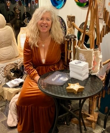
Recently, we worked with Cali Curandera on her book A Lunar Life. After initially working with a publisher, Cali decided to self-publish. She entrusted us with both the print and the design. Senior Graphic Designer Ellise Collins led the project and shares her experience below.
Setting the brief
“When Cali first approached Solodesign about typesetting her book, I felt two things at once, excitement and responsibility. To be trusted with someone’s manuscript, their words, their months, sometimes years, of work, is never a small task. It’s a privilege.
Cali provided the full manuscript along with her illustrated chapter headings, and after an initial conversation with Richard, our Creative Lead, the vision was clear. From there, the project became mine to shape.”
Before any visual decisions were made, the manuscript needed to be structured and prepared for layout.
Structuring the manuscript
“Before design begins, there’s quiet groundwork. I carefully cleaned and structured the manuscript, ensuring consistency across titles, subtitles, chapter headings and body copy. It’s invisible work, but essential.
Once inside InDesign, the book truly began to take form. Trim size, margins, folios, page count, every measurement considered. A book isn’t just read; it’s held. It needs space to breathe.
Choosing the typeface was one of the most important decisions. Typography sets the voice of the page. I chose Garamond, elegant, understated, timeless. Its smaller x-height makes it beautifully suited to book printing, and it carries a quiet sophistication that felt completely aligned with Cali’s aesthetic. It doesn’t shout for attention. It simply supports the story.”
With the manuscript flowed into the layout, attention turned to consistency and flow.
Refinement and detail
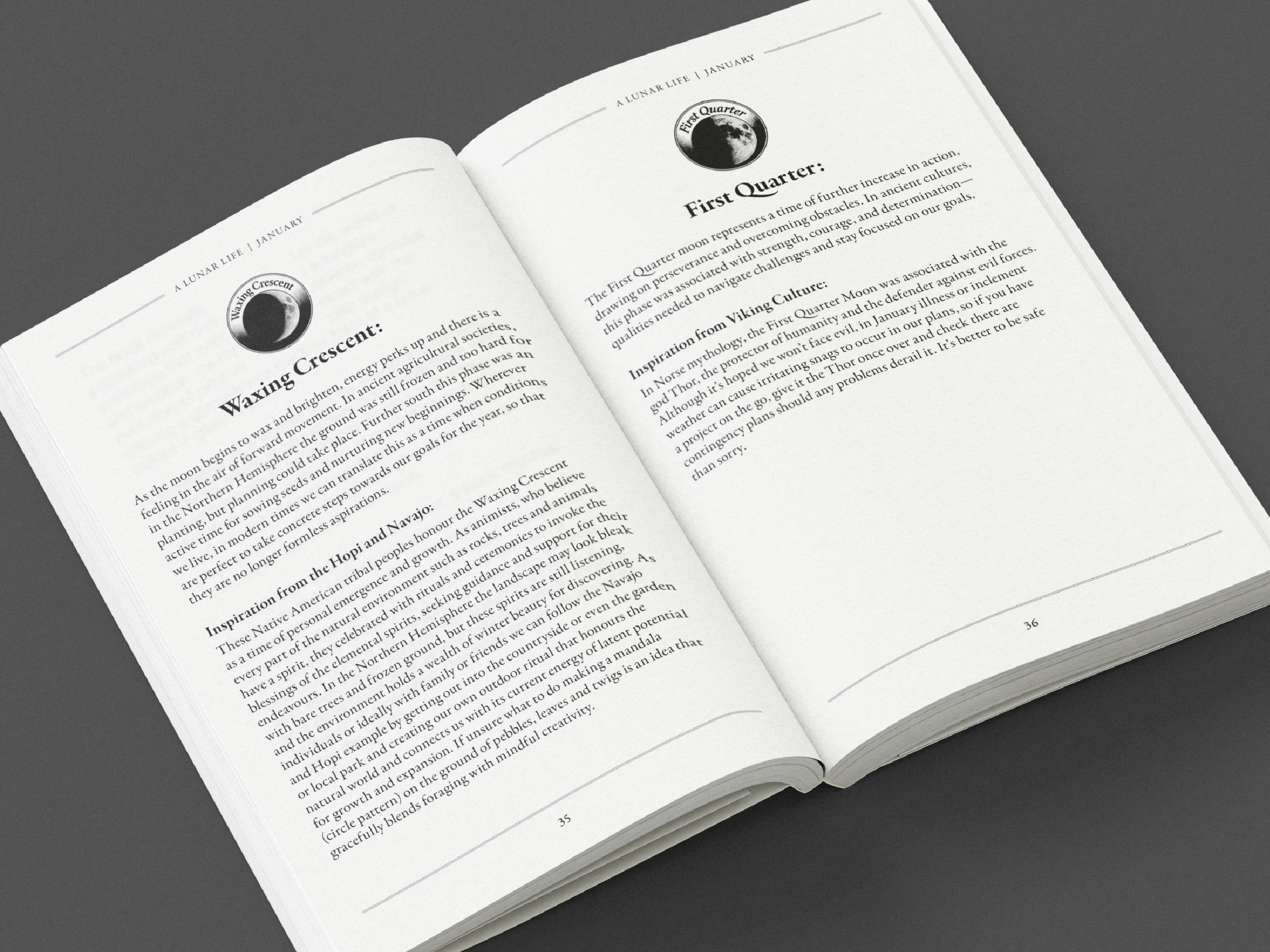
“With the manuscript flowed in, I worked through each page meticulously. Applying styles, refining hierarchy, ensuring chapters always opened on the right-hand page. Managing spacing. Balancing spreads. Watching for rhythm.
Then came the part I love most, refinement.
Adjusting leading so chapter openings felt intentional. Removing widows and orphans that interrupt the reader’s flow. Correcting hyphenation. Preventing rivers in justified text. Making sure the gutter was generous enough that no word would disappear into the binding. These are the details most readers will never consciously notice, and that’s exactly the point.
Good typography is invisible. When it’s working, you don’t see it. You simply read.”
This stage is where technical decisions directly affect the reader’s experience. Margins, spacing and text flow all influence readability, particularly in longer works.
Cover design and production
“Before designing the entire book, I shared the first chapter spread with Cali. That moment is always important. It’s the first time the manuscript truly feels like a book. Once approved, I continued through the remaining chapters, sharing proofs at key milestones so we could refine together.
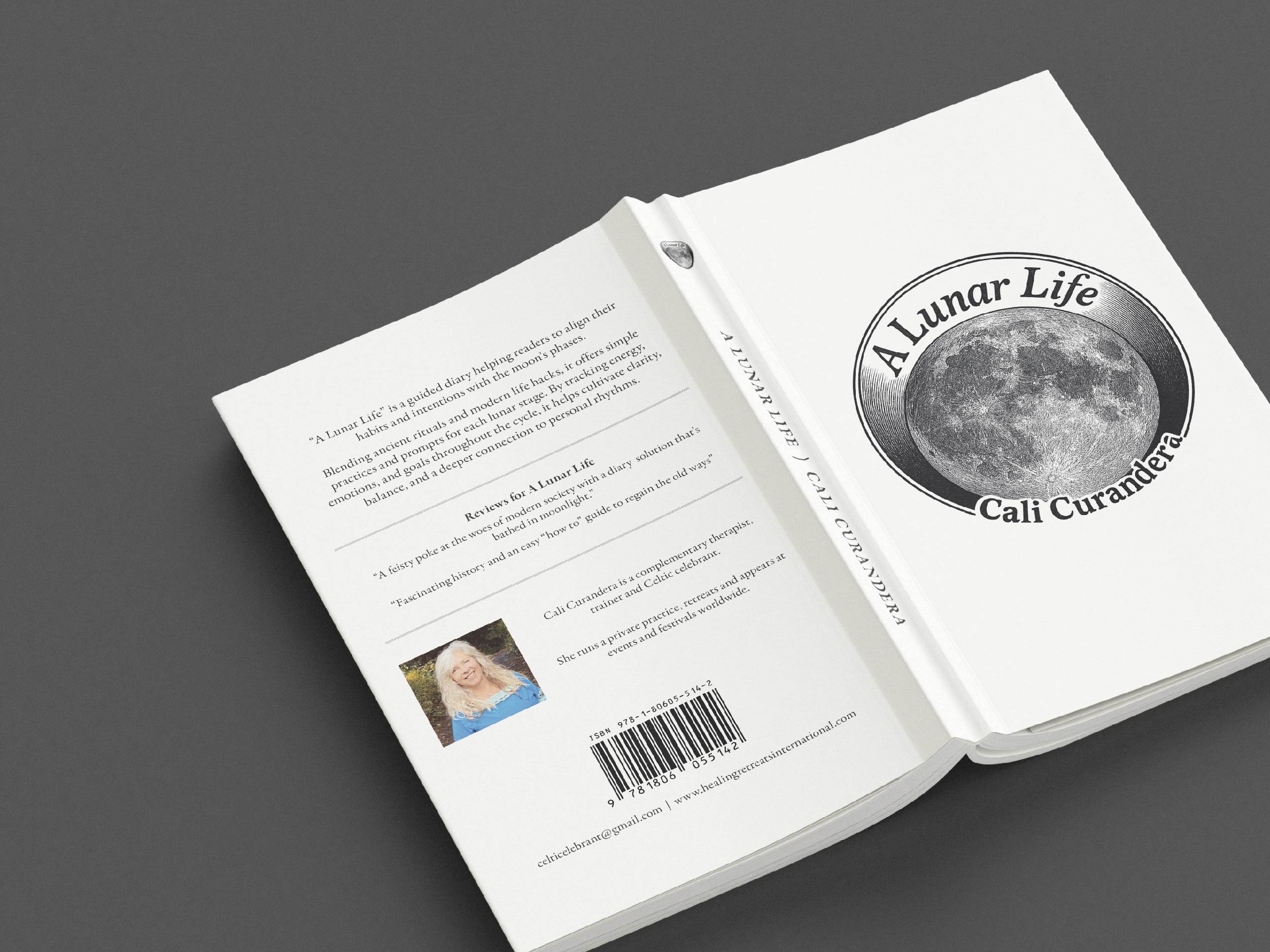
When the interior was complete, I designed the full cover spread. With the final page count confirmed, I calculated the spine width precisely and built the artwork as a single wraparound piece, front cover, spine, blurb, barcode and publishing details. We went back and forth, adjusting and polishing until it felt right.
Before final production, I printed scaled sections in house, holding the pages, checking proportions, feeling the margins. A final quiet review before letting it go.”
A considered craft
“Typesetting a book is a dream project for me. It’s a slow craft, it’s patience, it’s care. It’s obsessing over millimetres that change how a page breathes.
Cali trusted us to make the design disappear, to create something so seamless that her readers could fall entirely into the words on the page without distraction. And that, to me, is the true art of book design.”
For self-publishers, professional typesetting and cover design can make a measurable difference to how a book reads and feels. From manuscript preparation to print-ready artwork, careful design ensures that the final product reflects the time and effort invested in writing it.
Lunar landing
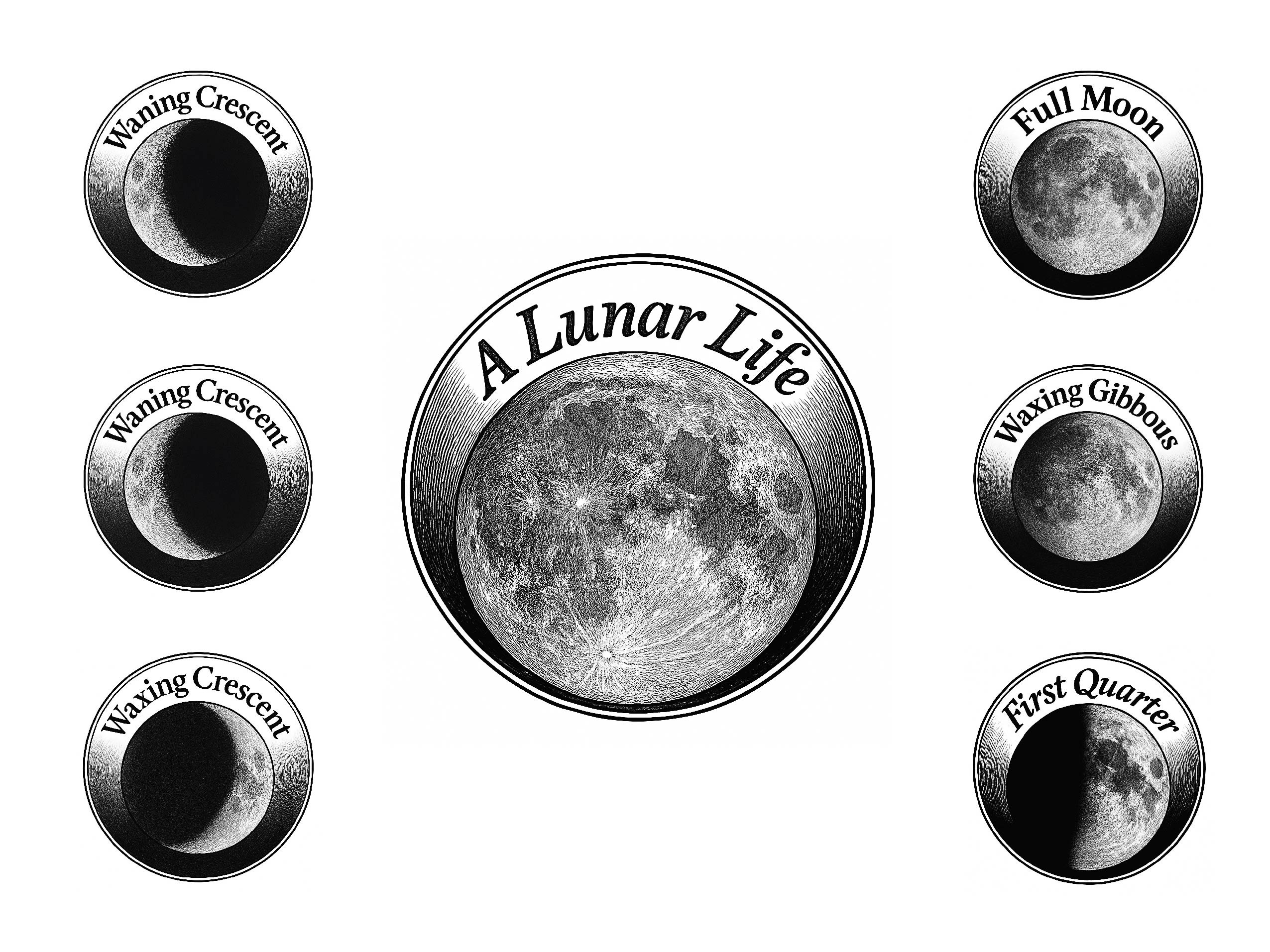
You can order your copy of A Lunar Life directly by emailing [email protected]. And when you receive your copy and you’re ready to dive into the ancient moon wisdom that Cali has lovingly gathered, spare a thought for the carefully laid-out text too!
If you are preparing your own book for print, our Solodesign team can assist with layout, cover artwork and production-ready files, alongside our Paperback Book printing options.
