

Brands use fonts in many ways to reflect their aims, values and personality. The most prominent use of a font is when the logo is expressed as a wordmark – a typographic rendering of the brand name in a custom, stylised or even off-the-rack typeface. Beyond the wordmark, designers have a choice to make. Do they echo their logo with an identical or consistent font? Or contrast it with a distinct typeface that complements the logo without confusing the brand? After all, when it comes to written communication, the reader’s understanding of your message isn’t just shaped by the words themselves. It’s influenced by a psychological interplay between the meaning of the words and the ‘mood’ of the font.
Setting the mood
However, what we determine to be a font’s ‘mood’ is derived through a complex mix of design details, cultural associations and context. This partly accounts for why we see brands change their house fonts as perceptions and associations shift over time. They are updated to create a new vibe, shed old ideas or as part of an overall rebrand. Other more practical factors also come into play, like making sure text is impactful across print, desktops, phones and laptops. Let’s take a dive into how different fonts can evoke different feelings from an audience, and how brands can harness this power.
Watching their weight
Fonts are powerful mood setters. One aspect that helps determine the tone of your message is the weight of the font. A fine typeface with slender lines can constitute elegance and a bolder font such as sans-serif can connote power. This comes from how we associate the stems, bars and strokes of a typeface with structures in the real world. Thicker. sturdier lines feel strong, while thinner ones suggest delicacy and flexibility.
Angles and curves

Another key factor in a font’s mood is its shape. Angular typefaces feel sharp and formal, while rounded ones come across as soft and approachable. This mirrors the findings of psychologist Dimitri Uznadze who identified the “Bouba/Kiki effect.” In Uznadze’s experiment, participants were shown two shapes and asked which was called “Bouba” and which “Kiki.” Most labelled the curvy shape as Bouba and the spiky one as Kiki, revealing a strong link between visual form and sound. These associations often extend to broader ideas: curves suggest softness, comfort and fun, while angles imply rigour, precision and seriousness. Whether these responses are instinctive or learned remains debated, but brands have long harnessed them to express personality and intent.
How the big brands do it
Many of the world’s most recognisable brands are defined by their font choices. These fonts become closely associated with their brand and help to create their strong identity filtering through all their branding. Where the brand has a wordmark logo, it will often feature handcrafted lettering rather than an off-the-shelf font. This leaves the brand with a decision to make in terms of their font choice for body text. Echo the wordmark with a similar font? Or create a highlight the difference with a contrasting font?
Dior
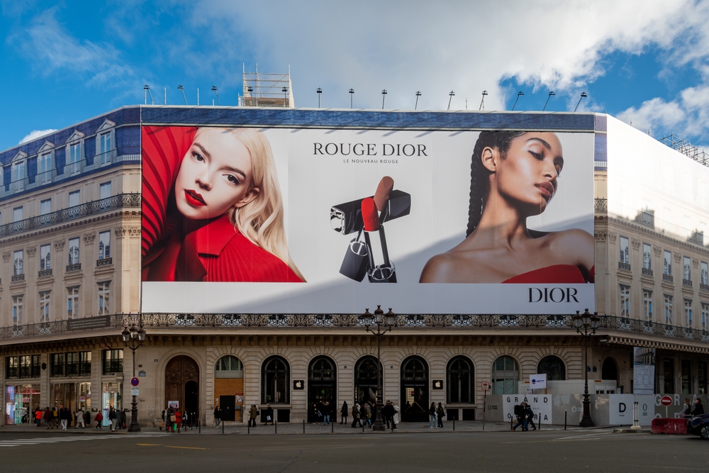
Dior uses a font called Bondi with iconic results. This font dates to the 18th century, the high contrast, crisp lines of this serif font give the brand its recognisable timeless elegance. The font shows the detailed craftmanship and luxury this famous fashion house is known for. The font feels natural and bespoke—exactly the mood the Dior brand wants to display to its customers.
However, Dior recently updated their fonts for fragrance and beauty within their marketing and communications. Atacama is now the new typeface representing the brand in 2025.
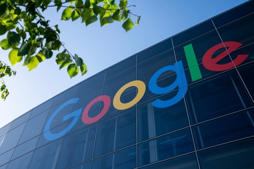
In 2015, Google introduced a new wordmark set in Product Sans, replacing its long-standing serif logotype with a cleaner, more modern look. The new design reflected a broader shift in the company’s visual identity—one that prioritised simplicity, clarity and accessibility. Product Sans is a custom-designed typeface created specifically for Google. Its rounded, open shapes lend a friendly, informal tone that aligns with the brand’s approachable image.
Beyond the logo, Product Sans is a sans serif font that Google created specifically for branding purposes. Google uses the font across various touchpoints, including body copy on pages such as its Data Centers site, helping to maintain a consistent and recognisable style. The typeface also performs well in terms of accessibility. While it doesn’t replicate Comic Sans—often cited for its legibility among dyslexic readers—it shares similar qualities: clean design, open counters and generous letter spacing, all of which contribute to ease of reading for a wide range of users.
Nike
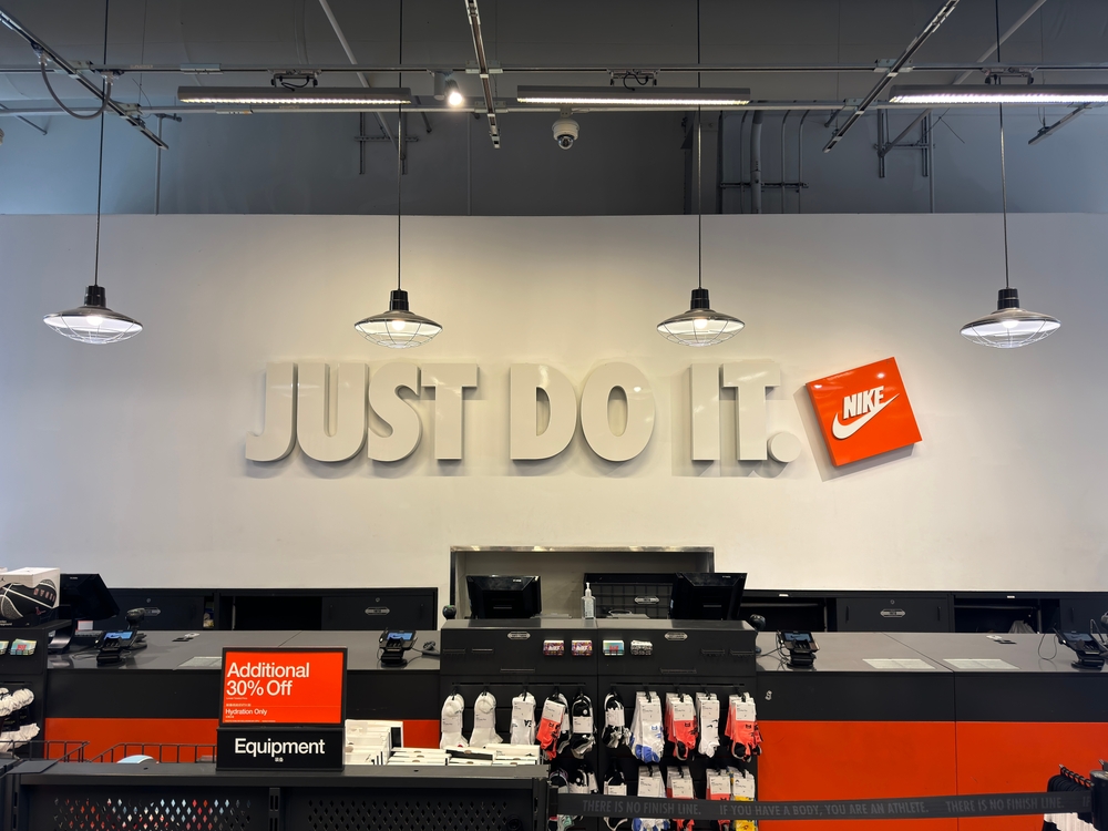
Futura Extra Bold Condensed Oblique is the chosen font of the Nike branding. The geometric structure has high impact and allows it to stand out, especially when rendered in the brand’s favoured black and white colourway. The movement of the world famous ‘swoosh’ is echoed by the oblique, angled lettering creating momentum, showcasing the brands ideology of athleticism and advancement. This is perfectly aligned with how Nike wants its brand to be perceived and the energy they wish to inspire in their customers. For it’s ‘just do it’ tagline and other slogans, Nike uses the non-oblique version of the same font for contrast and legibility.
Coca-Cola
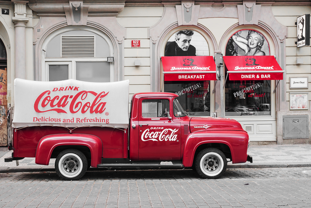
The lettering in Coke’s word mark is not derived from a standard font. While it is thought to have been inspired by Spenserian Script, a copper plate script popular in the US at the turn of the century, this iconic typeface started off as a hand drawn design when the company first began in the 19th century. The font developed with the times, but retains the flowing cursive of the original lettering. Even today, the logo has the flare of traditional handwriting. By leaning into the brand’s history and authenticity, it becomes a nostalgic reminder of Coke’s long heritage.
Every brand here has a font which is connected to them and enables clear brand recognition. However, it is important to highlight that not all these brands have kept the same font since their beginning. Even Coca-Cola’s classic logo has evolved over time, with small additions and changes to modernise its look. The hardest thing when analysing fonts for a company, is knowing when to stick with recognition or to change with the trends.
The Times
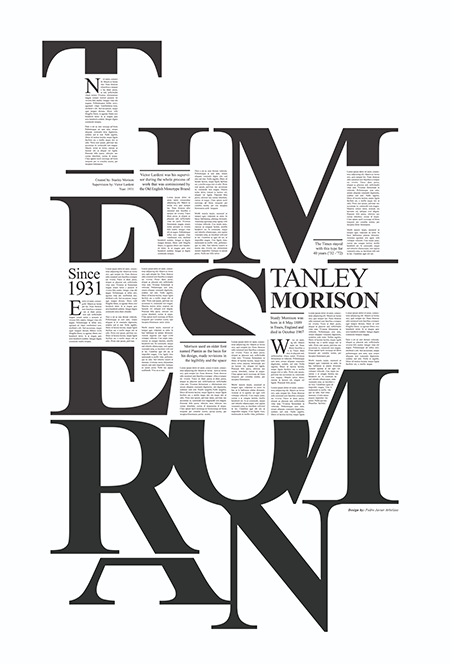 The font seen here has become a well know font for many. Times New Roman was originally created for the Times Newspaper back in 1931 and was used exclusively by the paper for 40 years. While the Times currently uses a modernised version, aptly named called Times Modern, the original continues to signal formality and credibility. This font exhibits a pleasing rhythm of balanced lines and proportions throughout. This allows this font to be a huge staple within journalism, finance and other formal industries, which aim to gain our trust.
Evolving fonts: how and why brands make a change
Changing a brand’s font is a big commitment —and often a dilemma for brand managers. Should they modernise the typeface and risk losing hard-won recognition, or retain a familiar look and risk appearing dated. A new font can refresh a brand’s image, but it can also shift perceptions in ways that aren’t always well received.
A change of font often accompanies a wider rebrand, and they can be contentious. We saw this recently with Huda Beauty’s rebrand, where the iconic logo font was changed from thin elegant lines to a bold bubbly font. This led many consumers to feel like the brand had shifted its focus towards a younger target audience, prompting a mixed reaction.

In some cases, a font change can be prompted by practicality as well as brand aesthetics. As brands expand across packaging, websites, and social platforms, typography needs to perform well in different contexts—from small mobile screens to high-resolution print. Fonts that work well in one setting may not translate effectively in another. To address this, brands may updated their font or develop custom ones that offer better legibility and flexibility across platforms.
The process is rarely straightforward. Fonts are powerful brand assets, and the wrong choice can weaken recognition or dilute meaning. That’s why we should approach font changes with caution. Get it right, and you strengthen the brand. Get it wrong, and you risk losing the connection with your audience.
Why accessibility matters in typography
One of the most important reasons to change a font is to improve accessibility. The typeface a brand chooses should support readability for everyone—including those with visual impairments or dyslexia. A brand’s message should be available to all, giving every reader the opportunity to engage with it on equal terms.
While Comic Sans is often criticised within the design world for its informal appearance, it remains one of the most accessible fonts. That’s particularly true for people with dyslexia. Its simple letterforms, generous spacing and lack of decorative flourishes make it easier to read than cursive or overly stylised fonts, which can be difficult even for experienced readers.
Readability should be a core consideration in any rebrand. Choosing a font purely for style risks alienating part of the audience—especially if that style prioritises aesthetics over function.
Stick or twist
So, should a brand stick with its typeface until it becomes iconic, or adapt it over time? The answer depends on the brand’s goals. Coca-Cola has built enormous recognition by preserving its script logo for decades, while Google has succeeded by evolving its typography to reflect clarity, modernity and accessibility. In both cases, the choice supported their identity and values.
Typography is more than a visual element. It tells part of a brand’s story—conveying how it thinks, what it values and who it’s for.
If you’re considering a font change as part of a wider rebrand, the Solopress Design Service can help. We offer a personalised service to ensure your visual identity remains clear, consistent and fit for purpose—across all platforms.


