

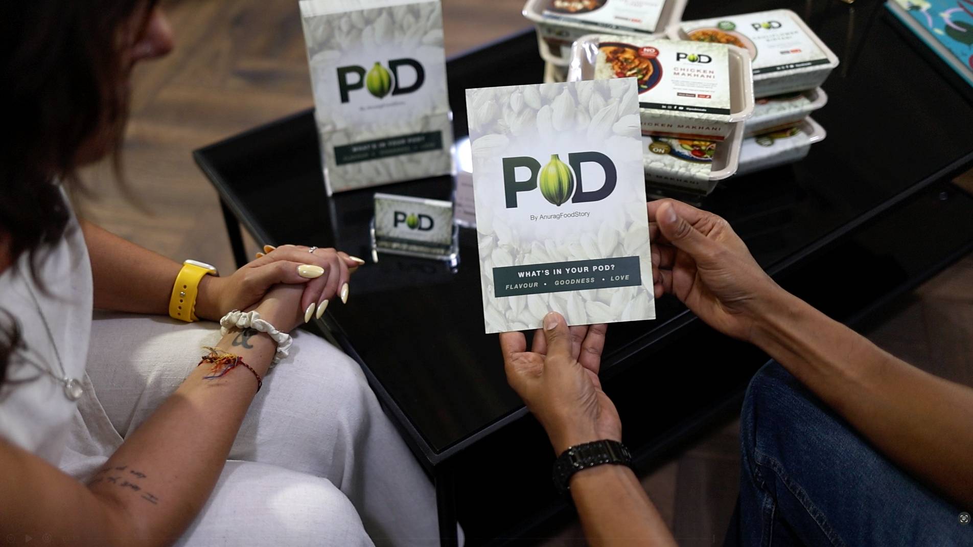
When MasterChef finalist Anurag Aggarwal launched POD, his goal was to serve healthy, flavourful Indian meals to people short on time. Great food was only part of the recipe. He also needed packaging that could communicate POD’s values of quality, goodness and flavour at a glance.
That’s where Solodesign, the design service from Solopress, stepped in.
A recipe for design
As a startup, Anurag had a logo, colour palette and typeface ready, but he needed help developing these elements into a complete identity. The brief was to create packaging that carried the boldness of Indian cuisine while keeping the brand modern, clean and practical.
Anurag explained:
“I wanted packaging that expressed the values of POD — love, goodness and flavour. As soon as someone looks at the product or any of our marketing, I want them to feel that sense of quality and care.”
Cooking up collaboration
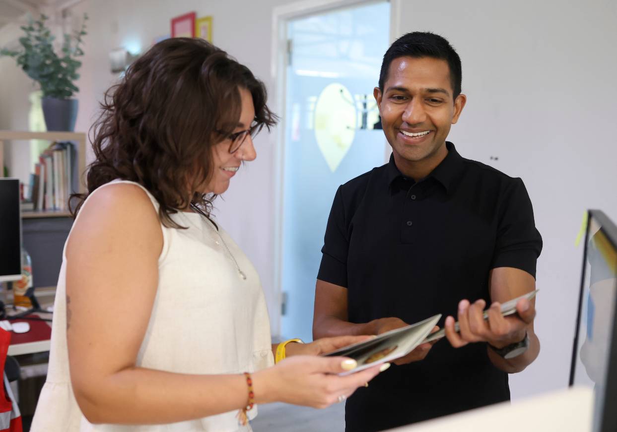
Working with Ellise Collins, Senior Graphic Designer at Solodesign, Anurag saw his ideas translated into packaging, business cards and brochures.
Ellise said:
“When you first came to Solopress you already had your logo, your colour palette and a typeface you wanted to use, but you put your trust in me to take it further. From your business cards to leaflets and now your packaging, it’s been amazing to see the brand develop and grow into a complete visual identity.”
That first design project set the palette and direction for the whole brand. It also defined how POD would present itself beyond the packaging, shaping its marketing and communications.
Anurag recalled:
“That first design piece we worked on took a lot of time, but it was worth it. It really set the palette and the direction for the whole brand, not just the product packaging. It defined the look and feel of our marketing and even shaped how we present ourselves as a business.”
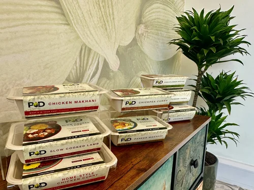
A key part of the process was handling mandatory information such as nutritional values and allergen details in a clear, legible way without overwhelming the design. Another highlight was colour coding each dish for variety without losing consistency.
Ellise added:
“One of my favourite parts of the process was using a different colour scheme for each dish. It made each product stand out while keeping the POD brand front and centre. All the colours work together in harmony, so there’s variety without losing consistency. I especially love the lamb dish — the deep burgundy-purple is really striking.”
You can here the rest of Ellise and Anurag’s chat here:
Packaging with impact
The result was packaging that reflects POD’s promise of flavour and goodness, backed up by supporting print that gave the business professional polish.
Anurag summed up the experience:
“As a startup, I had so many ideas running through my head. The Solodesign team helped turn those raw thoughts into something tangible. I’m so grateful — the packaging looks exactly how I imagined POD should be.”
A treat for our team
As a special treat, Anurag and his team even brought a hug batch of delicious POD meals to our office and factories for us to sample. It was certainly the tastiest lunch we’ve had here for some time. The flavours and aromas that POD are able to capture in these convenient meals are spectacular – truly restaurant standard!
Your brand, our brief
POD’s journey shows how the right design partnership can turn a vision into reality. Whether you need packaging, brochures or a complete rebrand, Solodesign can help.
Got a project in mind? Get a quote today.


