
")
As your business grows, your approach to exhibiting at trade shows needs to grow with it. If you find yourself leaving the world of trestle tables and shell schemes behind, then a bigger stand will require you to think bigger too.
We spoke to industry expert and exhibition stand designer Andy Hickinbotham about the new set of considerations you’ll need to tackle when creating a large-scale exhibition presence. Here are Andy’s five tips for turning your next exhibition stand into a true showstopper, along with images of some of his favourite displays.
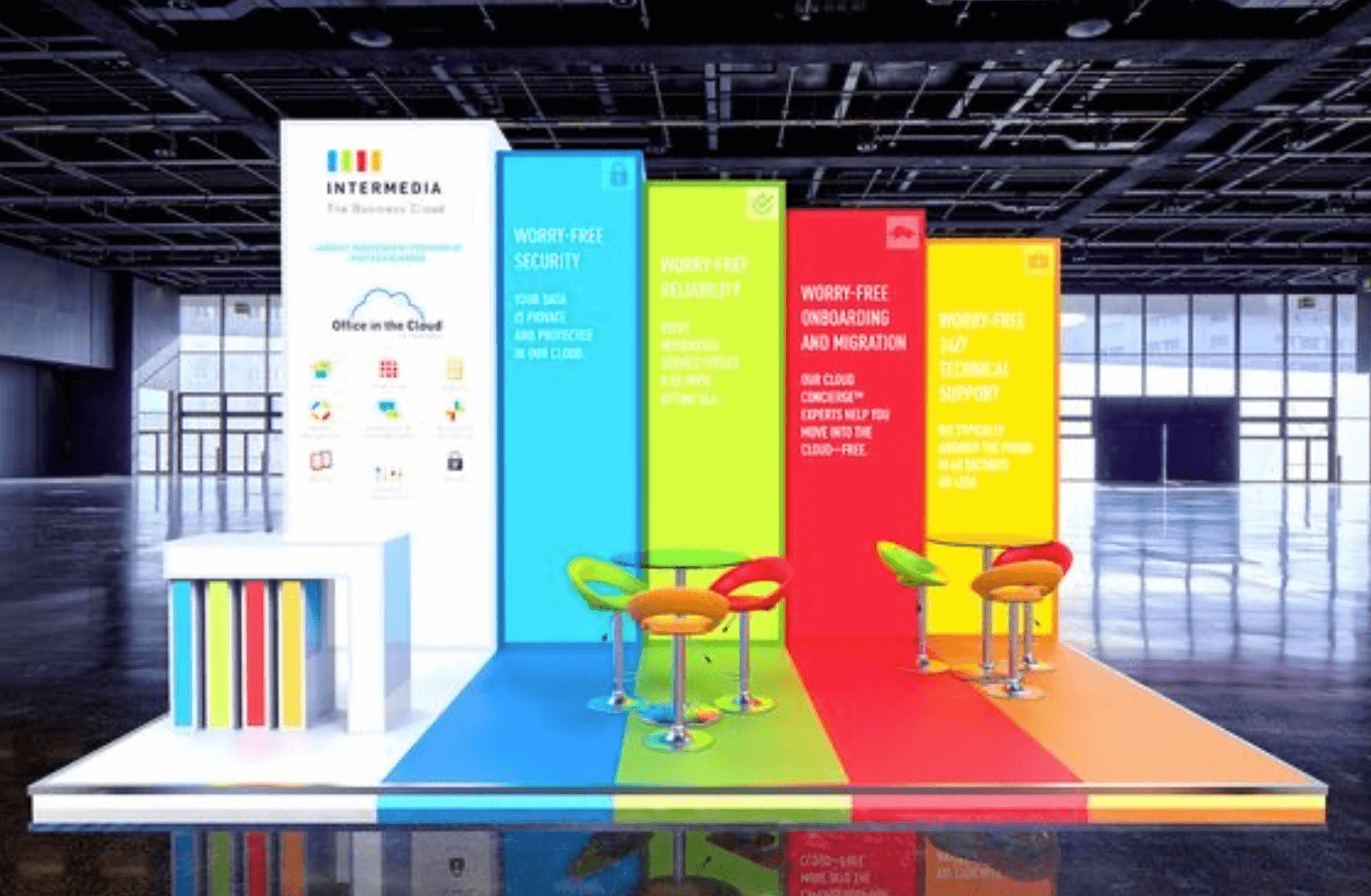
1. Choose one thing
We’re used to being told to pick an overall theme for our exhibition stands. A concept to inform our visual, physical and written content. Andy urges clients to go one step further: to select one single idea and let that inform their entire stand design.

Exhibitors are often rightly proud of the many strands that make up their business. You might boast a diverse product range or multiple USPs. The temptation is to express every last thing they’ve got going for you. In fact, leaving something out can be painful, as if you’re selling yourself short.
Think like a visitor, not an exhibitor
At this point, it’s important to stop thinking like the exhibitor, and start thinking like a visitor. A trade show is an assault on the senses, bombarding visitors with more sensory information than they can absorb. So the brain becomes a censor, taking in only what it perceives as valuable.
Memory is an even more ruthless editor. By the time the visitor has left the car park, much of the information will have been filed in a deep dark place. Promotional materials to takeaway can combat this effect, as can a meaningful human interaction.
Only the bold survive
But when it comes to stand design, nothing beats the power of one big idea. If you can survive in the visitor’s memory as “those eco-friendly guys” or “the guys with the huge model of an ant,” you’ll have achieved a huge accomplishment. According to Andy:
People talk about the ‘power of three,’ but I’m a big believer in ‘the power of one.’ One strong idea, whether that’s a launch, some big news or a single visual statement shows confidence and will be naturally memorable.
It’s naive to expect visitors to take away swathes of information. Presenting reams of data from your mission statement, to your new product variant, to your latest Trustpilot score can confuse the message. A confused message is more likely to be a forgettable one. Stay bold, however, and your one simple idea will survive in your visitor’s memories.
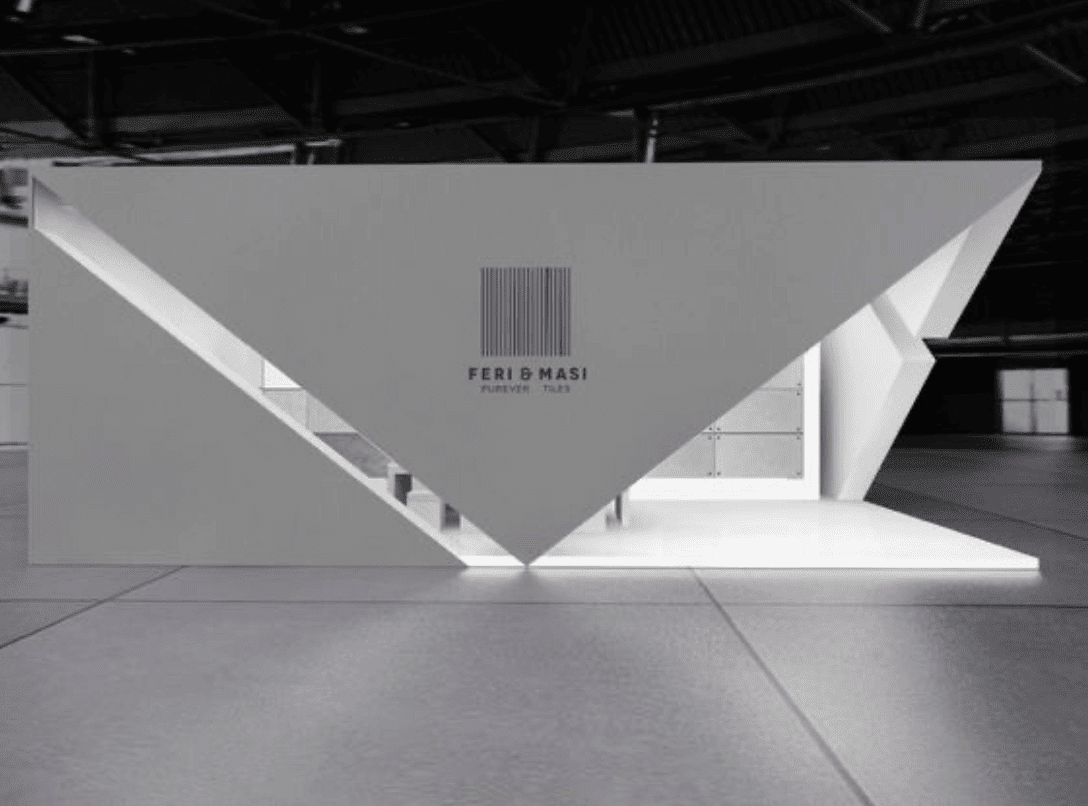
2. Hold back!
It’s called an exhibition. We get it. You want to show it all off, all at once. It’s perfectly natural to want to create a display that lays it all out in one glance, but we want visitors to engage with our stand on a deeper level. To do that, Andy recommends a design that sparks curiosity and draws visitors in.
Building blocks
If a visitor feels they’ve seen all they need to see from your stand, they may walk on by without taking time to explore. Andy has some great ideas that compel passers-by to take a second look:
It may seem counter-intuitive, but some of the most successful stands I’ve seen have featured walls that block vision. It’s a great technique to build suspense and intrigue. You might want to feature peepholes that encourage visitors to lean in and explore.
From the outside
Even if you’re bang in the corner, it’s likely that your stand will be encountered from more than one direction. You can use these different angles of approach to limit how much they see. Maybe a visitor will have to walk around your stand to see the whole picture, or read the whole tagline. At this point you’ve already sparked their engagement.
You may wish to ration the information even more frugally, with very little outward-facing information. This can entice visitors to come closer, take a peek and come inside.
Intriguing, not off-putting
The last thing we want is to create a stand that’s unapproachable. There has to be a ‘way in’ both physically and psychologically. A clear and welcoming entry point is key so that visitors feel comfortable entering your space.
Consider sight-lines and plot your visitor’s route. It will put you in control of their journey, allowing you to unfold your story at your own pace and to prolong engagement. This will amplify your chance of conjuring a more meaningful, and ultimately memorable experience. Andy puts it like this:
By concealing, and then revealing, you’re creating a moment for your visitor to feel fear, surprise, elation, repulsion, empathy. By evoking this sort of response, again, you make your stand more naturally memorable.
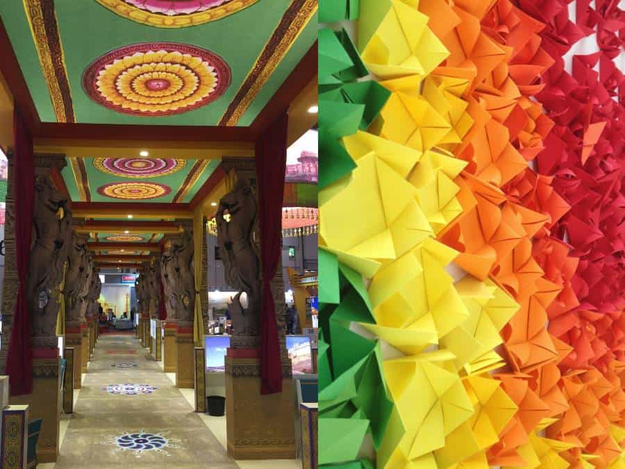
3. Alluring layers, pleasing patterns
Our minds are constantly trying to make sense of things, seeking out order in a chaotic world. Perceiving patterns seems to be a pleasing way for us to organise our thoughts.
At the same time, our ability to perceive physical layers at different depths in our field of vision is thought to derive from our ancestor’s need to locate water. It’s something that we’re seemingly programmed to seek out for our survival.
You can tap into these primal desires with a well-designed stand that offers a satisfying complexity through layers and patterns.

Advantageous arrangements
The trade show arena can be just the kind of chaotic environment that has us craving some kind of organising principle. Your stand can use pattern to become a beacon of order amid the visual clutter. In turn, visitors will feel drawn to your design.
Patterns can become part of your graphic display, or even the structure of your stand. A pattern that creates discrete cells, like a honeycomb, is particularly versatile. In print, it can create holding devices for imagery and text. Rendered in three dimensions, it can become shelves for products and promotional items, or a structure to divide your space.
Laying it on thick
Layers can break up flat panels and draw the eye beyond the surface. When exhibitors are provided with similar pitches, each occupying the same footprint, it’s a great opportunity to break up the space and introduce a point of difference between you and your neighbours.
Using those layers to introduce different content, textures and opacities will also introduce a level of sophistication that reflect positively on your brand and provides interest for customers. Andy told us:
Incorporating layers and patterns is where art meets science. Overlaying text over imagery or AV content over clear glass creates layers that are appealing to us. Patterns, whether they’re geometric or random, organise your space and information in a way that our minds appreciate.
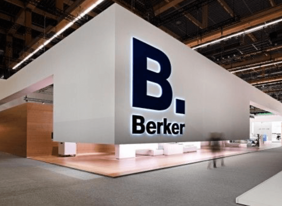
4. High contrast
When designing a stand, most of us will think of picking the dominant message, the dominant colour, the dominant material. Approaching the process in this way can mean that it’s easy to neglect contrast.

Contrasting colours are of course eye catching, but there are other types of contrast that can be similarly engaging. Contrasting textures, finishes, lighting and styles can create counterpoints throughout your space that draw the attention of your audience.
Extra texture
In pursuit of textural contrasts, Andy has experimented with origami, foliage, glass, timber, carpet, manmade materials and more. He told us:
Many exhibitors tend to pick from the same limited set of materials, leading to a lot of run-of-the-mill textures. If you can break out of that convention, even if it’s just one element of your stand, you’ll start to introduce contrast, both within your display, and with the exhibitors around you.
Let it shine
Lighting is an important part of a large-scale, bespoke stand. It helps visitors navigate, directs their gaze and calls their attention to the bits you really want them to see. You can create contrast by using dimly lit areas juxtaposed with bright spaces, like going through a dark tunnel into a well lit white space.
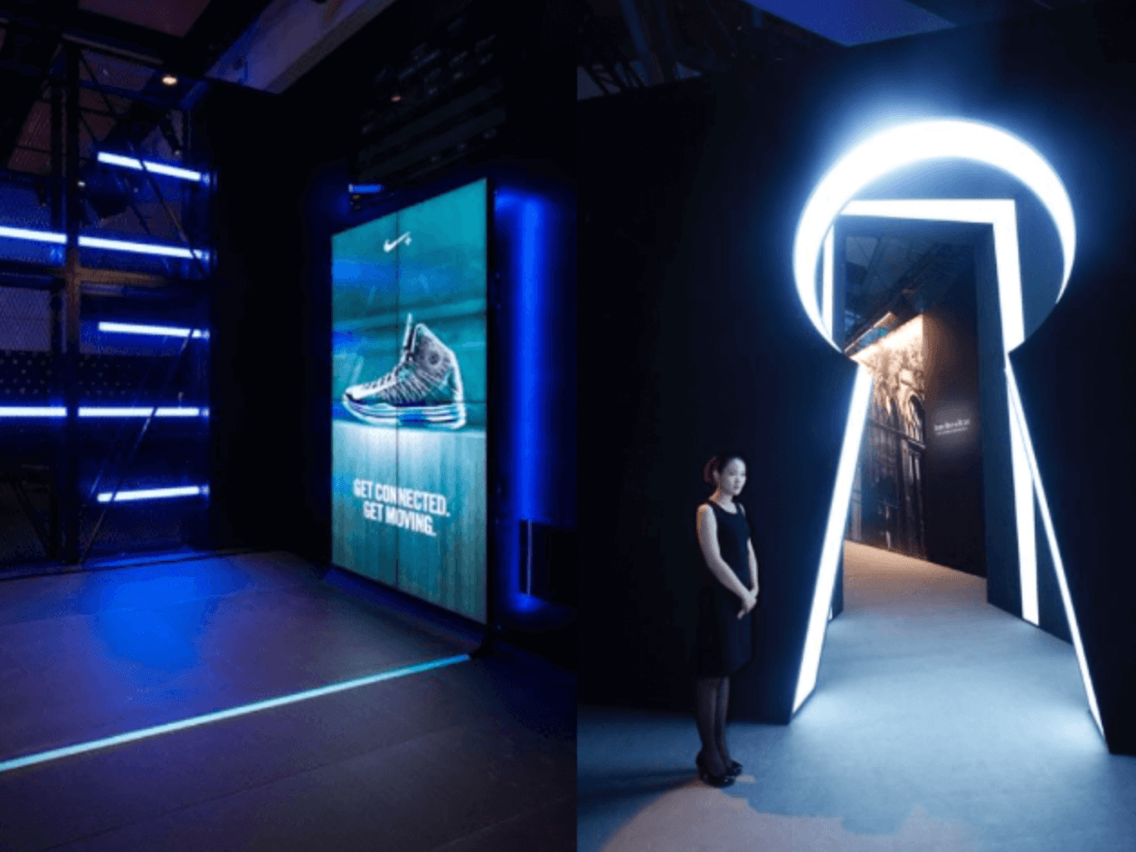
Display elements don’t have to be powered up to create contrasting lighting effects. Shiny, glossy surfaces will reflect the light around them and even create movement as visitors pass by. Dull, matt surfaces have a quiet presence that seems to absorb the light around them. Again, it’s the contrast between them that draws the eye, as Andy says:
Contrast gets attention fast. We’re hardwired to detect changes in our environment. That makes us sensitive to contrast, whether that’s light versus dark, rough versus smooth, or even focussed versus blurred.
Culture clash
Visual and tactile contrasts can stimulate a visceral reaction, but we can stimulate a cerebral reaction by clashing styles and cultures. An ancient sculpture alongside a neon sign. A 3D printer on an afghan rug. According to Andy,
Try mixing arty with technical or traditional with radical. It’s a fantastic tool to shake people up a bit by subverting their expectations
5. Make them smile!
Unless yours is an industry where it might seem inappropriate, it’s often a great idea to bring some fun and humour into your display.
Play with proportion
A scaled down model is a tried and tested way to present any project that’s too big to get through the door. But it’s so much more fun when we take small objects and scale them up to ridiculous proportions. In Andy’s words:
There’s just something about a massive version of a small thing that hits us where we live. Big corks, pencils and headphones just take us out of ourselves for a brief moment, and the joy of being around such objects can make visitors dwell long enough to make a big difference.

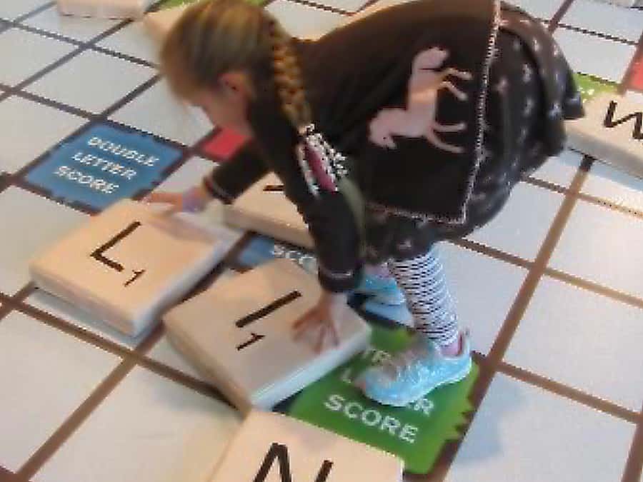
Invite interaction
A game of some kind will always attract those who’re up for a challenge. Footfall and dwell time will undoubtedly be increased by hosting a fun activity. You can even combine it with Andy’s out-of-proportion idea and create a massive version of a traditional board game.
After years of failing to live up to our sci-fi fantasies, the worlds of artificial intelligence, virtual reality and robotics are finally impressive enough to wow the crowds. Plus, these technologies are starting to come within budget for many corporations. If you can, why not explore these areas to formulate a unique interactive element for your stand?
Get shareable
The upside of making a big, humorous, visual statement is people will want pics, and those pics will get shared. The more quirky and fun the better, just make sure your logo is in shot for when the photo appears on Instagram. Andy has first hand experience:
When we created a giant jam jar for the English Jam Company, it was selfie-central. Visitors couldn’t get enough, and countless pictures of the jar appeared online!
A cheeky takeaway
So there we have five excellent ideas to bear in mind when we make that leap to big bold bespoke stands. Even if you don’t take on all five, there’s a spirit that runs through all of Andy’s tips that we can take away. It’s a slightly mischievous spirit that’s all about introducing something incongruous, subverting expectations, hiding, peeking, shocking and joking. Hopefully, you’re inspired as we are by Andy’s unique perspective. Mainly because trade shows would be far more fun with more stands like his.
