

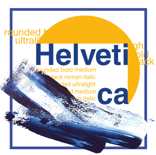
In the world of design, few typefaces have achieved the iconic status of Helvetica. Known for its clean lines and no-nonsense appearance, Helvetica is a sans serif typeface that has become a staple in modern design. It has been used in everything from corporate logos to public signage. Its journey from a Swiss foundry in the 1950s, to a global design phenomenon is a tale of simplicity triumphing over complexity.
The name ‘Helvetica’ is derived from the Latin name for Switzerland ‘Helvetia’, reflecting the country’s reputation for modern graphic design and its influence on international design standards. We will delve into how the Helvetica typeface has managed to remain relevant in an ever-changing design landscape, examining its impact and the reasons behind its enduring popularity. Join us as we explore the timeless appeal of this classic typeface and its place in contemporary design.
Sans serif typefaces and modern design
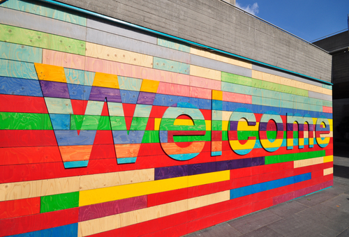
Sans serif typefaces are closely associated with modern graphic design, largely because they dispense with decorative strokes in favour of simpler letterforms. Without serifs, letters tend to read more evenly at a distance and reproduce more consistently across different formats. This made sans serif fonts particularly well suited to public signage, print advertising and, later, digital interfaces.
The term “sans serif” comes from the French sans, meaning “without,” and refers to a broad category rather than a single style. It includes geometric designs, humanist forms and early grotesques, each defined by different proportions, spacing and overall tone. Beyond aesthetic variation, these differences affect how a typeface performs in different roles, from body copy to display use.
Although sans serif letterforms appeared as early as the late eighteenth century, they gained wider acceptance in the early twentieth century as cities expanded and communication became more functional and information-led. Early examples became known as ‘grotesque’ because they were seen as crude by European societies used to ornate, traditional fonts. Fonts such as Akzidenz-Grotesk demonstrated that clarity and efficiency could outweigh decoration, laying the groundwork for later developments.
Helvetica and its origins

Helvetica emerged directly from this modernist tradition. Designed in 1957 by Max Miedinger, with direction from Eduard Hoffmann at the Haas Type Foundry, it was originally released as Neue Haas Grotesk. The intention was to refine existing grotesque models into a more neutral, versatile typeface that could function across a wide range of applications.
In 1960, the typeface was renamed Helvetica, a reference to its Swiss origins, as part of an effort to broaden its international appeal. Its restrained letterforms, consistent proportions and even colour on the page made it easy to deploy across branding, publishing and public information systems. Helvetica quickly became a visual shorthand for clarity and modernism, signalling order, neutrality and professionalism through its use alone.
As demand grew, Helvetica expanded beyond its original weights. Arthur Ritzel played a key role in developing lighter cuts such as Helvetica Light, which improved its suitability for longer passages of text and introduced clearer hierarchy within layouts. Distribution and further development by D. Stempel AG and Linotype helped cement its presence across Europe and North America.
Adoption and refinement
By the 1960s, Helvetica had been adopted by major organisations including Lufthansa and American Airlines, as well as public bodies and transport systems. Its success rested less on expressive character than on reliability. Designers could apply it at vastly different scales, from billboards to timetables, with predictable results.
Over time, refinements were made to address practical limitations. Helvetica’s tight spacing, while contributing to its compact appearance, could reduce legibility in dense settings. Later versions, including Neue Helvetica, adjusted spacing, punctuation weight and numeral design to improve performance across print and digital use. These changes allowed Helvetica to function as a coherent family rather than a single static design.
Structure and legibility
At a structural level, Helvetica is defined by a large x-height, which increases the visibility of lowercase characters, and by letterforms built around simple strokes and closed apertures. This contributes to its consistent texture but also explains some of the criticism it has attracted in small sizes or extended reading contexts.
Despite these limitations, its controlled proportions and predictability have kept it in use across decades of changing technology. Helvetica’s role has never been to draw attention to itself, but to carry meaning efficiently. That quality, more than stylistic fashion, explains its continued presence in modern design.
Helvetica in the Digital Age
As technology evolved, Helvetica had to adapt to new platforms and mediums. The development of digital versions of Helvetica ensured compatibility, clarity, and usability across electronic and digital media, allowing the typeface to maintain its iconic status on websites, mobile applications, and digital displays. Let’s examine how the typeface transitioned to digital design, its role in web typography, and real-world applications.
Monotype and Monotype Imaging have played a significant role in digitizing and updating Helvetica for modern digital use. Their efforts include releasing new digital formats, developing optical sizes, and supporting a wide range of scripts and languages, further cementing Helvetica’s relevance in contemporary type design and branding.
Transition to Digital Design

The digital age presented new challenges and opportunities for Helvetica. As design moved from print to screens, the typeface needed adjustments to maintain its clarity and legibility in digital formats. How Helvetica is displayed on screens became increasingly important, as optimizing its appearance for different display sizes was crucial to ensure consistent legibility and visual appeal. The introduction of Helvetica Neue in the 1980s marked a significant shift. This updated version offered a broader range of weights and improved readability on digital displays.
The digital transition required thoughtful redesigns to ensure compatibility with new technologies. Designers worked to preserve Helvetica’s clean aesthetic while optimising it for screen use.
These efforts ensured Helvetica continued relevance, allowing it to thrive in a rapidly changing digital landscape. Its adaptability has been key to its survival and success in the digital era.
Role in Web Typography
Helvetica’s role in web typography is significant due to its legibility and professional appearance. Helvetica is commonly used in web design because of these qualities, making it a preferred choice for digital communication. As the internet became a primary medium for communication and commerce, designers sought typefaces that could convey clarity and dependability across devices.
Key factors contributing to Helvetica’s prominence in web design include:
- Consistency: Helvetica offers a uniform look across platforms, enhancing brand recognition.
- Readability: Its clean lines and well-balanced proportions make it ideal for both headings and body text online.
- Versatility: Easily adaptable for various design styles, from minimalist to complex layouts.
These qualities make Helvetica a go-to choice for web designers aiming to create user-friendly, aesthetically pleasing websites.
Case Studies of Digital Use
Helvetica’s impact in digital design is evident through various case studies where its application has enhanced user experience and brand identity. One notable example is Apple’s use of Helvetica in its iOS interface, chosen for its legibility and classic appearance.
- Apple iOS: Helvetica was the default typeface for iOS until it was replaced by San Francisco. Its use contributed to Apple’s sleek and clean interface design, aligning with the brand’s minimalist ethos.
- Microsoft: Microsoft adopted Arial and MS Sans Serif, both designed to be metrically compatible with Helvetica, for use across its digital platforms and branding. This allowed Microsoft to provide a Helvetica-like experience while addressing licensing and technical considerations.
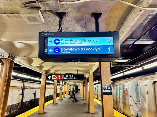
- New York City Subway: The city’s iconic subway signage utilises Helvetica, showcasing its effectiveness in conveying clear and concise information in a bustling environment.
These examples demonstrate Helvetica’s enduring relevance in digital design, proving its ability to adapt while maintaining its core characteristics.
The Timeless Appeal of Helvetica
Helvetica’s appeal lies in its versatility and aesthetic qualities, making it one of the world’s most recognized and influential typefaces.
Versatility Across Mediums
Helvetica’s versatility is a testament to its universal appeal. It seamlessly bridges different design mediums. In print media, Helvetica is valued for its clarity and neutrality, making it suitable for everything from newspapers to corporate reports.
In digital formats, its straightforward design ensures consistency and readability across various devices and screen sizes. Recent versions, such as Helvetica Now Variable, offer a wide range of weights, further enhancing its adaptability. This has made Helvetica a preferred choice for designers who need a reliable typeface that works well in diverse applications.
Cultural and Social Impact
Helvetica’s influence extends beyond design; it has become a cultural icon. Its use in public signage and corporate branding has made it a familiar sight worldwide, embedding it in the collective consciousness.
The typeface represents more than just an aesthetic choice, it symbolises a commitment to modernism and efficiency. Culturally, Helvetica has become synonymous with professionalism and reliability, qualities that resonate across different industries.
Socially, the typeface has been a part of major events and movements, often seen in protest signs and political campaigns, lending a sense of authority and clarity to messages.
Challenges and Criticisms
Despite its popularity, Helvetica is not without its critics. Explore alternative typefaces, and consider responses to typeface fatigue. Additionally, there are many free Helvetica substitute fonts available, offering accessible alternatives for those seeking similar design aesthetics without the associated costs.
Common Critiques of Helvetica
While Helvetica is celebrated for its simplicity, some feel its impact has been diluted by its ubiquity and lacks personality as a result. Critics argue that its neutrality, once a strength, can make it feel impersonal and unoriginal in a world where branding often demands distinctiveness.
Some designers find its widespread use to be a limitation, reducing its impact and making it a less exciting choice for creative projects. Additionally, Helvetica’s design can pose challenges in smaller sizes, where its compactness might affect legibility. To address these concerns, newer versions like Neue Helvetica introduced features for improved legibility, such as increased spacing, more unified proportions, and structural refinements that make the typeface easier to read at various sizes and formats.
These critiques highlight the need for designers to carefully consider context and application when choosing Helvetica, ensuring it enhances rather than detracts from their intended message.
Alternatives and Competitors
As designers seek variety, several alternatives to Helvetica have emerged. These typefaces offer similar qualities but with distinct features that cater to specific design needs. Organisations such as Font Bureau play a significant role in developing and distributing alternative typefaces, collaborating with designers and foundries to expand the range of professional font options.
Prominent alternatives include:
- Arial: Often compared to Helvetica, Arial offers a more rounded appearance and is widely available on digital platforms.
- Univers: Designed by Adrian Frutiger, Univers shares Helvetica’s clean aesthetic but provides more stylistic variations.
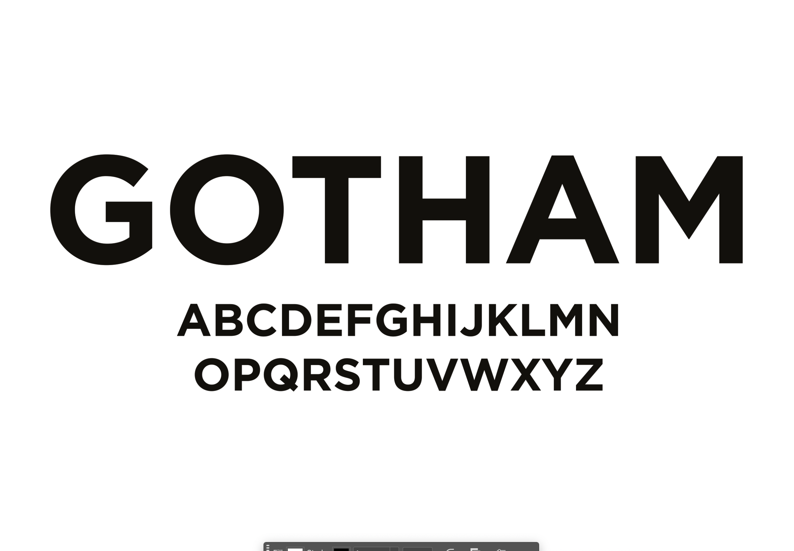
- Gotham: Known for its geometric simplicity, Gotham is a modern alternative with a unique character.
These competitors provide designers with options that maintain Helvetica’s core principles while offering fresh perspectives and adaptability.
Responding to Typeface Fatigue
With Helvetica’s prevalence, some designers experience typeface fatigue, prompting them to explore new options while maintaining design integrity.
Strategies to combat fatigue include:
- Mixing Typefaces: Combining Helvetica with other fonts can create visual interest without sacrificing readability. Approach this technique with care, as it can appear amateurish if not applied judiciously.
- Customisation: Altering Helvetica slightly, such as adjusting letter spacing or weight, to suit specific design needs. Newer versions like Neue Helvetica offer a more structurally unified set of heights and widths, enhancing consistency and reducing visual fatigue.
- Exploring New Fonts: Experimenting with emerging typefaces can inject novelty into design projects.
These approaches allow designers to innovate while respecting Helvetica’s foundational role in modern typography.
Helvetica’s Future in Design
As design trends evolve, so must Helvetica. We must consider innovations, predict future trends, and reflect on the typeface’s ongoing legacy to ensure that the characteristics evolve with the times to come.
Innovations and Adaptations
Helvetica continues to evolve through innovations and adaptations that ensure its relevance in contemporary design. Recent updates like Helvetica Now introduced additional weights and sizes, enhancing its functionality for modern applications. Notably, Helvetica Now features three optical sizes, Micro, Text, and Display, which are each optimised for different content types and viewing distances to improve readability and visual harmony.
Designers are also exploring interactive and variable fonts, which allow for dynamic adjustments in real-time, providing greater flexibility and creativity. Neue Helvetica World, a versatile multilingual typeface, is designed for global applications with extensive language support and contemporary design. This allows it to be suitable for a wide range of industries and media platforms. These innovations demonstrate Helvetica’s potential to adapt to new technologies and design paradigms.
The continued development and adaptation of Helvetica highlight its resilience and enduring appeal in a constantly changing design landscape.
Predictions for Typeface Trends
Looking ahead, typeface trends are likely to focus on greater personalisation and digital optimisation.
Key predictions include:
- Variable Fonts: Increased use of fonts that allow dynamic changes in weight and style.
- Sustainability: Growing interest in eco-friendly designs may influence typeface development.
- Inclusivity: Typefaces that cater to a diverse range of cultures and languages will gain prominence.
Monotype Studio plays a significant role in developing innovative typefaces and influencing future trends through its collaborative and forward-thinking approach to font design.
These trends signify a shift towards more adaptable and inclusive design solutions, with Helvetica poised to evolve alongside these changes.
Continuing the Legacy
Helvetica’s legacy in design is already well-established, but its future remains promising. By embracing innovation and adapting to new mediums, Helvetica can continue to play a pivotal role in design.
The challenge lies in balancing tradition with modern demands, ensuring that Helvetica remains both a reliable choice and a source of inspiration for future generations of designers. Our in-house design team is full of font aficionados who are never happier than discussing the right typefaces for your project. Contact Solodesign for top tier text support!


