

Since its inception in 1970, Glastonbury has firmly established itself as one of the biggest festivals in the world, with Michael Eavis bringing the crème de la crème of the music world to Somerset on a consistent basis.
To tie in with this year’s festival, we asked our design team to cast their expert eyes over some of the iconic Glastonbury line-up posters that have been produced over the years.
Intro
Glastonbury 2022 has just thrown open the gates to its throng of faithful festival goers who have been starved of their annual trip to Worthy Farm since 2019. The festival even missed its own 50th birthday party in 2020 owing to the Coronavirus pandemic. Absence makes the heart grow fonder, though, and this year’s festival – with the sun shining and Sir Paul McCartney filling the top slot on Saturday – should prove to be an all-time classic.
So, what better time to look back at the festival’s branding past and present and track how the famous Glastonbury poster has evolved over the past half-a-century?
Trends can change quickly and graphic styles are prone to becoming outdated over the years. But if the history of Glastonbury posters is anything to go by, their visual identity through poster design is protected from the passage of time by its ability to bring back amazing memories to any avid concert-goer.
Glastonbury has commented on their visual identity: “We have a lot of artists and 47 years of history so we don’t normally single any one designer/artist out I’m afraid. ‘Tis all a group effort!”. This could explain why there has been a lack of focus on the Graphic Design element of the festival over the years.
So which are the posters that stand out and which ones were a complete miss?
1982 – Hit

Van Morrison headlines here and this is a fantastic two-tone poster that delivers a great balance of type and image. A simple reflected image gives this poster strong symmetry with the peacock illustration and the Pyramid stage shooting a beam into the night sky. The acts all have space on the poster to be able to breathe and differentiate between the three categories of music, film, and theatre.
1986 – Hit

Peace and love, man. Looking back at 1986 I can appreciate where this design differs from the rest. Promoting vibrant colours, with a really strong logo concept, which steers away from any previous attempts to ‘brand’ the festival. Historically it’s known to brand a festival can carry its complications, by many bands looking too much like a brand instead of an act. So this poster carries a great blend between fitting in the Glastonbury style and its easy to digest.
1989 – Miss

How did they get it so wrong with just 3 years apart? A huge change here going from 1986 with an easy-on-the-eye take, all the way to this questionable lyric sheet, looking piece of work.
The designer for 1987 completely threw out the rule book about best practices. This is a lazy design if I’m being critical. Most disappointing of all, all the acts have been thrown together in the same sized font, which has then been centrally aligned continuously running down the page. Enough to make my eyes completely switch off and focus my attention on something else. Next!
1993 – Miss

Oh, the nineties. What a decade that gave us performances from Red Hot Chilli Peppers, Radiohead, Blur, Bob Dylan, Morrissey and more. What can’t be said as memorable would be the typically bad poster designs throughout the ’90s?
Although the ’93 poster is bad, it’s probably the best pick out of the bunch in terms of having some character added to the design rather than slapping the acts all in one paragraph style.
Although I can appreciate setting the festival name in a larger, more playful hand-drawn font that uses the colours from the Glastonbury icon mark. Apart from that, the rest of the poster is easily forgettable.
So, let’s get to the good stuff.
2003 – Hit

A decade later and with 2003 going down as the fastest-selling Glastonbury to date, with all tickets selling out in 24 hours. This poster definitely arrived at the scene in some fashion, which looking back was a welcoming change from the older artwork which had become visibly outdated in such a short time.
Looking at this poster it welcomes in a new change. Bigger typography, which helped acts stand out from each other, all the way down to a stronger colour palette.
The man responsible for these changes is Stanley Donwood, notoriously known for creating all of the Radiohead artwork. Also, it should be mentioned he took over in the commission for the poster designs and illustrations for Glastonbury since the early ‘00s.
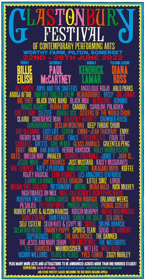
2015 to the present – Hit

Since 2015, Glastonbury have adapted a multi-coloured, more playful theme, as shown in this example from 2019. Each poster since has presented a variation on the theme – the only thing that has been significantly tweaked and changed in this time are the names of the acts.
The fact that the style hasn’t changed in 4 years is a testament to its success as a design. After all, if it ain’t broke don’t fix it. All the headliners can clearly be seen from the top line and working down the list are the acts who will perform on other stages. The hierarchy is good and the use of coloured text works well. The background colour has stayed black since 2016, allowing the colourful text to pop.
The temptation for the first festival since the pandemic may have been to ring the changes in terms of poster design. In fact, it’s great to see the return of something as familiar. As we can see in 2022’s poster here, all the successful elements are present, with a tweaked border and the black background softened to a midnight blue. The fact that it’s recognisable from pre-pandemic designs reinforces the idea of a triumphant return to business as usual.
There may come a time to rebrand the festival’s approach to poster design, and we suspect that time may come soon. But for now, it’s just great to see this cultural institution re-establish itself in a style that’s both successful and familiar.
Feeling inspired?
Here at Solopress we print posters for festivals and gigs up and down the country. Check out our poster printing options here.

