
Postcard marketing is a great way to get your brand seen. Small yet impactful, a well-designed postcard will help you to grab your readers’ attention – and maybe even make them laugh, smile or remember a cherished moment in the past.
Check out these 10 inspiring postcard design ideas for your business.
Hello from Someplace Beautiful
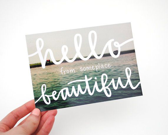
The reader is seeing the view from the sender’s eyes. This captures the feeling the image brings, calm waters and clear skies, and projects it to the reader.
The handwriting-style text also adds a personal touch, as though this is simply a note scrawled by a friend over the top of a holiday photo – possibly as an afterthought. The white text contrasts with the blue water, helping it to stand out from the backdrop.
Man vs Ink Pop-Up Postcard
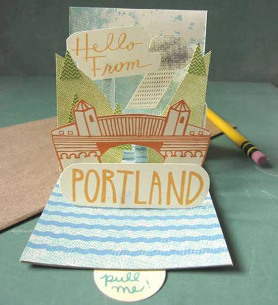
This popup postcard literally jumps out at the person who gets it. With an interactive ‘pull me’ tab and a personal, homemade feel, this design perfectly captures Portland’s creative vibe in a quirky and fun way. This postcard design has the feel of one of these cool indie films, all hand-drawn illustrations and muted pastel colours.
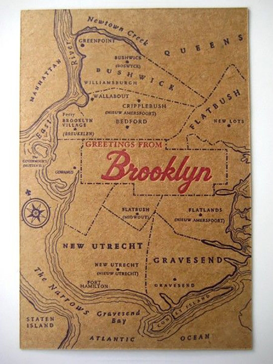
Greetings from Brooklyn
Italian Orange Wrappers
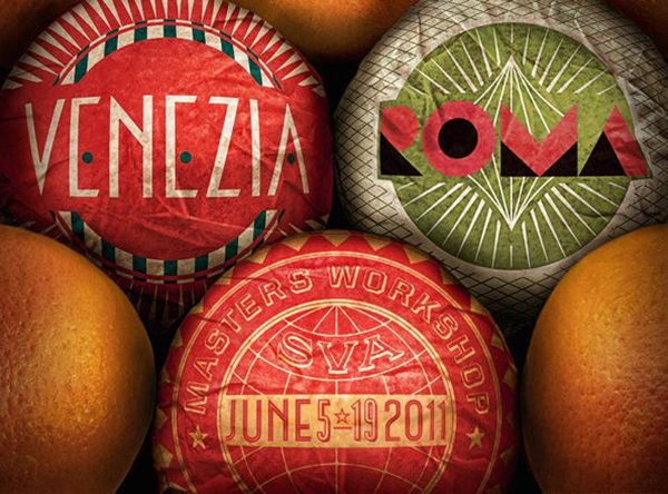
This postcard plays on its audience’s senses with text printed on traditional Italian delicacies, such as oranges and chocolates. The detailing on the crinkled and shiny wrappers also make you want to reach out and grab one, just like they would on a market stall in Rome.
Design guru Phil Cleaver, winner of a prestigious Yellow Pencil, says the best brands appeal to our senses.
“An effective brand targets as many of the human senses as possible to root themselves firmly in our memory,” Phil explains.
This retro postcard features an old-fashioned map of Brooklyn. Printed on pulp paper, it has a naturally old look and feel – like those tea-stained ‘maps’ you made in school.
The red lettering stands out from the rest of the text, subtly drawing the reader’s eye. The brown, red and dark blue colour scheme is classic, with an American Ivy League feel. Put history at the heart of your postcard design to evoke memories in your readers and make a connection.
Naomi
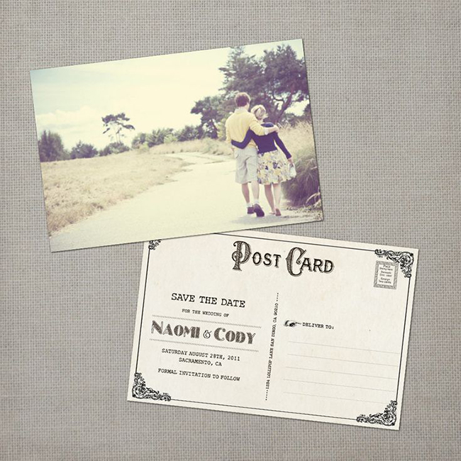
This traditional postcard plays on memory, evoking that quintessential holiday in the English countryside – all lazy afternoon strolls down quiet country lanes. The old-fashioned text adds to this feel of lamenting a bygone era reached only by reading this postcard.
The curve of the lane in this postcard design draws the reader’s eye and inspires them to follow it through to the horizon. This is a traditional photography technique called leading lines – selected to guide people through an image.
Tokyo
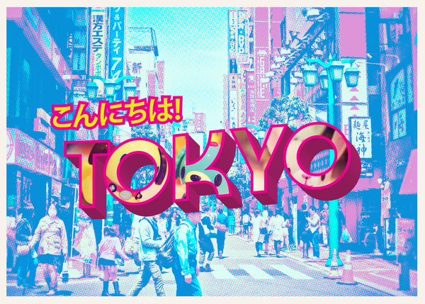
This contemporary postcard juxtaposes a comic style typeface against the backdrop of one of the city’s most historic streets – Asakusa Rokku. It balances sentiments of modernity and tradition, past and present.
The colourful blue wash brings shades of psychedelia, capturing the buzz and vibrancy of modern Tokyo as well as its techy quirkiness – Pokémon is big in the city, with lots for fans to do.
Wonderland
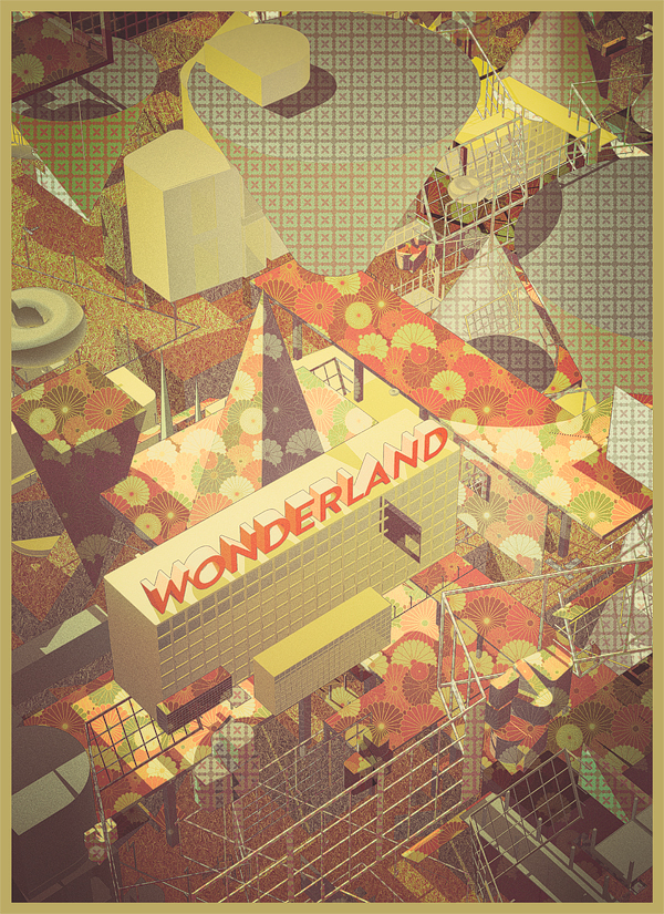
This contemporary design is built around geometric shapes on different levels. This creates the illusion of depth, pulling the reader into the postcard. The unorthodox design is balanced by the muted autumnal colours – oranges, browns and greens. It is redolent of 20th century European cinema. For a contemporary brand, perhaps a quirky gift shop or bar or creative agency, this design works well.
Oia

This artistic postcard captures a perfect moment in drawing form. Unlike photographs, illustrations give you the opportunity to adapt the image to best suit the messaging you want to convey. This way, you can choose where the reader’s focus should be, as well as add any additional text or features as you see fit.
Pizzaland
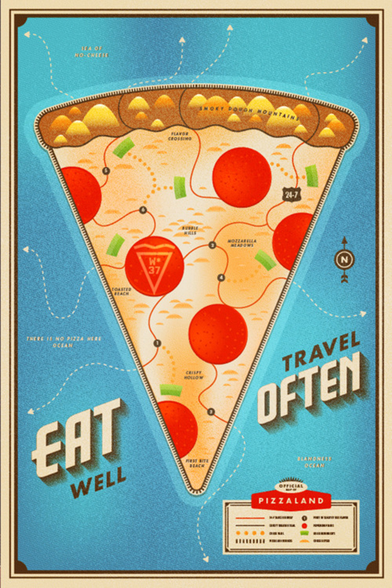
A well-known US pizza chain created this infographic-style postcard which uses a map layout to ‘map’ the main ingredients and USPs of its brand of pizza.
With areas such as ‘mozzarella meadows’ and ‘first bite beach’, the reader is taken on an interactive journey to pizza heaven. This unique approach is a great way to stay as fresh as this morning’s pizza dough in your readers’ minds.
Alpine
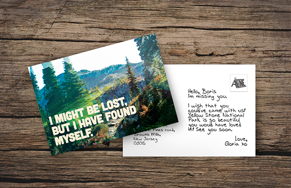
Another simple postcard design, only this time, it’s the words which draw you in. The bold, capitalised headline message clearly introduces someone who is now confident after a period of uncertainty. The inspirational message reaches out to the reader and says – ‘you could find yourself too’. The typeface is important here – thick, bold and white, it carries the weighty message of the words.
Phil says it’s key to get this right. “Think about the message you want to convey and choose a typeface which best suits this.”
Get started with your premium postcard at Solopress with our easy-to-use templates. Shop postcards today.


I like how some of the postcards play in the touch and visual part of the 5 senses. The 3D postcard brings a different look as well as the other postcard that is more centered of having the person feel the texture. Thanks for sharing!
Such a big fan of this retro/outdoors look with 70’s style photo filtering. Definitely appears to be a nice trending design paradigm. I have lost count of hte amount of stamp-like and swirly font’s I now have installed on photoshop 🙂
You can’t have too many Simon!
Really unique designs. However, I think I still prefer traditional destination postcards.
I would love to try this…I have so many precious photo’s waiting to be turned into postcards
epic postcards
These are really fabulous !
While I still love the look of the traditional postcards I really do love these. My favourite out of this bunch is ‘Greetings from Pasadena’.
This is a great idea, especially using holiday photos to create postcards.
Some of these are really clever! I like the 30s retro feel to the Pasadena one. ‘Greetings And Salutations’ made me laugh out loud!