
Shopfront business signs are intended to be eye-catching. The whole point is to draw potential customers in! Unfortunately, many are boring and lacklustre. Not these ones, though. Clever and amusing, they command attention.
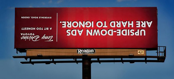
1. Tony Divine Toyota.
While not an especially original design, the humorous point intended with this billboard is made perfectly. This is one sign that would be rather difficult not to notice.

2. Push, or Pull?
Ever get stuck at the door to enter a shop and be the person pulling when a push is what’s needed? The worst are when doors say “push” or “pull” but can actually go either way. How confusing! This little sign is witty and helpful.

3. Are We There Yet? I’m Starving!
While these simplistic McDonalds adverts aren’t particularly pretty, the idea behind them is clever. The fast-food chain’s advertising is synonymous with that instant urge to eat a burger, regardless of whether you ever felt like you were hungry moments before. Therefore, the sign every three metres is apt.

4. Check Your Eyesight.
The advertising outside this optometrist’s office may not have their company name or details, but it’s instantly obvious what they do. If you find yourself squinting at this, it might be time for an eye exam.

5. Ah, Go On.
Playing cheekily on the pronunciation of Thailand’s famed city, Air Asia gets noticed with this minimalistic billboard. Would it entice you to look into flying with them?

6. Husband Day Care Centre.
For all the “other halves” who would fancy having a few pints while their wives shop, the man creche is brilliant. The key to success for a pub considering a similar sign is to word it so it sounds like her idea.

Recent studies have shown that at least 50% of consumers learn about a business from their on-premise signage, compared to 33% who come in based on a recommendation and only 1% who were drawn in by a television advert.
With the majority of your customers living within 5 miles of your business and 33% of them learning about it through signage (versus 10% from other adverts) having a clever, noticeable sign is essential.
Print Your Own Witty Sign:
Replacing your storefront signage alone can increase profits by more than 7%! Get noticed with well-designed poster printing, vinyl banners or a-board and draw in that local business today.

It’s not clear whether the Toyota sign is a “shopfront” one. It looks American to me and if the intended audience is passing motorists (and not bloggers or internet photo posters) then the deliberate illegibility may not be very effective.
The opticians sign has two lines in red, perhaps one is the name of the business and the other is “Optician” (in Swedish)
I love the Husband Day Care Centre sign, such a brilliant idea. If I had a husband I might just be inclined to drop him off there, though he would have to stick to soft drinks lol.
The Husband Day Care Centre one is great! The Air Asia one doesnt appeal to me though; whilst I can understand its witty play on words, it seems crass, therefore cheap which wouldnt encourage me to think of them as a quality airline and who wants to fly on anything less than quality?