
A lot of hard work and investment goes into digital marketing activity, so businesses need to be able to see returns. That means getting customers over the line by inspiring them to act.
But for digital advertisers, that challenge is only getting tougher. Busy, cynical audiences are now vastly more likely to ignore a button than they are to click on it. Everyone is hustling for their attention and they’re wise to evil scammers, hardworking marketers — and everyone in between.
Modern audiences require something rather more sophisticated than “Click here” to prompt them to take action. That’s why we’ve brought together 7 handy tips to help you create a call to action button that’s engaging enough to stand out from the crowd and inspire your audience to act.
-
Decide what YOU need…
-
…Then write for what THEY need
-
Be realistic about what you can achieve
-
Be human, and appeal to human nature
-
Be aware of Size. Shape. Colour. Position
-
Put it to the A/B test!
But before we get into details about putting these tips into action…
What is a call to action?
In the world of digital marketing, a “call to action” — or CTA — usually means a perfectly positioned button featuring a few carefully chosen words that will stimulate your target audience to act.
Digital marketers are ceaselessly creating PPC ads, online campaigns, landing pages, and marketing emails. Why? Because they want their audiences to do something. That’s when you need them to follow your “call to action.”
Tip 1: Decide what YOU need…
You need to be clear from the outset what it is you’re looking to achieve from your ad campaign or page. So what’s your goal?
Sales
Nearly all campaigns will have sales as an end goal, but you should refer to Tip 3 to see if you’re ready for a quick conversion, or whether you need to advance your leads a little further down the sales funnel first…
Data gathering
For products and services that require a greater commitment from the customer, it can be enough to register their interest and gather data (in accordance with GDPR).

This invitation from Squarespace to ‘Create a Portfolio’ is a nicely conceived data-gathering exercise. Once you click the CTA, you find yourself submitting various answers about the nature of your business, ostensibly so that Squarespace can provide an appropriate portfolio template, but actually helping to populate their database.
Lead generation
Build a data-gathering strategy that’s specifically aimed at handing your sales teams hot leads and allowing them to work more efficiently.
Increase traffic
For sites that rely on ad revenue, boosting page impressions is the number one goal. The term “clickbait” describes clichéd and even exploitative ads that deliver disappointing content. However, there’s no shame in tempting visitors to your page to by leveraging curiosity through your CTA and following that up with useful or entertaining content.
Sign-ups, Entries, and downloads
Free content and competitions are all great ways to pique their interest and gather contact details and win email subscribers. A CTA that promises prizes, free resources, webinars, and white papers will help you harvest leads.
Likes, Subscribes, Views, Shares
Before all social media activity, decide whether you’re directing traffic to a landing page, or boosting your presence on the platform itself. Building a strong following can be its own reward for brands chasing awareness or content creators seeking ad revenue or sponsorship.
Takeaway: Think hard about your objective and make sure your CTA is focused on achieving it.
Tip 2: …Then write for what THEY need
We’ve zeroed in on what we want to get out of our CTAs, but let’s be real for a minute — our audience doesn’t care! They care about what’s in it for them.
Know your audience
A CTA is a two-way street. It only works when both you and your audience stand to benefit. But what is it your particular audience is craving? It might require some research to gain an accurate picture. You might not have the resources to gather focus groups or conduct customer interviews, but online surveys coupled with experimental A/B testing can be even more valuable.
Say it clear
If you know what they want, and you’re geared up to provide it, make sure you communicate those facts in the most explicit and attractive terms possible.
It’s not enough to say “Do this!” — make sure you’re CTA is saying “Do this because…” and give them a good reason to click.
“Buy now” invites the question “but why?” — but “buy now and save 50%” adds an incentive. It doesn’t have to be a cost-saving — a USP (unique selling point) works well here too. Be guided by your research when choosing what to offer up as a carrot.
Risk-free, hassle-free clicking!
It might take a bit of effort to define what your audience wants, but you can be sure that they don’t want extra risk or hassle.
Presenting your “free trial” as a “no risk-free trial” immediately shifts the response from “why would I want that?” to “I might as well get that!”.
Also, avoid presenting them with anything that looks like a chore. The promise of a good outcome is more likely to attract a click than highlighting the hoops they have to jump through.
So if you want subscriptions or competition entries, for example, avoid a CTA that focuses on: “Fill in our form” or “Enter your details”
Instead, go for positive language like: “get started” “grab exclusive offers” or “win”.
Takeaway: Add an incentive to your call to action with a clear promise to solve a problem or improve a situation without effort or obligation.
Tip 3: Be realistic about what you can achieve
When we ask customers to take action, we need to have an appropriate expectation about what we can ask them to do. Aim too high, or get too pushy and we could scare them off.
What status are the leads you’re targeting?
The customers we reach through PPC ads, are often likely to be strangers. There’s a strong chance they haven’t interacted with our business before. They may have been targeted through their interests and behaviours online, but it’s possible they’ve never heard of our brand. These are customers at the very top of our sales funnel, so our CTA needs to be clear about what we do and how we can help without trying to whisk them straight to checkout.  Customers viewing a landing page however have already taken an important step by navigating to your site. These customers are further down the sales funnel so you can potentially expect greater buy-in from them.
Subscribers that are reading your campaign email are yet more invested in your brand as they’ve had to opt-in to receive them. Plus you can leverage all kinds of information about them such as sales history in order to target them with the right messages. You’ll find you can serve these subscribers with more ambitious CTAs with a reasonable expectation of success.
Are they ready to “buy now”?
A CTA like “Buy Now!” is often too blunt and pushy, so it’s only really worth a punt if the audience is on-side and your deal is a no brainer.
On rare occasions, we might score a home run right off the bat by asking them to purchase a product there and then. If it’s a low value, impulse-buy product your CTA can go straight in for the kill with some level of success.
Likewise, if you’re just asking them to enter a free prize draw, you can probably come straight out and ask. However, if you want them to transfer their pension into your fund, maybe not. For a high-value, high-stakes product you’ll need to tread more gently.
Instead, you could offer a free consultation, a pdf guide to pension-planning or invite them to use a free retirement income calculator. Something that gets them in at the top of the sales funnel, gathers data, identifies leads, and establishes you as an authority in your industry.
For B2B customers, your lead might be an office manager who has been asked to gather a handful of quotes. So if you supply a service to businesses, construct a CTA that promises an “easy instant quote!”
An offer they can’t “refuse”!
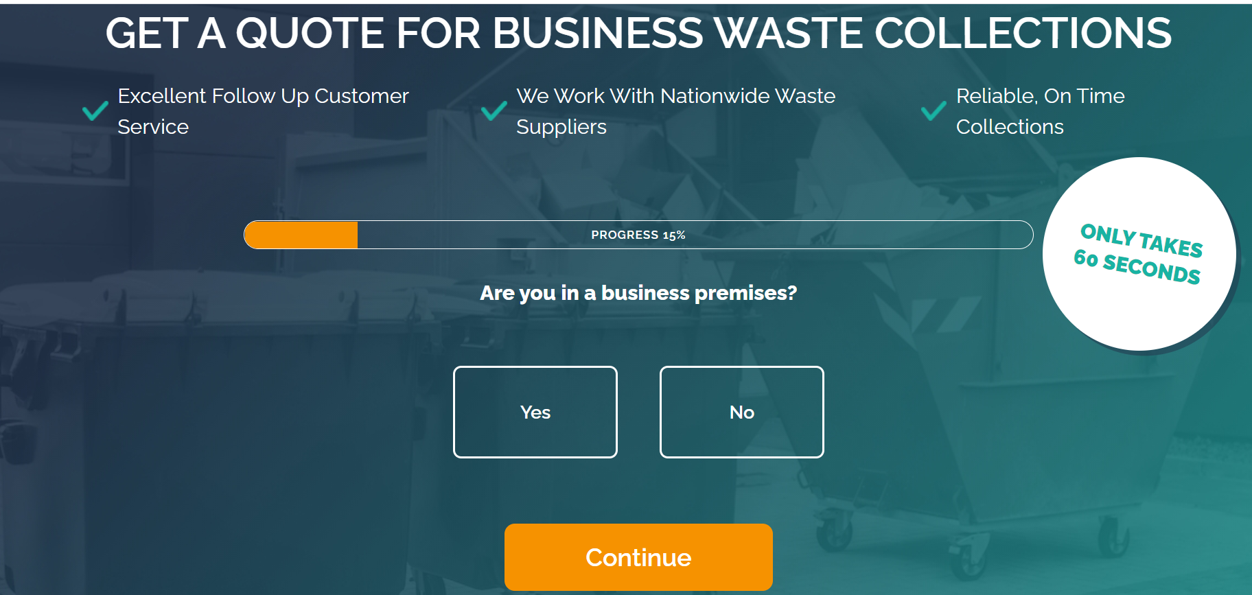
This landing page from Betterwaste.co.uk offers a free quote, which is handy for customers. The stroke of genius, however, is the way it launches visitors straight into the questionnaire. How can they refuse! The simple CTA advances prospects onto question two.
Great ways of inspiring customers to take their first step into the sales funnel can include free guides, white papers, free trials, free samples, or apps and calculators that help people see the benefit of your services.
Takeaway: By easing leads down the sales funnel in reasonable increments, we’re more likely to convert them.
Tip 4: Be human, and appeal to human nature
You can write far more engaging CTAs if you use conversational language and address something in your audience that craves satisfaction. So from what we know about humans, what can we tap into that will encourage them to click our CTA?
Use action words
We don’t like being bossed around, but we do like to know where we stand. These proven action words are used again and again in digital marketing because they get the job done:
- Buy
- Call
- Contact
- Fill
- Get
- Order
- Purchase
- Register
- Save
- Shop
- Start
- Try
- Visit
Incentive, inclusion, and instant gratification
People want to be in on the deal, they want to be a part of something, and they want it sooner rather than later. If you can suggest novelty and exclusivity in your CTAs — “request an invitation” or “shop new arrivals” are good examples — you can appeal to those human desires in your audience.
If you can deliver your service, product, news right here and now, let them know that it’s only a click away. “Now”, “Start” and ” Let’s Go” are great CTA terms for this approach.
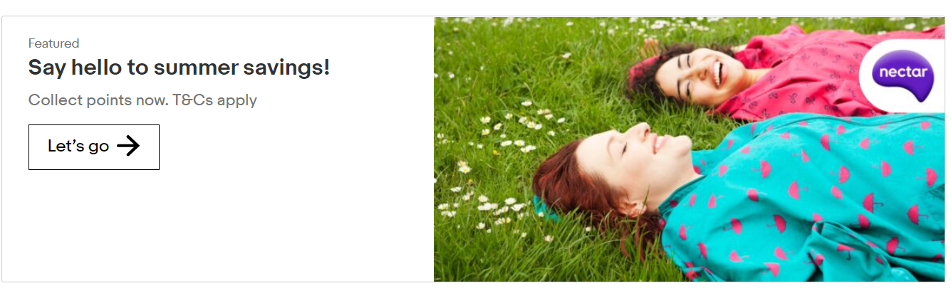
This ad from Nectar manages to create a scenario that we want to be part of: A summer of savings! Relaxing in a field with friends! Who doesn’t want a piece of that? The CTA “Let’s go” is the perfect sign off that harnesses our urge to get involved.
Something for nothing/something for less
If you can afford to give away something that your audience will value, then “Get your free…” is a powerful CTA.

Business accounting services firm Xero has gone all out with the free stuff here, with a free trial plus a free gift if you decide to subscribe.
Excitement!
Creating excitement is a great way to capture their attention. Exclamation marks can be overused in ads, but if there’s ever a place for them, it’s at the end of your CTA. Try a “!” to see if it adds energy.
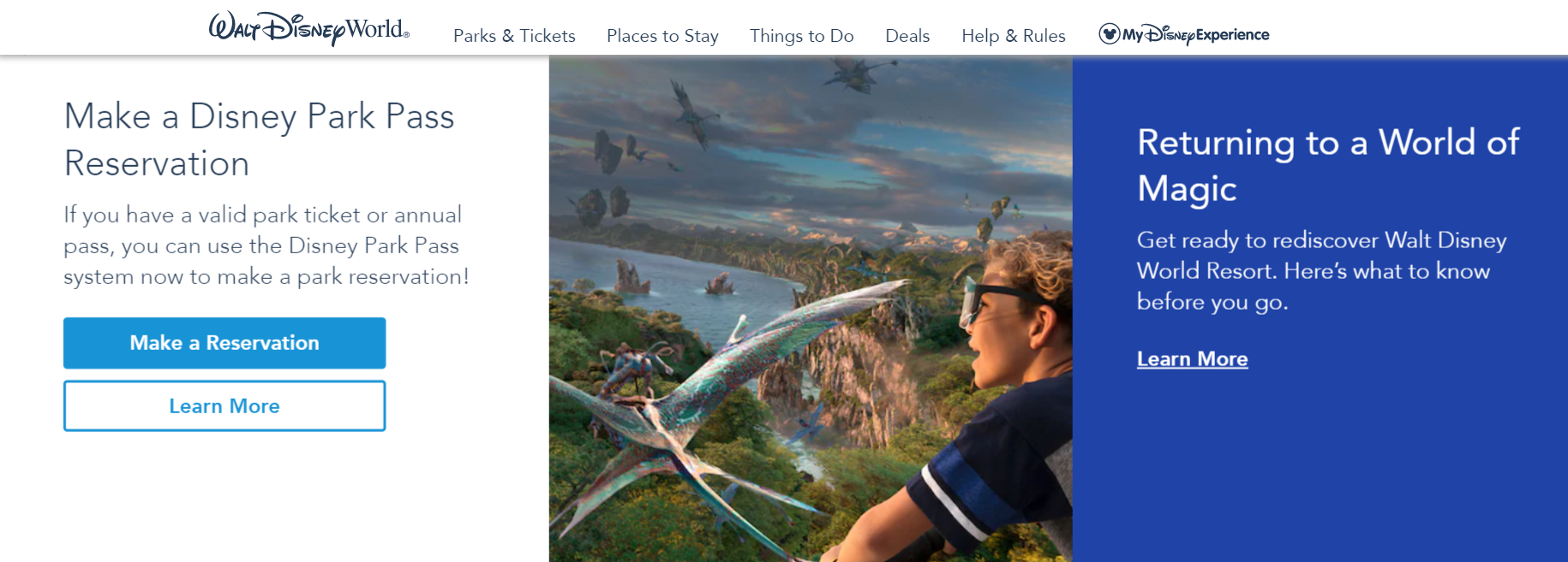
Underwhelming – a disappointing CTA here from Disney. When you’re pushing Walt Disney World – the home of excitement – surely you can do a bit better than ‘Learn More’…?
Urgency!
There might be limited time to take up of your offer, or some other calendar deadline might be looming. If so be sure to make that clear in your CTA
If your product is scarce, or there are finite places or tickets for your event. Try adding a countdown clock to inject urgency. If your CTA aims to get people to sign up for your webinar, for example, you can tee it up by showing how many remaining places there are. Anyway you can ramp up the urgency could help you spur your audience to take action.

A discount AND urgency here from ASOS.com, though we suspect their student discount will pretty much run forever!
Me versus you
A study by conversion optimisation expert Michael Aagaard saw a 90% increase in click-through rate when he tested Get my free 30-day trial against Get your 30-day trial. So if you’re in the habit of using the second person as the default in your CTAs, try switching it to the first person and see what it does to your results.
Frustrations versus Solutions
Remind them how frustrating their problem is and then swoop in with a CTA that solves it. For example, mention the pain of sensitive teeth and cap it of with a CTA that lets them “Find relief here!”
Want to be in the know?
Your audience is unlikely to subscribe to emails, for example, just to get more adverts in their lives, but they might sign up to hear “news” or receive “exclusive offers”, so use this language in your subscriber CTAs.
We all want to be in on the secret or be the first to hear about something. Create CTAs that capitalise on this urge.
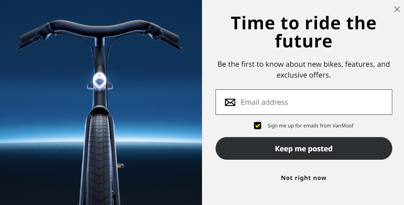
This Pop-Up from VanMoof.com wants to keep us posted so that we can be the first to know about futuristic electric bikes – yes please!
Develop trust
As we covered earlier when we discussed risk-free offers, it’s important that your audience feels secure that they aren’t exposed to hidden costs, insecure transactions
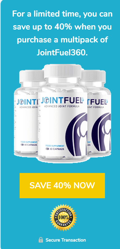
This JointFuel ad achieves the triple: Urgency with the ‘limited time’, savings with the 40% discount, and no risk with the satisfaction guarantee and secure transaction assurance. The CTA button focuses on discount and immediacy with ‘SAVE 40% NOW’.
A cure for curiosity
While confused people don’t buy, curious people often click. If you can suggest that the answers to their problems are just one click away, your audience is likely to want to find out more. Advertisers call it the ‘Curiosity Gap, but make sure you can back up your promises, or you’ll struggle to convert clicks into sales.
The body copy in this ad from Wordstream.com gets you doubting your PPC strategy, and then the CTA swoops in at the end and offers to satisfy your curiosity.
Let your character shine
Make sure the tone of voice that you’ve established for your brand shines through in your calls to action. For example, if your brand uses the shock factor with great effect, pull that attitude into your CTA.

Edgy clothing brand Dolls Kill often use ‘Let’z Shop’ among their CTAs. Their unconventional spelling ‘letz’ them add a bit of character to an otherwise functional CTA.
Takeaway: Think of the humans that make up your audience. Cater for their needs and desires with your CTA.
Tip 5: Be aware of: Size. Shape. Colour. Position
Word count is best kept under six words if you’re keeping it punchy, but you’re the success of your CTA goes beyond words. Where it is and what it looks like can be just as important.
Size
You’re CTA has to be big enough to get noticed, so make sure it’s distinct from other copy and content. There is such a thing as too big though. There’s some evidence that huge buttons with large text are less successful, with readers unconsciously put off by their overbearing size.
Shape
Most button shapes remain reasonably conventional, with digital marketers reluctant to reinvent the lozenge. It makes sense as variations on the rectangular landscape button are familiar from commonplace operating systems and social media platforms.
This email header from Wireframe gets it just about right. The button size is significant but not overbearing. The shape is a recognisable lozenge and the triangle play symbol makes the function even clearer. The contrasting colour marks it out and red is a great choice to stimulate action.

Colour
Your CTA is often a short line of text among a lot of other text. A contrasting colour background will help your button stick out. If the idea of a contrasting colour does not fit with your brand or puts your designer in a sulky mood, you can differentiate your button with a classy black or white outline.
There are exceptions to the rule, and if you have a strong brand, a well-designed site and committed customers, you could experiment with trendy invisible buttons or more avant-guard approaches.
Position
It makes sense for a button to appear below a block of copy that introduces your offer, Audiences expect to see your CTA as your final instruction
However, your CTA should always be in view — don’t let it drop below the fold. You can’t expect your viewer to scroll down the page to take you up on your CTA.
Takeaway: The size, shape, colour, and position of your CTA buttons should follow certain recognisable conventions so customers know just what to do
Tip 6: Put it to the A/B test!
Testing is so commonplace in digital marketing, there’s really no excuse for not monitoring the comparative click through rates for different approaches top CTAs.
If the top-performing CTA for your product with your audience is “Click here” then congratulations, stick with it!
You may have a few ideas of how to construct a CTA for your web page or promotional email. You can trust your instincts and pick which approach seems best, but you’ll only ever know how well that particular approach performs. You’ll never know how it might have compared to your second favourite approach.
The way to compare the effectiveness of the two is to A/B test them against one another. There are some great apps out there that can help you split audiences and trial two or more approaches. Monitor click rates and conversions for your different calls to action and you’ll quickly get a feel for what works and what doesn’t for your product and audience.
Takeaway: Don’t trust any of this advice until you have tested your CTAs for yourself!


