In a bid to solidify their ‘brand DNA’, The Guardian have now unveiled their official guidelines to ensure steady evolution instead of revolution.
Much like former Facebook designer Ben Barry, Alex Breuer and Chris Clarke were faced with a great challenge upon the appointment of their new roles as Creative Directors at The Guardian. The goal was to bring together the myriad of different styles, colours and patterns that make up the overall Guardian brand.

This task required the pair to work with their team to come up with a strategy that would allow easy brand comprehension across the entire company with the values of each department as well as the entire company easily understood by readers. The first item on the agenda was the typography, which was compared with a human’s handwriting. This is the first point of contact with the reader and needs to be instantly recognisable. The font is now set with a selection of 8 various and a guide to recommend when they should be used.

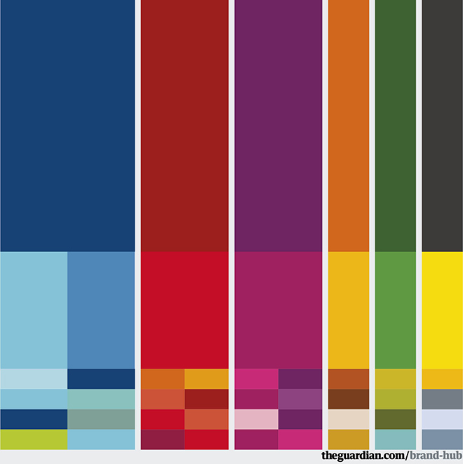
The next crucial element of the brand to be assessed by the new creative directors was colour. They give readers clues and allow for a harmonious navigation through the paper; speaking of harmony, the colours used must always work together and avoid clashing; this will ease the journey through the paper and make for convenient signposts to suggest the type of article.

The result is a vast landscape of identity, complex yet in perfect working order. More than just a masthead, there is a sense of belonging to each element and they work like cogs to move the brand together as one, this is recognised from the smallest favicon of their ‘roundel’ logo to the colour theory behind content for different sections. Alex and Chris are not finished here; the brand can now continue to evolve with a clear framework and sense of direction to allow articulation and expression with robust foundations and clear room for growth.


