
")
In our previous instalment, we looked at how three businesses came up with names and taglines for their brands. This time, we’ll be looking at how Cookies and Cones, Create 98 and Latham Street came to establish their visual identities.
Creating the look and feel of your brand is a fun process, but it’s also an important stage that could set the tone for your brand in the long term. We spoke with Matt Davis, Christine Wyatt and Lorna Minter to discover how they arrived at logos and brand colours for their businesses.
When the pros call in the pros
With a name and a tagline in place, brands need a visual identity to present to the world. That brings us to the issue of who actually does all this ideation and design work. You can bet that most entrepreneurs spent their idle moments as youngsters sketching logos for their future empires. However, most fully-fledged business leaders know when it’s time to hand over to the experts.
All three of our businesses sought some design help, and all three decided to stay local in their search for expertise. Lorna at Latham Street reached out to friends Joe and Charlotte to help her with graphic design and web dev. Joe and Charlotte are a design duo who split their work lives between wedding photography, signwriting, murals and design. Cookies and Cones used a local digital artist in Leigh, Roza Hamta of Dozy Rose. Create 98 used marketing agency Shout Design that has a studio in Leigh.
Logo from the get go
A logo is the cornerstone of most brands. Well-established national and international brands can sometimes rely on an abstract graphic element like the Nike Swoosh, or simply an initial like the Netflix “N”. Brands that audiences are likely to be encountering for the first time are often better served by a “wordmark” logo.
Mark my words
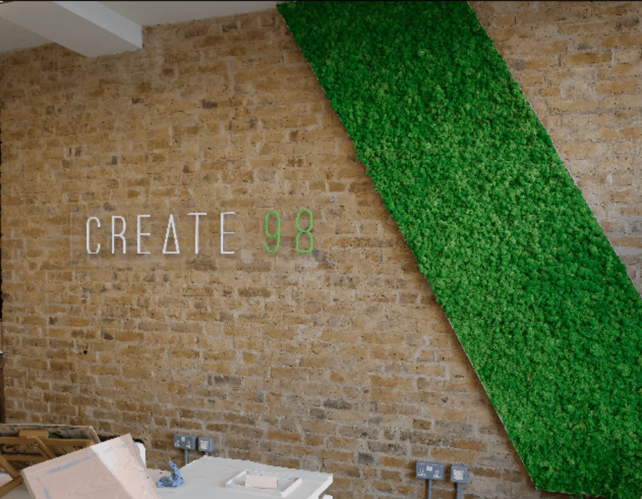
A wordmark is a typographical treatment of the brand name that relies on the colour and style of the text to create its unique visual impact. Create 98’s logo is a great example. On devising the logo, Lorna said:
I did the usual thing of going through pinterest and gathering a bunch of logos I really liked. I hadn’t really noticed, but the designer we worked with said “Oh you like tall skinny fonts, then!”

Once they had selected a font, the designer set about fine tuning the wordmark. Adjustments like turning the “A” into a triangle and giving the “8” a flat base resulted in an original and elegant wordmark. The contrasting white and green text introduces the brand colours, as we’ll discuss below.
Words & pictures
The logo for Cookies and Cones features a combination of lettering and illustration. The wordmark is accompanied by line-drawn illustrations of a cookie and a cone, separated by an ampersand.
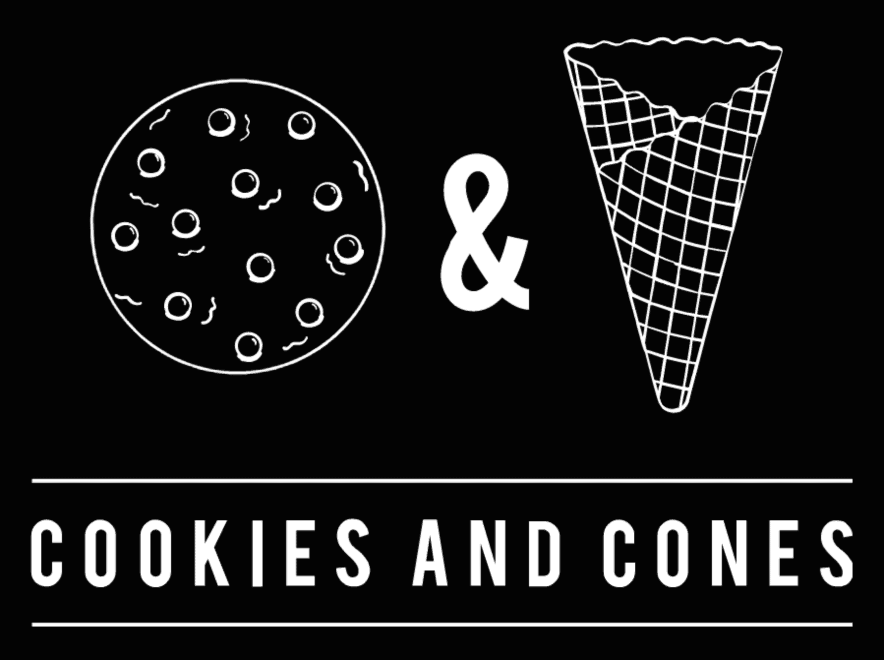
The wordmark and illustrated elements are linked by colour (both white) but also by the fact that the strokes that form the letters are the same thickness as the lines that form the illustrations. It makes for a pleasing and consistent composition. Matt explained the creative process:
We tendered it out to a local digital artist in Leigh-on-Sea; Roza Hamta from Dozy Rose. We just said, “this is our name, give us some ideas.” She gave us 5 different options, but we were immediately drawn to the cookie and cone in black and white.
Smile!
Latham Street’s logo is based on the classic acid house smiley face. That graphic itself is based on a motivational badge that we’ve written about in our piece on Button Badges. Before evolving into everyone’s favourite emoji, the smiley was the emblem for rave culture from the 1987 onwards.
![]()
The version of the logo that Latham Street has created comes with a twist. The horizontal glitch effect not only sets it apart from the original, it also represents the idea that Latham Street and its clothing represents rave culture seen from a unique perspective. As Lorna told us:
Everyone wants the smiley on everything, so it’s definitely one of the most recognisable and popular parts of the Latham Street brand.
The horizontal glitch effect is carried through in the wordmark, which is particularly effective on the bold block caps, and adds to the brand’s impact and consistency.
True Colours
All three of our businesses could be forgiven for spraying their branding with every colour under the sun. Rave inspired fashion? Ice creams and baked treats? The creative arts? It’s hard to imagine a more kaleidoscopic sample of sectors.
And yet when we look at their branding, all three businesses have selected a very spare palette to reserve for their core brand materials. In truth, most brands follow this principle unless they want to make a point of including many colours, for example in a rainbow configuration. From 1977 to 1999, Apple Inc. used a rainbow striped version of the famous bitten apple logo, but adopted the current monochrome iteration in time for the new millennium.
For most businesses, a well chosen palette limited to one to four colours gives their branding maximum impact, recognition and manageability.
Beyond black and white
Cookies & Cones resists the temptation to reflect its coloured confections in the majority of its decor and materials. This minimal monochrome approach is elegant and timeless, but it has some other great benefits too.
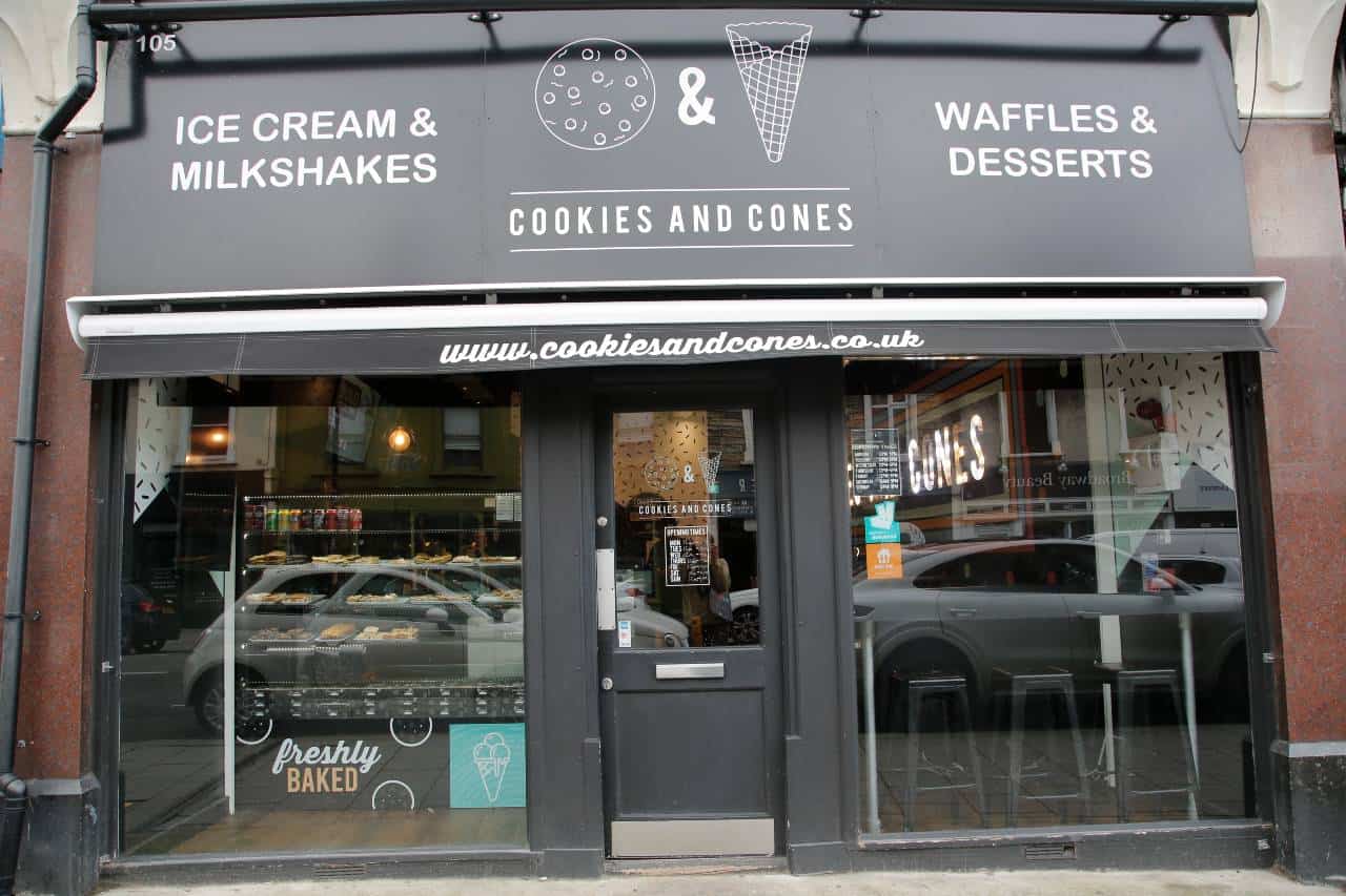
Firstly it makes the product pop. When you step into a Cookies & Cones, there’s no doubt that the confectionery is the star of the show. Although, as Matt explains, the colour choice was originally influence by a desire to contrast with the neighbours:
We did consider a number of colour options, but at the time, we just had the Leigh-on-Sea restaurant and we were located next to quite a colourful shop, so it made sense to go with black so that we could look totally different to what was next door.
On occasions when the brand does decide to splash a bit of colour about, it makes all the more impact. As you can see from this wall, a coherent palette of colours stands out against the black. It’s a clever selection of pastels that are bright enough to bring a sense of fun, without appearing garish and inedible.
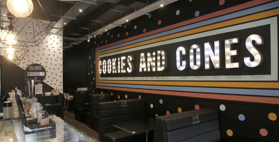
Having started with predominantly black interiors, the brand is moving towards using more white in its newer locations:
It’s always been our style to have black, very dark interiors, but we are starting to use a lot more white and to have black in the background. In our newest stores and our new head office. it’s now mostly white, but with a black ceiling, black grout between the tiles – using black as the accent colour a bit more. We want these spaces to be open, inviting and welcoming.
They call it acid
Acid House culture has been a huge influence on Latham Street’s brand aesthetic, from the clothes themselves to the publicity materials of the time. Lorna told us:
The bright Neon colours that we’ve used, the purple and the yellow together with white and black are basically picked from 90s rave flyers.
The sharp neon yellow that Latham Street could not be more aligned with the brand’s rave culture roots. With just enough green lurking in there, it can still pop out of a white background, an issue to be mindful of when working with yellow.
Contrast is important and the greatest contrast can be found between ‘complementary colours’, shades that occupy opposite positions on the colour wheel. The complimentary colour in opposition to Latham Street’s acid, green tinged yellow would be a purple-tinged neon blue, which is exactly the accent colour that Latham Street uses on its website.
Going green
When it came to establishing a visual identity for Create 98, Christine and her partners liked the idea of using green as their principal brand colour. Christine’s primary creative outlet is floristry, and green is most often the colour of creative growth in the world of botany.
I think it’s an appealing colour. It’s a restful colour that’s not too shocking. but not a dead colour either. It’s a vibrant shade because we wanted people to feel really alive as they enter.
As we mentioned, Create 98 is a brand rooted in its location, and one of the most striking features of the space you first enter is the living moss wall feature. The lush green swathe that the feature brings to the space is a good match with the brand colour.
Green, black and white have since become staples of Create 98’s promotional print, the quarterly brochure that sets out the season’s programme of courses and events.
Into print
In our next instalments of “Grow with the Pro’s”, we’ll be looking at the process of printing those brochures with Create 98, along with a variety of new print products for Latham Street and Cookies & Cones.
