

Have you ever spent hours trying to figure out the best font style for your print work?
Each font style is fantastic but not every style is suited for every type of print. Some typography is more suited depending on the copy and its context.
Here are the 18 best free fonts to use on your print as well as some things you should be thinking about when choosing the ideal typography style for your business!
Style or substance?
It’s important to think about what style of font might be most appropriate for your print. For example, if your business is known for being creative or innovative then it’s important to use a font style to reflect this, rather than a standard font, such as Times New Roman.
Unless you’re after a specific look, a serif font like Times New Roman most often just looks like, boring unformatted text.
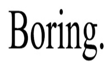
Some fonts will look like you haven’t made an effort…
Send the right message
Consider what format of print your font will be used on. What kind of copy are you designing and what is its purpose?
If you are designing a Roller Banner for a one-off event or to highlight a special offer, you may choose a bolder, more eye-catching font that you’d use for more formal literature such as letterheads.
There’s nothing wrong with mixing things up occasionally. It can create a striking effect and generate interest. However, if you use too many different fonts or styles for each item, the effect will be inconsistent and amateurish. Save the wild and wacky fonts for special occasions for a greater impact on your customers!
Too many fonts can spoil the alphabet soup.

Nothing to write home about
Avoid style over substance. It can be easy to get carried away with your font selection and sometimes, original font choices can turn out to be unreadable. It’s essential to keep print accessibility in mind, so you should always check that you and your customers can read the document easily.
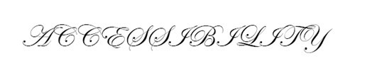
“Accessibility”
Low-Resolution Issues
Consider how your font will translate onto your print. If you are printing from a low-resolution printer, subtle font characteristics such as delicate serifs or fine lines will not get printed, which means the final document may not look exactly how you expected it to.
The 18 best free fonts for every occasion
![]()
Aller is a bold, authoritative font while not being overly formal at the same time. It’s a great conversational font to speak to your customers with and perfect to use on your Flyers and Leaflets.
![]()
This variation of the above font, Aller Light, offers defter typography. Being thinner, this font offers a more delicate approach to communicating with your customers.
![]()
Arial is a classic font. Formal yet conversational, bold yet not in your face, this typography can be used for a wide array of print. This is a font that your customers will find easily readable and transferrable across a broad range of subjects.

Bree Serif is a font that demands your customer’s attention. Perfect for a striking headline on one of your Invitations, this font won’t go unnoticed at first glance.
![]()
Clear Sans is an easy-to-read font. It strikes as a matured version of its font cousin, Comic Sans. If you want your customers to read your print easily, this typography is a great choice.
![]()
Using Georgia will bring a higher level of formality to your print. This font will strike your customers with confidence, reinforcing your expertise and gaining their trust as a result.

This font will give your print a unique look. With typography that looks handwritten, your Postcards will give a personal effect. For best use, it could be a good idea to sign off using this font, giving the impression that you’re speaking to each individual customer directly.

League Gothic really stands out with its bold tone, making it easy to read for your customers. Being easily readable, this font is great for headings, subheadings or any bit of copy you want to stand out to your customers.

Lobster is a great font to add a quirky touch to your Business Cards. This font doesn’t carry the same formality or professionalism as other typography. Use this font sparingly in your print for maximum effect.

Montserrat is incredibly easy-to-read typography. Very simple in design, use this font sparingly as the simplicity may undermine your customers, while potentially not reflecting the professional look your business deserves.

Muli is a thin, delicate font. Great for the body text of your print, without a bold look to this font, this typography might not be the optimal choice to use for your headings as it won’t stand out as much as others.
![]()
Not overly bold but not too thin, Museo Sans strikes the perfect balance in typography appearance, something that would take to Goldilock’s liking. Simple to read but not insulting your readers, this font is easy on the eye for any print you produce.

Ostrich Sans gives you a stretched typography, much like its namesake. Thin lettering doesn’t usually stand out so well, however, this font does because the tall letters are all capitalised.

Pacifico gives a classic look, reminiscent of a vintage 1980’s Miami beach Poster. Perfect for your graphic designs, this typography will really stand out in your print. This font will be great for titles or short pieces of text, however, any copy that’s too long and it may become hard to read.

Questrial is great conversational typography. Not too formal but not informal either, this font strikes a fine balance between both formats. When speaking directly to your customers, Questrial is a great choice to use on your prints.
![]()
Tex Gyre Adventor is an imposing font, whose bold, sharp corners demand the attention of your customers. A great choice when trying to give your customers a clear and concise message.
![]()
Tex Gyre Heros is the identical twin to Tex Gyre Adventor, try and spot the difference! Like its twin, this font is bold and sharp. Being so easy to read makes it a great choice when trying to provide your customers with a message in a clear way.
![]()
Times New Roman is as formal as typography gets. Steeped in history, this font gets its name from The Times newspaper and was adopted for its formal tone in 1929. This font is great to address your customers on news and information that you feel is important to them.
All 18 of these fantastic fonts are free for you to use through our Create Your Own tool on our website.
