

Have you ever wondered why certain colours are synonymous with specific brand logos of the world? Why do we instantly recognise the yellow arches which have placed themselves in over 60% of countries worldwide? It’s all to do with psychology.
To find out more, our research team at Solopress has analysed hundreds of the most famous brand logos of the world to reveal the most popular colours within the biggest industries and the psychology behind their use.
Our new study reveals the power of colour psychology, which colours dominate best-performing brands across the food, drink, finance, tech and fashion industries, combined with a review of the most successful brands of all time.
We have also spoken with neuromarketing expert, Katie Hart, who guides us through the power of colour, describing how this psychology affects our purchasing decisions.
Colour psychology explained by a neuromarketing expert
Colour psychology explores how different colours affect humans, from their moods to their actions. Its influence can be shown through the design of buildings to the development of different brand logos. Colour psychology, therefore, plays a significant role in the way we communicate and influence those around us.

Katie Hart tells us: “Developments within neuroscience have discovered that colour affects us subconsciously, meaning we’re not truly aware of the power it has over us.
“Different wavelengths of light convey powerful messages within our brain, which we have no control over. This is where the true power of colour comes in.”
We also asked Hart how colour psychology affects our purchasing decisions. She tells us that brand logo colours affect our purchasing decisions in three ways:
- Through our subconscious mind
- Via colour psychology
- From our evolutionary past
Why do our favourite fast-food franchises always use red branding?
Did you know that red can energise us and drive us into action? Alternatively, did you know that blue can calm us down and even reduce our heart rate?
Whether you’re creating your brand logo from scratch or looking to revamp your current style, considering this indispensable data and expert analysis will help you show your true colours.
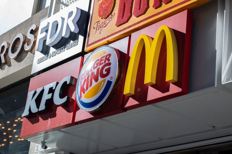
Red or pink dominates food and drink
Fast-food’s favourite colour reigns uncontested in the food and drink industries. This is because red or pink occupies 41% of the food industry and 29% of the drink industry.
Katie Hart comments: “Longer wavelength colours, like red, are known to have a stimulating effect on recipients. They arouse us and drive us into action. At some levels, red colours increase our appetite, heart rate and even blood pressure, making us act faster, be more impulsive and potentially eat more.
“Can you see why this is such a popular colour to use in the food and drink industries, particularly fast food chains?”
Blue consistently averaged around a quarter of the best-performing brand logos of the world, with 27% in the food industry and 24% in the drink sphere.
Purple is unanimously the worst-performing brand logo colour across both industries. If you’re entering the food or drink space and are creating your logo, you should stay clear of purple!
Even as the world is deploying greener initiatives and environmental choices, green logos are yet to take over the food or drink industries. This eco-friendly colour averages 12.5% across both sectors.
Why is finance blue in the face?
Our research found that blue is the leading brand logo colour in the finance industry with 31% of companies opting for blue tones in their logos. Blue edges out red which 28% of finance brands choose to use within their logo colour palettes.
Perhaps it’s a blessing in disguise for finance workers that red isn’t the dominating colour of the industry in what is already a high-blood pressured environment.
![]()
Katie Hart added: “Shorter wavelength colours, like blue, have an opposing effect to red. They calm us down and reduce our impulsive tendencies, lowering our heart rate too.
“These feelings of security, stability and reliability may be why the colours work so well in the tech and finance sectors. In our evolutionary past, blues would be associated with large sources of water and clear skies. These are usually conducive to us being relaxed, provided for and feeling safe.”
What’s made the tech industry black and blue?
With a combined worth of roughly $5.2 trillion as of 2021, you could say the tech industry as a whole is anything but battered and bruised. However, blue and black dominate the industry, controlling 53% of the total best-performing brand logos of the world.
Blue is a popular choice for many social media platforms. It’s the face of Facebook, LinkedIn, Twitter, Skype and Telegram and is donned by 30% of the best-performing tech companies.
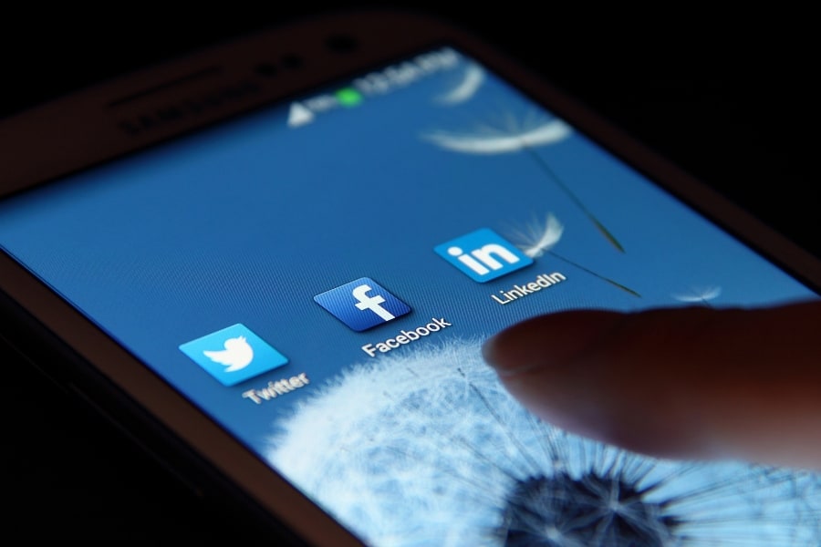
Katie Hart added: “Interestingly, the colour blue is now often associated with communication too, which may derive from these feelings of security and safety.
“In fact, Google changed the specific shade of blue they use for their links when a search comes up to a more ‘reddish’ blue. Did you notice it had changed? No? Well, they attribute that change alone as contributing an additional $200m of advertising revenue per year. Per year! And most people didn’t even consciously notice that it had changed.”
Black dominates 44% of logos in the fashion industry
From designer couture to low-cost clobber, black remains a firm fixture. Calvin Klein, Dior and Boss all rock black. On the more affordable end of the spectrum, the black theme continues with the likes of Next, New Look and River Island.
When you look down the high street, many fashion brands keep it simple, with black supporting 44% of the best-performing fashion brand logos of the world.
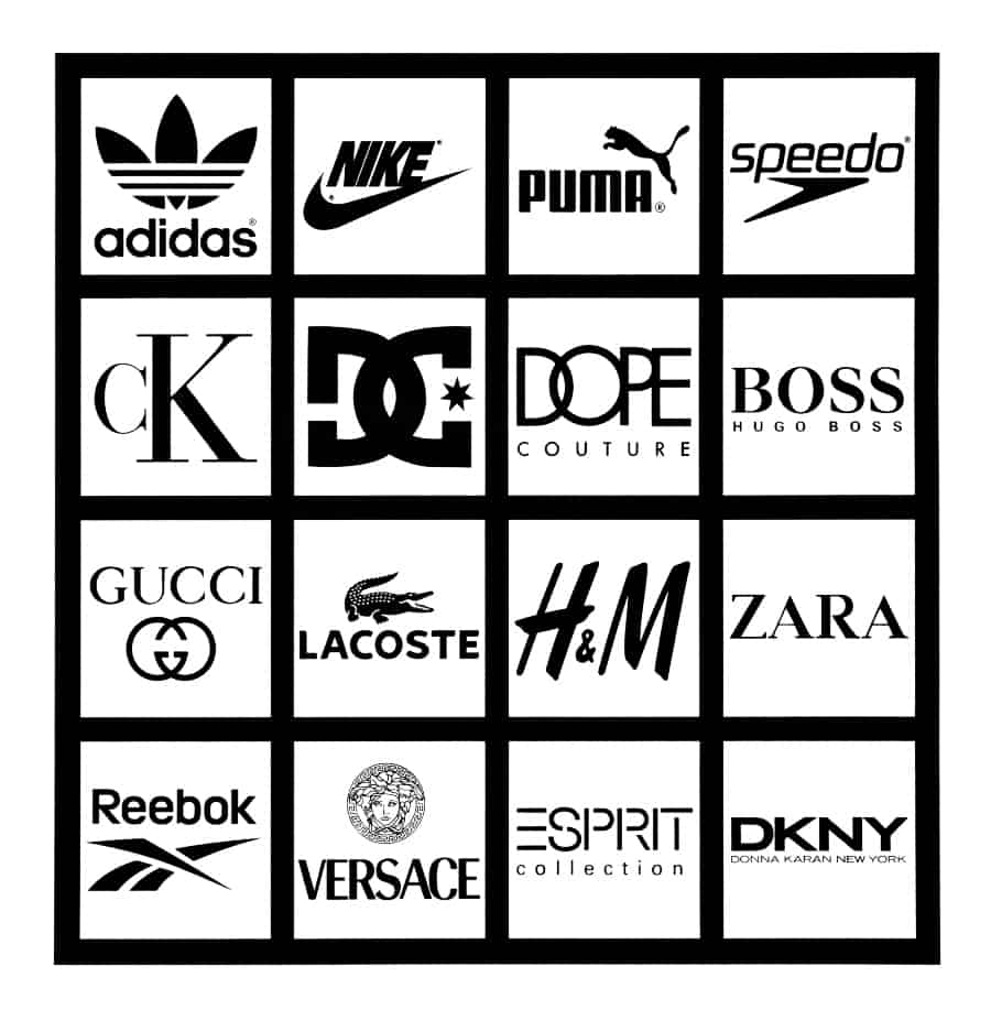
Katie Hart said: “Black suggests strength, dominance, power and mystery, which are all desirable in high-value brands.
“However, it is also important to consider them in context, as with a fashion brand, the use of black means that the brand identity can be successfully utilised against any colour palette which is trending in any given season. This is clearly a significant advantage for anyone seeking longevity in the fashion industry!”
Blue is the most successful brand logo colour of all time
Our study found that 31% of the best-performing brands of all time have blue in their logo. Blue can be consistently seen as a popular choice in each of the food, drink, finance, tech and fashion industries.
Similarly, red ranks highly among the best-performing logos. Both blue and red tones combined make up a 55% share of the top brand logos leading from the front that we see around us on a daily basis.
The colours that feature in the logos of the most successful brands of all time:
| Colour | Percentage |
| Blue | 31% |
| Red/ Pink | 24% |
| Black | 15% |
| Yellow | 12% |
| Orange | 7% |
| Green | 6% |
| Grey | 4% |
| Purple | 2% |
It’s interesting that the two most successful colours provoke such different reactions in us. The calming effect of blue that can lower our heart rate contrasts with the colour red’s ability to drive us into action while increasing our heart rate and blood pressure.
Katie Hart added: “The more we become aware of the effects of colour on our moods and behaviours, the more we can begin to understand the successes behind brands such as these.
“Reds, oranges and yellows have been used to attract attention and stand out from our environment for many years. For example, look at road signs around the world!
“Therefore, when establishing a brand it is only natural to utilise colours which will get us seen and differentiate us from the competition. These brand colours are usually associated with being bold, youthful and even a little bit disruptive.”
Our subconscious mind
Katie Hart said: “We receive huge amounts of information from our senses, and only some of this makes our conscious threshold. Therefore, colours which naturally attract our subconscious attention tend to get noticed more than others.
“Most of this is unknown to consumers, so we think we are making choices based on conscious colour preferences, but actually, there are many more factors at work.”
Many brands harness the power of colour psychology
Katie Hart said: “Brands which align their colours with key emotional states they want to trigger, harness the power of colour perception to their advantage.
“The experience of perceiving colour can change our physiological state, mood and likelihood to act therefore influencing our purchasing decisions.”
Colour psychology and our evolutionary past
Katie Hart said: “Different colour wavelengths are received by different parts of our retina, which in turn send different messages to the brain.
“These messages trigger automated physiological responses within our systems. This may have had evolutionary survival advantages which may still influence our actions in the modern day.”
Showing your true colours
Colour impacts our lives in ways we have no control over. Our subconscious mind filters light in ways we still don’t fully understand!
Take a look at the brands you buy from regularly. Do you tend to need your heart racing to drive you into action? Or do you prefer a calmer space where you’re less likely to buy impulsively?
If you want to take this information and transform your branding into a printed masterpiece, look no further than Solopress, the most trusted UK printer!
