

The FA Cup final is the oldest football trophy in the world. Since 1871, the magic of the cup has invaded our nation’s hearts and minds to become an integral fixture on our calendars.
Football memorabilia, such as Brochures, are a key component to the tournament’s long-standing success, excitement and fame, with the first matchday FA Cup final programme dating back to 1882.
The FA Cup final 2023 takes place on the 3rd of June and will be the 151st time the notorious cup has been lifted.
Our designer, Oscar, put on his creative hat as we took a whirlwind stop through the last 100 years, from the White Horse final to several underdog triumphs, to look at the design evolution of the FA Cup programme.
1923 FA Cup final programme
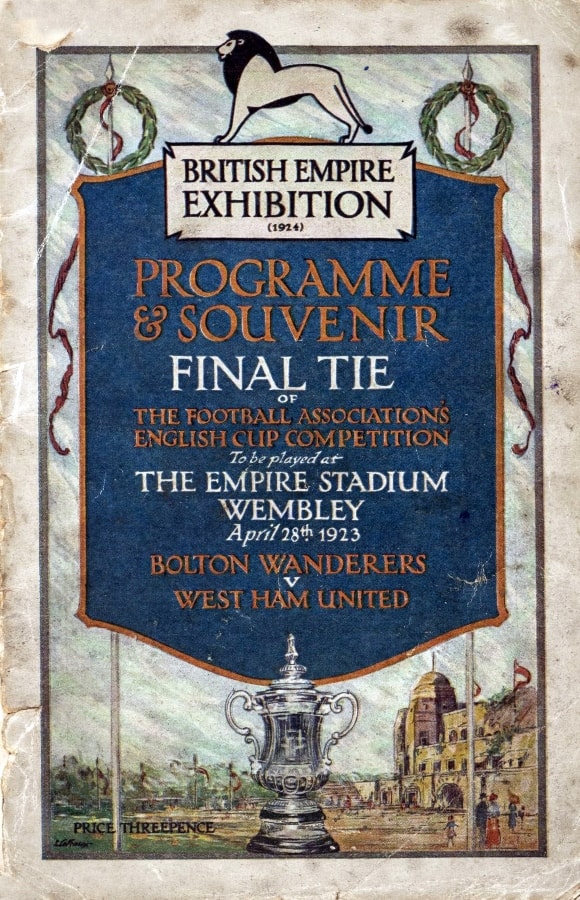
Bolton Wanderers beat West Ham United in a match that’s famously remembered as the White Horse Final. This was the first match played at Wembley and the excitement was palpable when 125,000 seater stadium turned into 250,000 fans stormed the ground and then spilled onto the pitch. Billie, the police horse, fought the crowds back to regain control of the pitch, which delayed the match by an hour.
Oscar’s opinion:
The background of the poster includes a nice hand-drawn image of the old Wembley. Hand-drawn images still remain a popular choice in Brochure designs to this day. This programme has a nice use of typography, especially for the time. The designers have done a great job splitting the info with the orange and white text. Overall, it’s a nice balanced, symmetrical design.
1933 FA Cup final programme
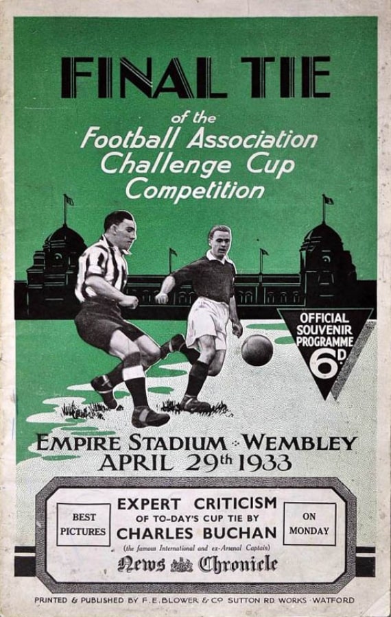
We jump forward 10 years to a match that’s notable as 1933 was the first final where numbers were put on the back of players’ shirts for identification. Everton were given numbers 1-11 and Manchester City numbers 2-22, although with the Toffees championing a comfortable 3-0, identification clearly didn’t help the Cityzens enough.
Oscar’s opinion:
This version includes a mixture of real and illustrated elements. The two players provide a great composition which really stands out to me. There’s a nice use of different fonts to break up the information. Unfortunately, from this Brochure design, you wouldn’t be able to tell who played in the final as it’s not clear! Not many colours have been used in this Brochure but I don’t think it hurts the design too much as the vibrant green helps make the rest stand out.
1953 FA Cup final programme
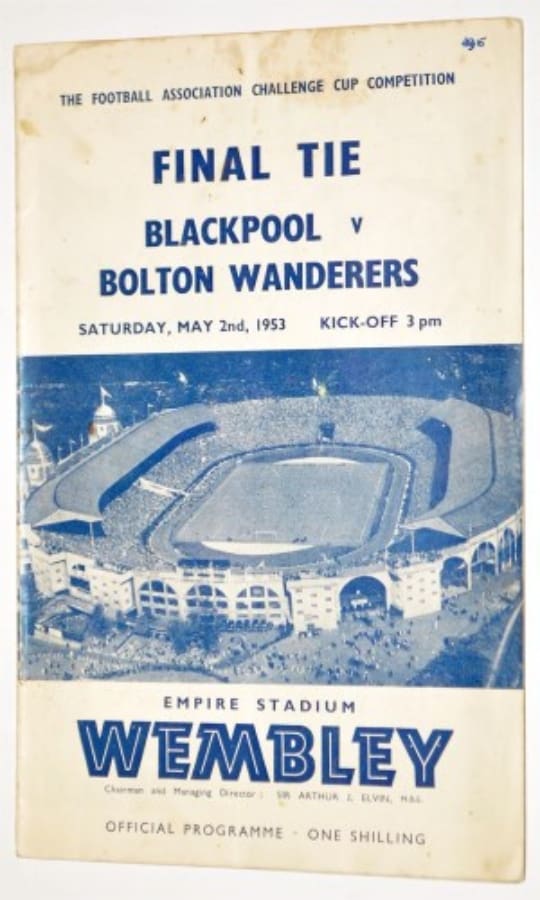
In the eighth final to be held at Wembley since the Second World War, Stan Mortensen scored the first final hat trick of the Wembley era to give Blackpool a dramatic 4-3 win over Bolton. What is widely regarded as the Sir Stanley Matthews final had a delayed kick-off due to Blackpool’s star defender, Harry Johnston, who needed to pass his dentures to the bench!
Oscar’s opinion:
There’s not too much to say about this Brochure as its minimal design focuses mostly on hierarchy which works well. Other than navy blue, no colour has been used on the front of the Brochure. There’s a nice aerial Image of Wembley but personally, I don’t find this cover too interesting or memorable.
1963 FA Cup final programme
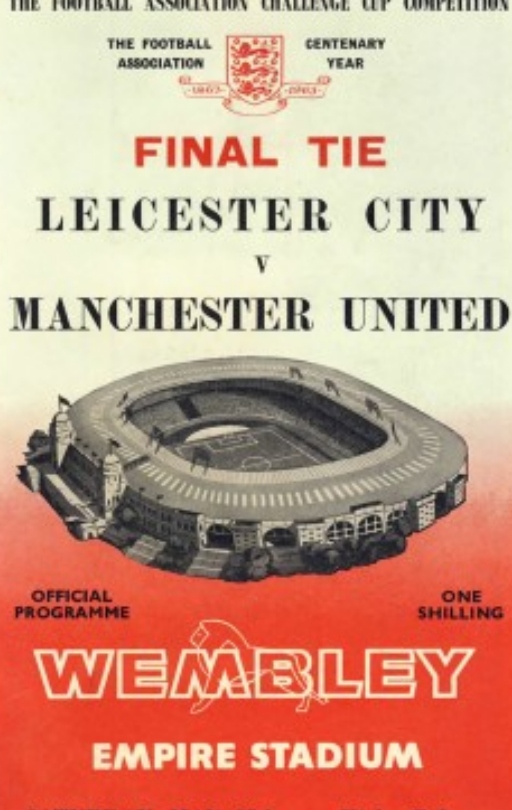
Manchester United lifted their first trophy since the Munich air disaster in a 3-1 victory over Leicester City, in a game widely regarded as the moment that launched the birth of United as we know them today. The Busby Babes entered the game as underdogs but ended victorious. In stark comparison to the modern game, man-of-the-match, Paddy Crerand, was awarded a cigarette lighter for his performance.
Oscar’s opinion:
Similar to the programme from the decade before in certain ways, I think some changes have been made which makes it stand out much more to me. The use of minimal colours in red, black and white flatters each other nicely. The use of gradient compliments the illustration of Wembley. It includes a nice use of space and is easy on the eye so you can process the information easily. It’s simplistic but put together well.
1973 FA Cup final programme
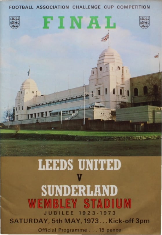
Sunderland edged out Leeds United in a closely contested 1-0 win to become the first Division Two team to lift the heralded trophy in over 50 years. Having lifted the cup the season before, Leeds were a dominant force. Don Revie had built a team full of international players, who challenged on all fronts throughout Europe and had just won Division One. This result truly stands as one of the greatest shocks in FA Cup final history.
Oscar’s opinion:
Wembley is the main feature of this Brochure design taking up most of the space. It’s a great image, however, I think too much space was sacrificed for it. As a result, the remaining information looks as if it has been crammed in with no breathing space. Alternatively, the photo could be cropped higher and then the text below would appear less squashed.
1983 FA Cup final programme
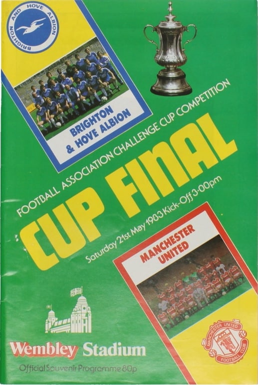
After drawing the first final 2-2, Manchester United beat Brighton 4-0 in the replay five days later to claim their fifth FA Cup. This final was notable for the awful wet and boggy conditions of the Wembley pitch. This defeat compounded Brighton’s misery in a double blow as they were relegated from Division One the same season.
Oscar’s opinion:
This Brochure design is quite fun! The use of vibrant colours and angled text provides a fun style. I’m reminded of football trading cards through the way they have used frames around the images. The information is easy to digest and overall it’s a good Brochure design. Each component complements the overall design while working well on its own.
1993 FA Cup final programme
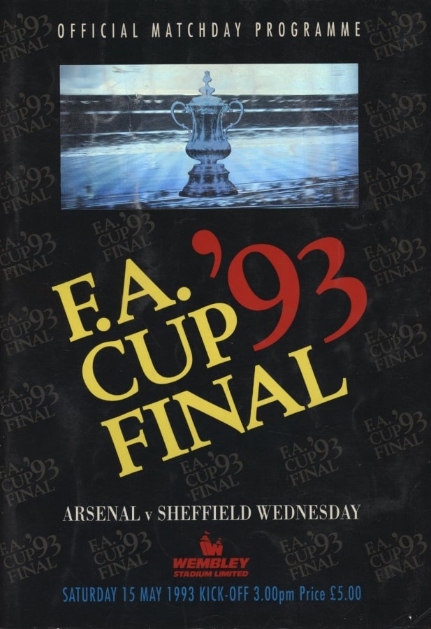
Similarly to the decade prior, Arsenal needed a replay and extra time to beat Sheffield Wednesday 2-1 in the finals after drawing the first match 1-1. This was the first time in English football that the finalists in both the FA Cup and League Cup were identical. Unfortunately for The Owls, the results were identical as Arsenal ended 1993 as double champions.
Oscar’s opinion:
This design is very different. It doesn’t look like a classic football Brochure design. I like how they have used the logo as a repeating pattern in the background, but this doesn’t feel like something you would traditionally see on the cover of a sports programme to me. I can barely make out the image behind the trophy as it appears blurred. The typography is nicely laid out and easy to read but I think the overall design fails to capture the magic of the FA Cup!
2003 FA Cup final programme
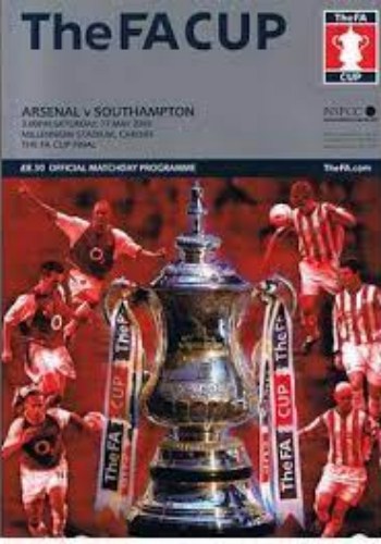
Played at the Millenium Stadium, now known as the Principality Stadium, this was one of the seven finals played away from home while Wembley was being restored from 2001 to 2006. Arsenal edged out a tight 1-0 victory over Southampton, a win which was at the start of their 49 unbeaten streak that saw them lift the 2003/04 Premier League without losing a single game.
Oscar’s opinion:
In this Brochure, they put all the information in the top third which allows the bottom two-thirds space for design. The top third is very dull with the grey colour block. Unfortunately, I don’t think they did a great job with this design and it feels a bit flat. With both Arsenal’s and Southampton’s kit being red, the red background on top loses the players in the design. I feel like they could’ve added something to maybe separate the players from the background. The trophy also feels as if it’s just been placed there without any care.
2013 FA Cup final programme
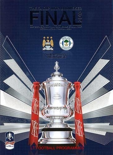
Wigan beat billionaire-backed Manchester City with a last-minute header in one of the biggest underdog stories the magic of the Cup has produced. After winning their first major trophy, the Latics were relegated three days later from the Premier League. They became the first team to win the FA Cup and get relegated in the same season. This win saw them compete in the Europa League the following season while fighting in the Championship.
Oscar’s opinion:
A great composition. Really balanced and clean. The typography is small but legible and not too dominant like previous Brochure designs. The trophy looks amazing and really stands out, especially since this was the last year this trophy design was used! I think the use of illustrated, futuristic lines helps highlight the trophy in a modern style. Overall, it’s a nice, clean Brochure design.
2023 FA Cup final programme
Manchester United take on rivals Manchester City this Saturday. The Red Devils will be desperate to be victorious. A win would prevent the Cityzens from equalling their record as the only English team to win the treble of the Premier League, FA Cup and Champions League.
