

We’ve launched Paperback Books for the first time on solopress.com, and the debut publication that went through the press was written by one of our own. Solopress designer Richard Kemp has written a book for children, titled “This Way, That Way, Off We Go!”
Richard had the idea for his book 20 years ago. During that time, it’s evolved from a collection of loose, hand-drawn pages to a fully fledged paperback book with its own barcode and ISBN number!
We spoke to Richard about the process he, and long time colleague and illustrator Matt Bruty, went through to arrive at the finished article.
A whole new story…
Richard’s aim for the book was to create a story that was easy to follow for preschool and key stage one children. He was keen to weave elements of colours and counting into a narrative thread that all kids could relate to.
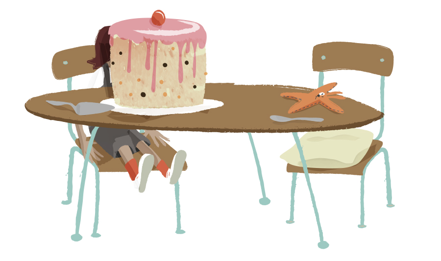
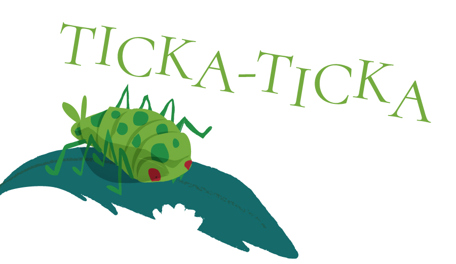
Piece by piece, he came up with the tale of a child and their cuddly toy “Thingy-Bob”, faced with the task of tidying their toys. However, we all know how easy it is to be distracted while tidying, and it doesn’t take long for the child’s vivid imagination to take over. Almost immediately, they embark on a magical journey, encountering monkeys, wizards, aliens and more!
An early call
Writing for children raises a lot of stylistic questions for authors. Many of them seem obvious, but some are quite unexpected.
A fundamental decision at the outset might be to decide on a gender for the protagonist. Any choice here can limit how inclusive the book feels for young readers. Richard decided to side-step the issue by leaving the child’s gender ambiguous throughout the book.
We never get a good look at the child’s face, and there are no specific pronouns to pin the character down. That leaves it up to the young reader’s imagination to decide how they see the character, or to put themselves in the character’s place.
Making exceptions for the children
Other equally important questions arise around how to express certain ideas in the text. For example, Richard’s book centres around numbers and counting. Should the numbers appear as numerals, or should they be spelt out? While numbers written as part of a sentence are most often spelled out, Richard decided on numerals which he felt would be more easily recognisable by children.

Similarly, Richard opted for block capitals to express the different colours in the book. While those words wouldn’t be capitalised according to traditional grammar rules, he felt they would provide more impact in caps. Again there’s no wrong answers, but it’s good to consider these decisions.
What’s your type?
When it comes to selecting a typeface, there are various schools of thought around what makes a good font for kids. Many feel that Sans-serif fonts are easier to read.
Serifs are the small strokes at the beginnings and ends of the letters. Sans-serif fonts do without these strokes, arguably leaving the core shape of the letter a little clearer to make out. Likewise, literacy experts recommend using a version of the lowercase “a”, without the aperture at the top.
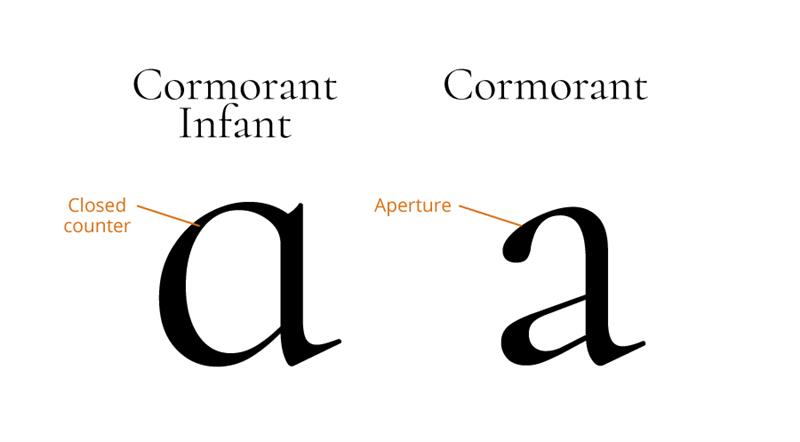
However, it’s worth noting that The Gruffalo and The Very Hungry Caterpillar break both of these rules, and those titles did OK! Other kids’ classics like The Tiger Who Came Tea and Elmer feature a serif font, but with the closed counter “a”.
Richard was keen for his book to sit within this tradition, but to appear as welcoming and accessible as possible. He opted for a font called Cormorant Infant, a serif font adapted for young readers with that all important “a”.
Finding a level, finding a style
Writing for this age group – preschoolers through to key stage one pupils – presents a unique challenge, because the reading experience changes so radically during these years. The younger audience will almost certainly have the book read to them by a grown up. Kids in the middle of the bracket might be reading it accompanied by an adult. Older children will be able to read it independently. Richard used his awareness of this issue to make sure there was something for everyone on each page, both in terms of words and pictures.
Repetition is a common feature of books for this age group and it was an element that Richard wanted to include. Having a repeated phrase throughout the story helps to round off each encounter the characters experience, and provides a sing-along element for adults and children reading together.
Originally, the repeated sections that closed each double page spread were longer. However, when Richard invited feedback from friends with young children, they felt it was too long. Instead of driving the story on, the longer repeated section became slightly laboured, slowing the momentum. In response, Richard shortened the phrase to:
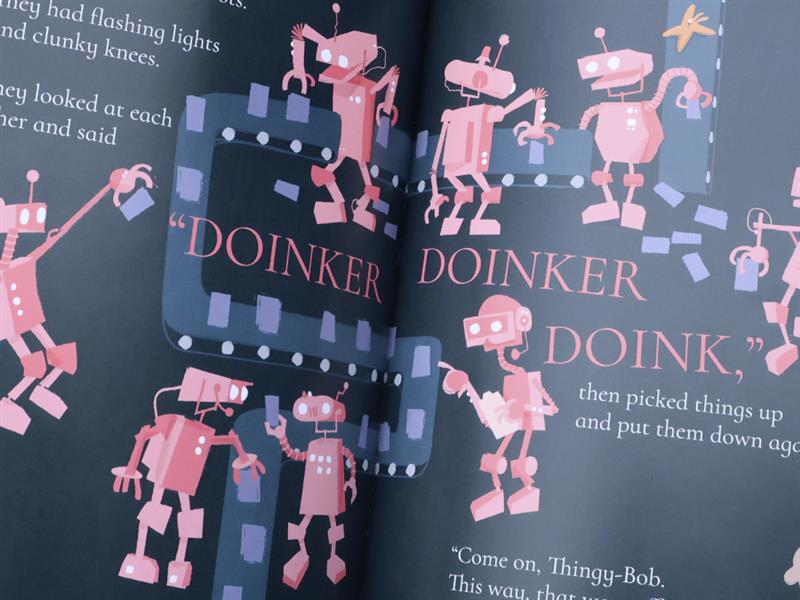
“Come on, Thingy-Bob.
This way, that way, off we go!”
Talking pictures
To create the illustrations, Richard turned to his friend and colleague Matt Bruty, himself a children’s author. Richard and Matt’s long standing relationship as fellow designers meant they had a short-hand between them, allowing communication to flow freely.
Exchanging ideas and sketches via Whatsapp, Matt was able to create and work on vector files in Adobe Illustrator that could evolve with Richard’s input. Vector images are ideally suited to this kind of work because they’re scalable to any size and remain editable until it’s time to print – you can learn more about them in our Vector Support Guide.
Settling on a visual style
The style they landed on uses a flat perspective to set the stage for the items and characters we meet. Imposed over stylised textural backdrops, the figures we come across are infused with tons of personality and humour. As the book progresses, the number of characters we meet increases. This provides more and more opportunities for children to explore each individual, or to discuss them with their grown up. This depth of content means the book remains engaging through repeated readings, which is great for kids’ development and parents’ sanity!.

While the whole book works from a consistent colour palette of vivid secondary and tertiary colours, each double page spread has its own distinct colour scheme. This helps to give young readers a sense of place and progress as they track their way through the story.
Time for a wet proof
Once all the content was assembled, Richard and Matt were ready to produce an initial wet proof. A wet proof is a fully-realised print sample that gives the creator the chance to hold the real thing in their hands, identify issues and make further adjustments.
Sure enough, a couple of things became apparent that Richard wanted to change. Certain words that sat on darker features in the background were difficult to read. By moving the background and adjusting colours, Matt was able to create greater contrast, improving the reading experience.
Elsewhere, text and illustrations that had previously sat in a good amount of space seemed to be sinking inward toward the book’s spine. This is a common phenomenon for paperback picture books, owing to their perfect bound structure. Some careful repositioning of the elements on the page led to a far more balanced composition.
Exchanging words
As well as giving Richard the opportunity to proof the colours and identify any issues, it also allowed them to pass samples to friends and invite further feedback. Some readers wanted to see more elaborate language. This feedback challenged Richard to strike a balance between introducing more dynamic language and keeping accessible for young readers. While Richard retained the simplicity of his first draft, he was able to enrich some key sentences. For example:
“The spells went into the air”
became
“The spells roared into the air”
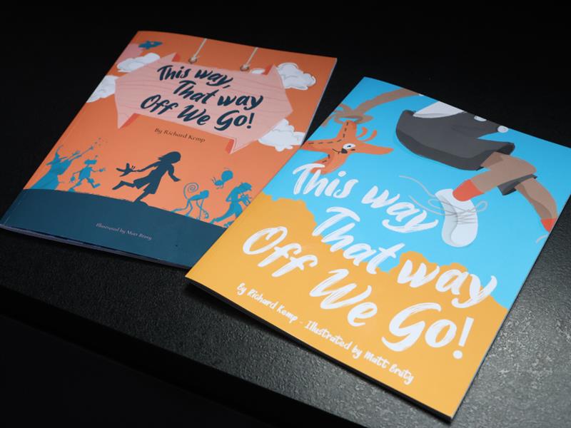
Another comment was about the front cover. With its silhouetted characters and muted colours, one friend felt that it was a bit too subdued. Taking the criticism on board, Richard and Matt arrived at a new design for the cover that was brighter and bolder with the text and illustrative elements filling the page.
About the size of it
The wet proof is also a chance to confirm choices you’ve made regarding the size, paper stocks and finishes for your cover and inside pages. For “This Way, That Way, Off We Go!” Richard used a custom size that fell within A4 dimensions.
Picking a custom size is not without risk. Firstly, if you pick a set of dimensions out of the air, you may unexpectedly drive up your costs. However, by choosing dimensions that fell within A4, Richard was able to avoid adding to the bill.
Another pitfall is if your book were to fall outside of what retailers are used to handling. This is more of a concern for adult literature, where mass market paperbacks fall into a couple of conventional sizes that fit comfortably into packing boxes and airport sales racks alike.
As you’d expect, there’s far more leeway when it comes to children’s picture books. At 210x270mm, “This Way, That Way, Off We Go!” is within expected parameters, and runs in between 8”x10” and 8.5”x11” which are both oversize standards in the US.
Cover story
For the cover, Richard selected a satin laminated 350gsm paper stock. The 350gsm cover lends structure to the book, meaning it behaves well in the hand and sits proudly on shelves without flopping or curling under its own weight.
This weight coupled with the satin lamination adds durability, protecting it to some extent from trials and pitfalls that a child’s possessions go through. Satin also feels pleasant to the touch and has a visual appeal that’s livelier than matt, but not so unforgiving as gloss.
Inner strength
While a book aimed at the adult market might typicaly feature pages of 80, 100, or 120gsm, Richard’s book is 170 silk to provide that bit more protection against tearing and moisture.
A second and third round of wet proofs was enough to eliminate every last typo and design snag, and it was “Off we go” for “This Way, That Way, Off We Go!” If you want to secure your copy from the first print run, you can buy your own copy.
