
Before you rip open the packaging in your haste for a chocolate hit, take another look at the Cadbury Dairy Milk bar in your hand. It’s subtlety changed.

How do you take an iconic brand and create a design for the future? That was the dilemma faced by London design agency Pearlfisher when chocolate giants Cadbury wanted a redesign for their iconic Dairy Milk brand.
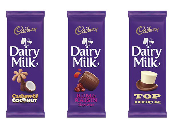
The creative minds at Pearlfisher were inspired by the idea of ‘say what you see’, replacing the original product shots on the packaging with “playful, imaginative and joyful expressions” of each unique flavour and character in Cadbury’s Dairy Milk range.
Like McDonald’s recent global rebranding, the packaging for Cadbury’s Dairy Milk will also feature QR codes. If people scan them with their smartphones, they will be able to download surprise “joyful content” that’s been designed by the Cadbury team to help make them smile.
How They Compare
Here’s the latest packaging redesign for Cadbury Dairy Milk:
And this is the previous Cadbury Dairy Milk packaging design, also created by Pearlfisher back in 2009 (the image credit for the older version goes to Design Week):

After the design debacle of Yahoo!’s new logo earlier this autumn, Pearlfisher’s latest work is a pitch perfect lesson in redesigning a well-known brand’s identity the right way. Just as long as Cadbury didn’t mess with the flavour – or size – of the chocolate bar itself!
Packaging Cadbury
Pearlfisher have uploaded this 2-minute promo video onto YouTube, showcasing their new Cadbury packaging collaboration:

The name Cadbury sells chocolate without any further artwork. But the new American owners know best…
I like the new art, very intelligent they must a paid a small fortune to an advertising company for these designs.
I prefer the old packaging. I guess they are aiming for a new target market or to improve their demographic influence. But although in vogue,this simpler packaging is not going to appeal as much to your ABC1s. My mother loves her chocolate as an indulgence and Cadbury in particular. She doesnt want to think cheap and fun, she wants to think quality and exclusive. ‘Fun’ packaging doesnt scream indulgence at me, it screams dumbed down and slightly patronising and I suspect my mother will feel the same!
Quite like the retro feel of the new packaging, and the font works pretty well. Really like the Christmas ad, although the chocolate bars in it are in the old packaging… would’ve been nice to see the new packaging!
Good spot with the TV ad packaging, Becca. The perils of using two different creative agencies for your branding and TV advertising, perhaps?
The ‘simplicity’ of the new design is of course trendy right now (unlike the word ‘trendy’)! However, my main question will be, will the chocolate taste any better because of it? I have my doubts…