

In light of the upcoming film festival in Cannes, film posters are everywhere. These are a huge part in advertising movies. You want it to make an impression, gain interest and be memorable.
An eye-catching and exciting font, which makes you want to read the movie title, is a must. There are a few fonts which designers seem to love and we see them everywhere. So, we have gathered 5 of the most popular free fonts and listed reasons why we think they work so well. Maybe you can use them for your own designs!
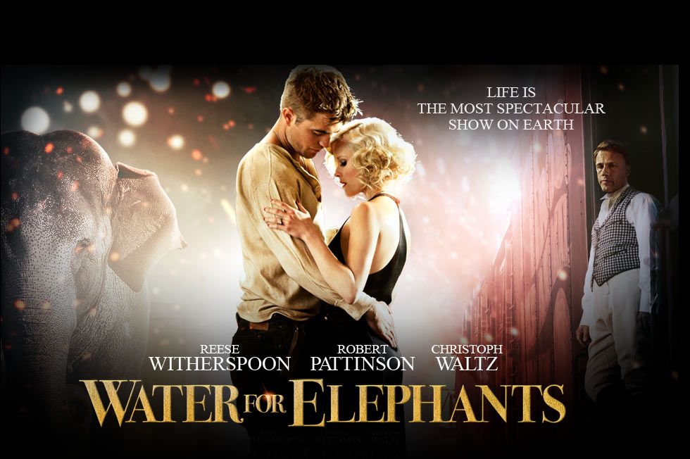
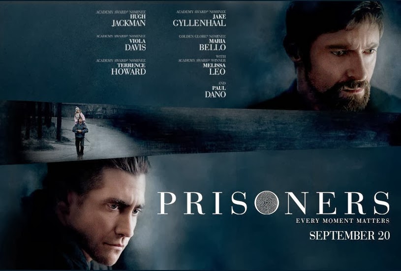
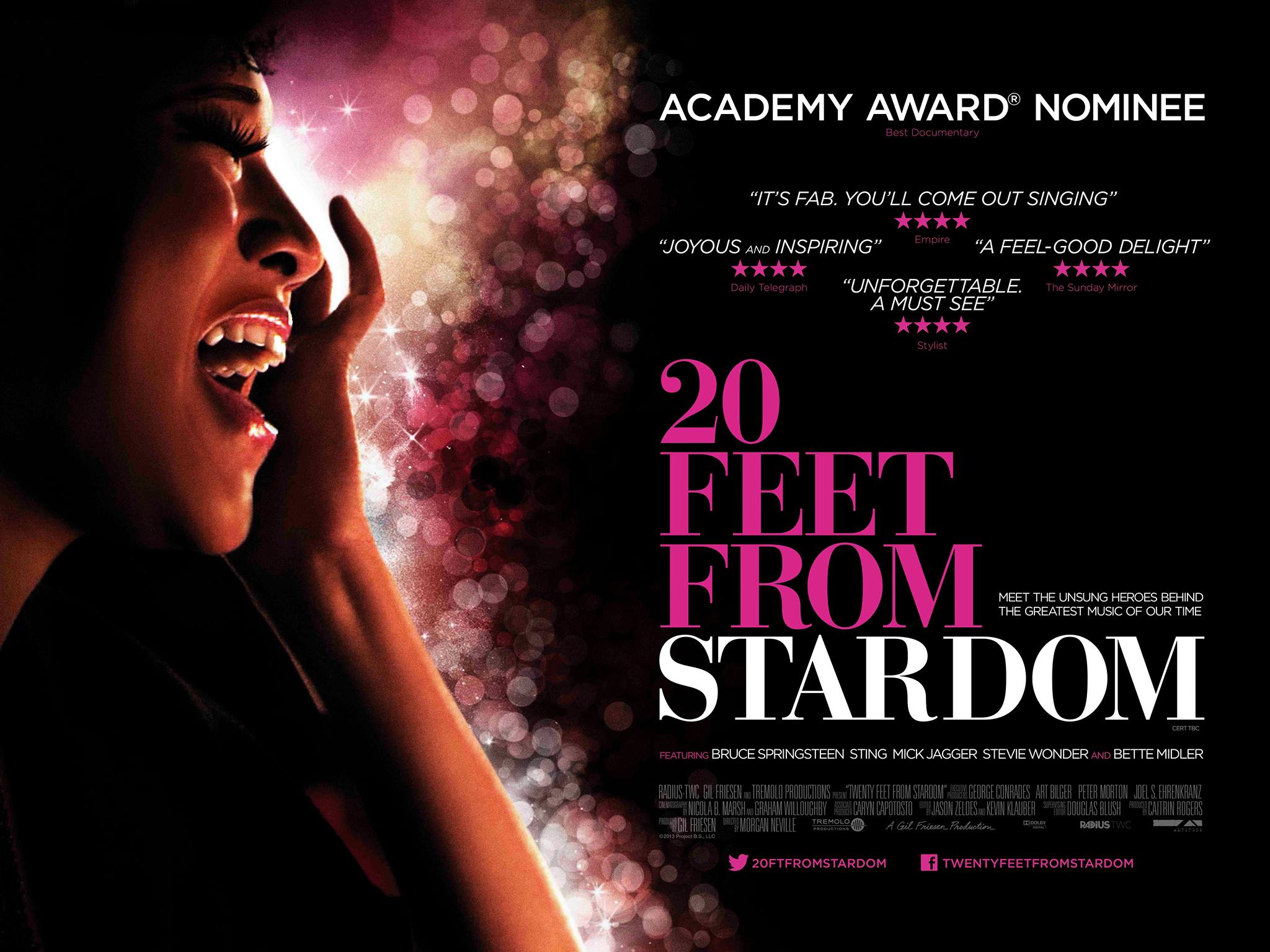
Okay, so the first font we have found to be popping up is Bodoni.
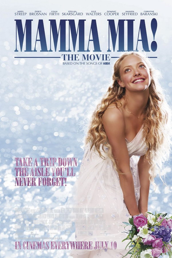
This is a lovely bold font with strong contrasts between the thicker and thinner strokes of the typeface. It has been used as the main font for many movie posters, as seen above for Mamma Mia. Other examples using this font would be 20 Feet From Stardom, Prisoners and Water for Elephants.
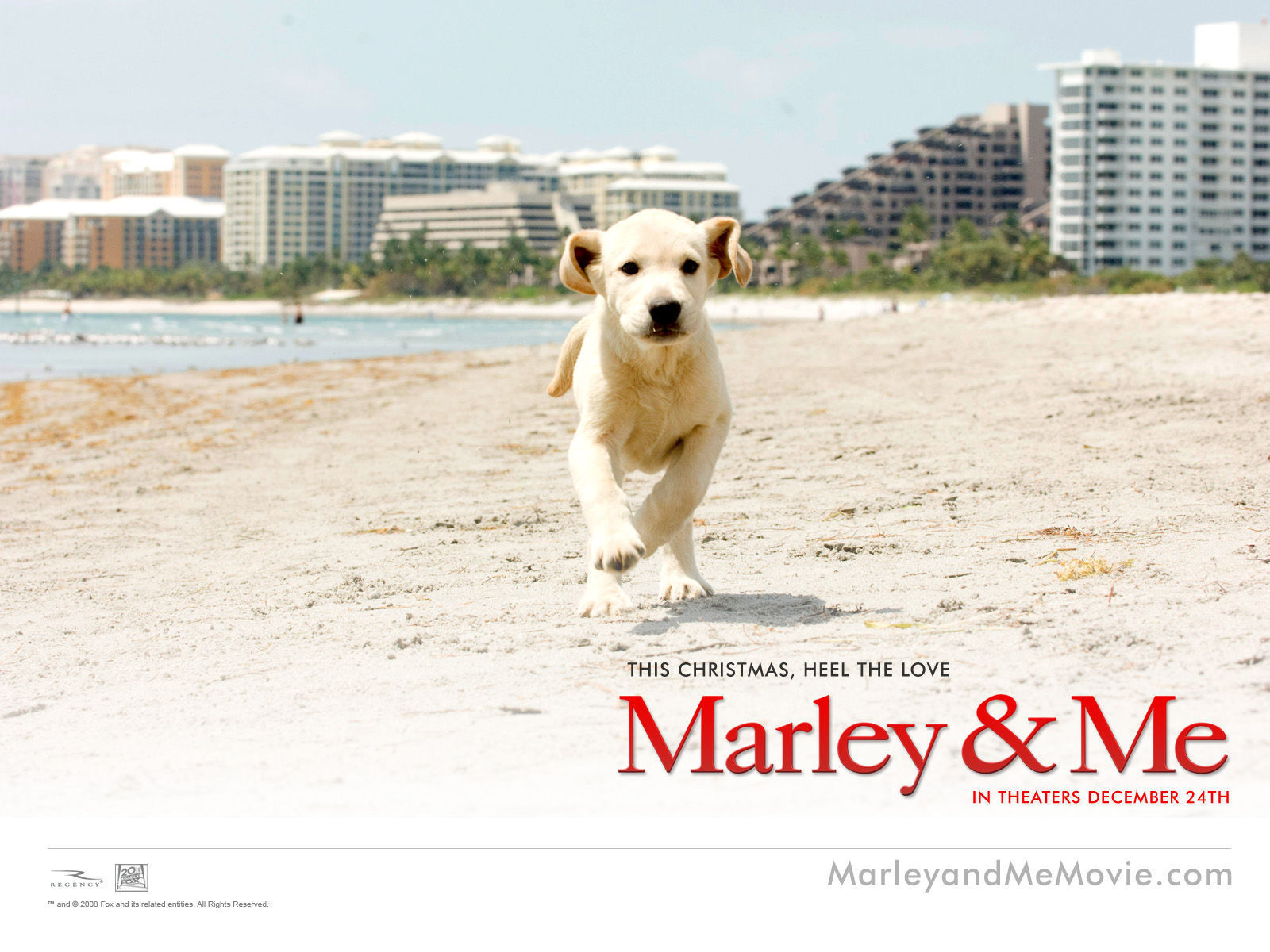
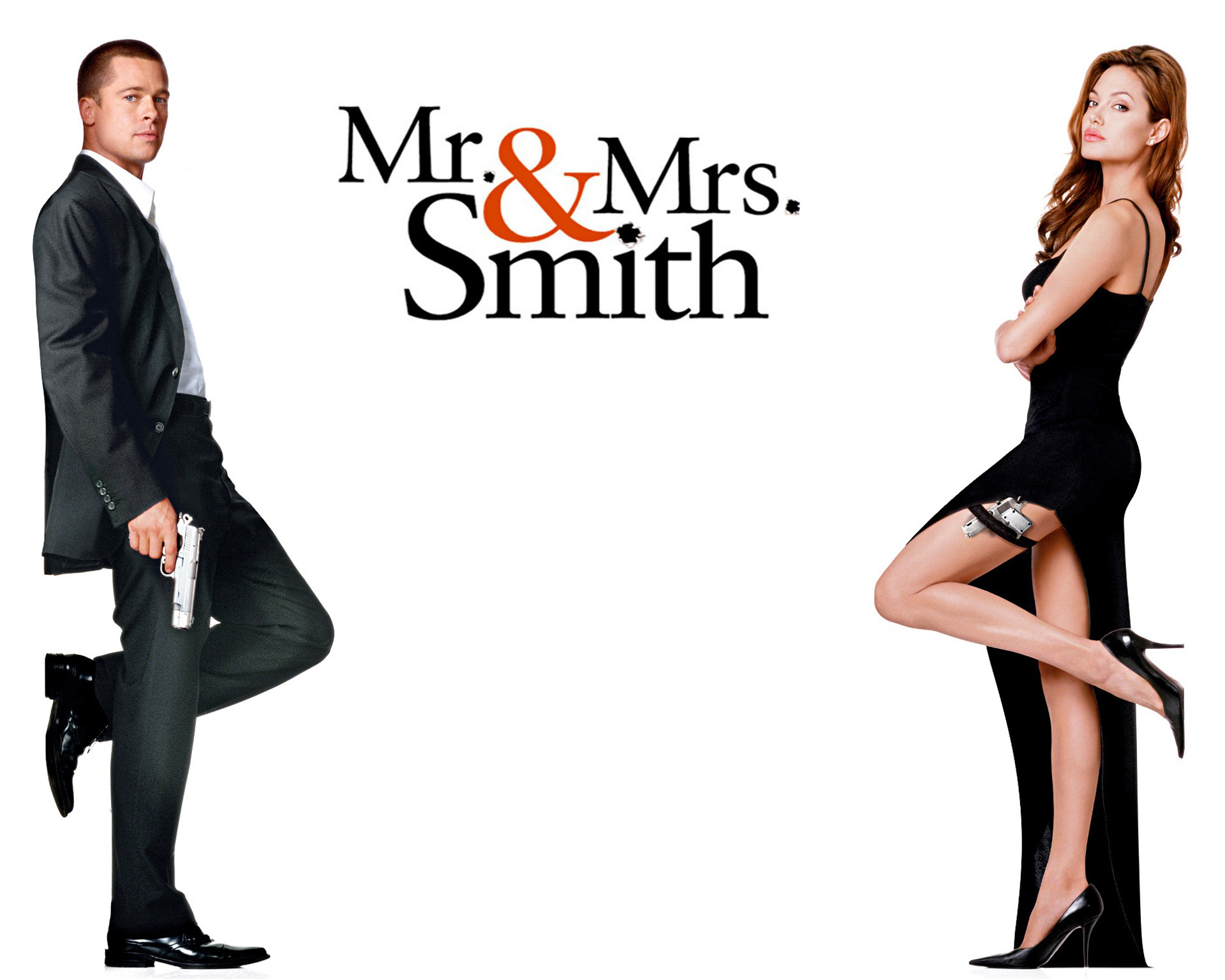
Following on, the next font we are featuring is Garamond.
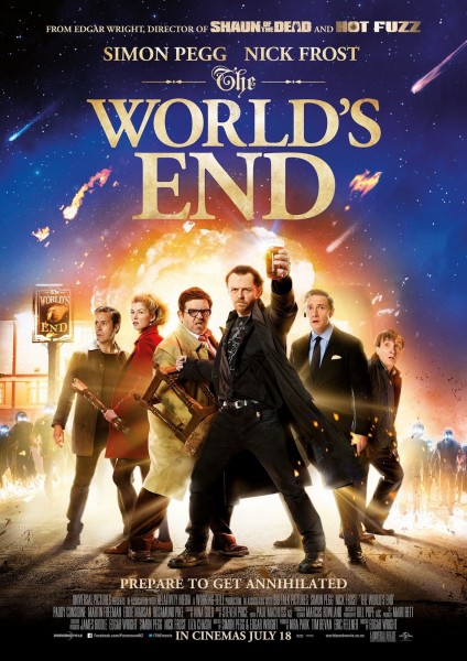
Garamond was one of the first fonts to differ from hand-written styles. There is a lot of spacing throughout the letters making readability good. As seen in the above image, the film The Worlds End successfully branded its movie poster with this font. This typeface has also made an appearance on the posters of Nottinghill, Mr. and Mrs. Smith, and Marley and Me.

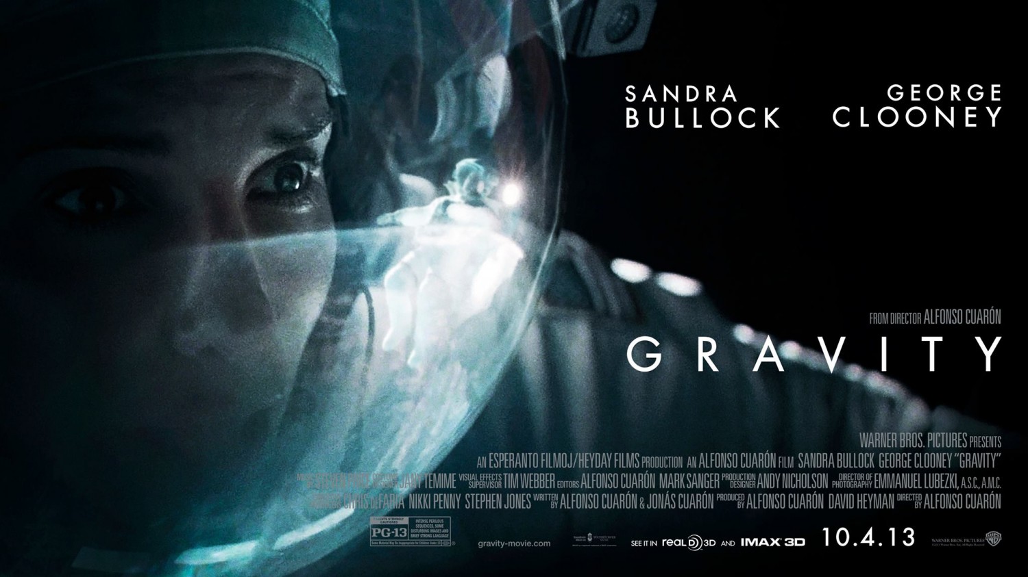
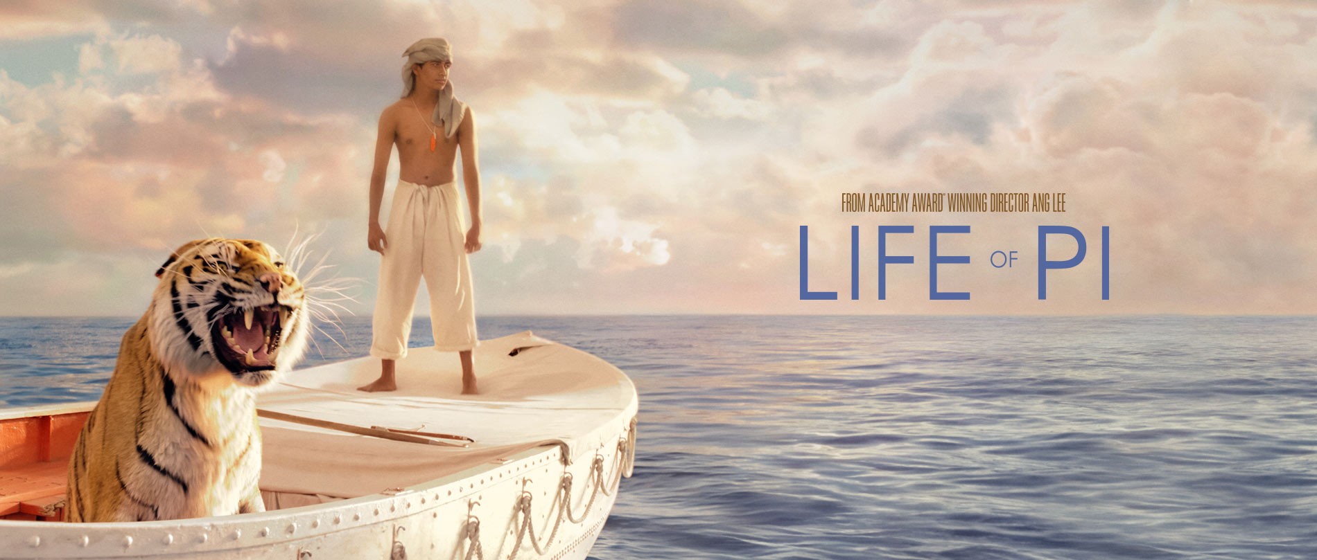
Another font that is featured a lot is Futura.
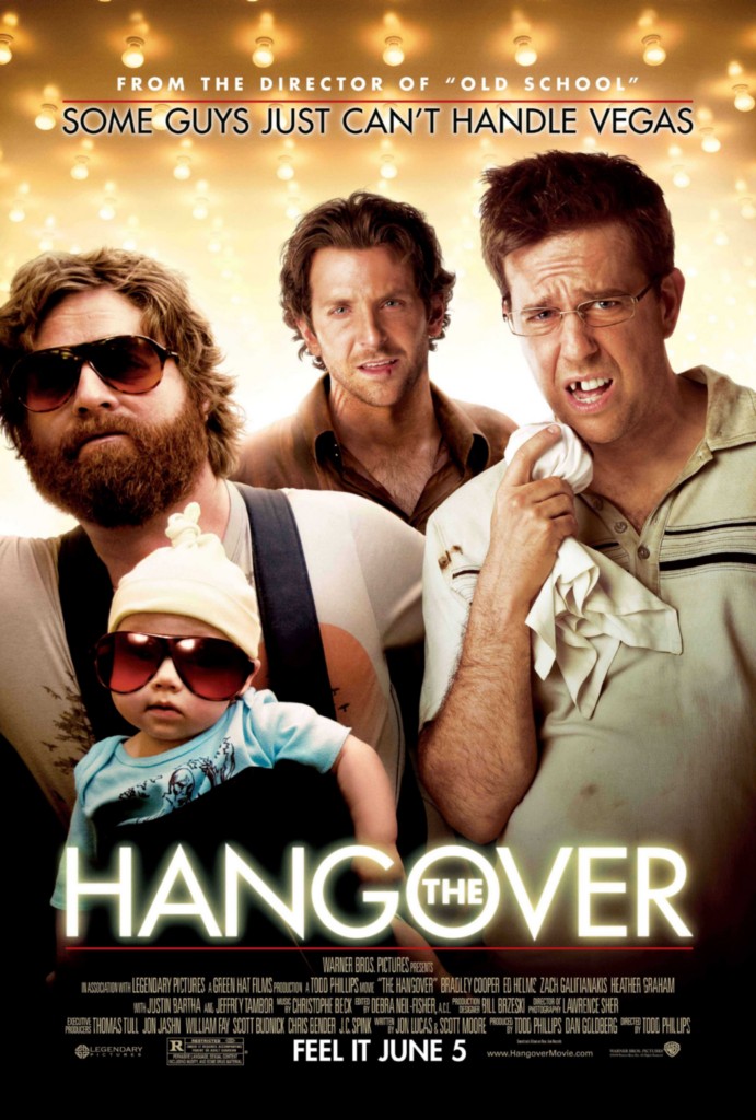
Futura was the result of an idea to create a modern typeface. It is crisp, clean and very easy to read. This is due to the geometry of the font being based on a circle. The very popular film, The Hangover, used this font in its marketing for a clean main title. Futura has also been featured on the posters for Life of Pi, The Help and Gravity.

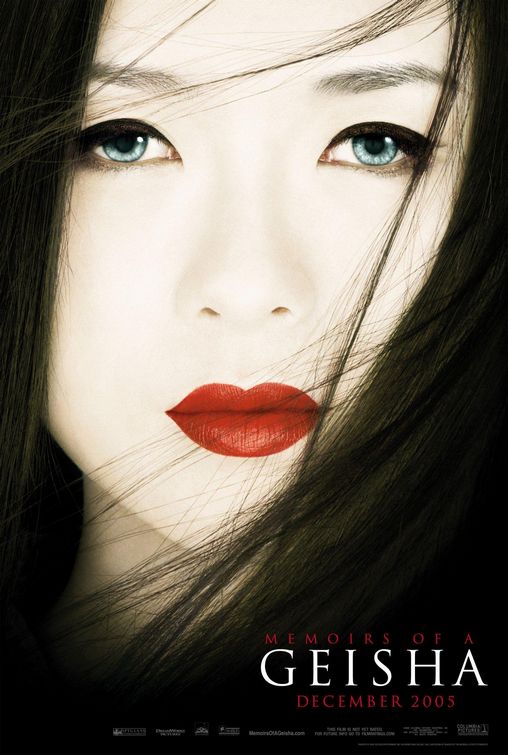
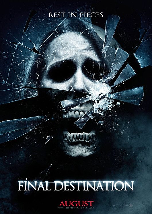
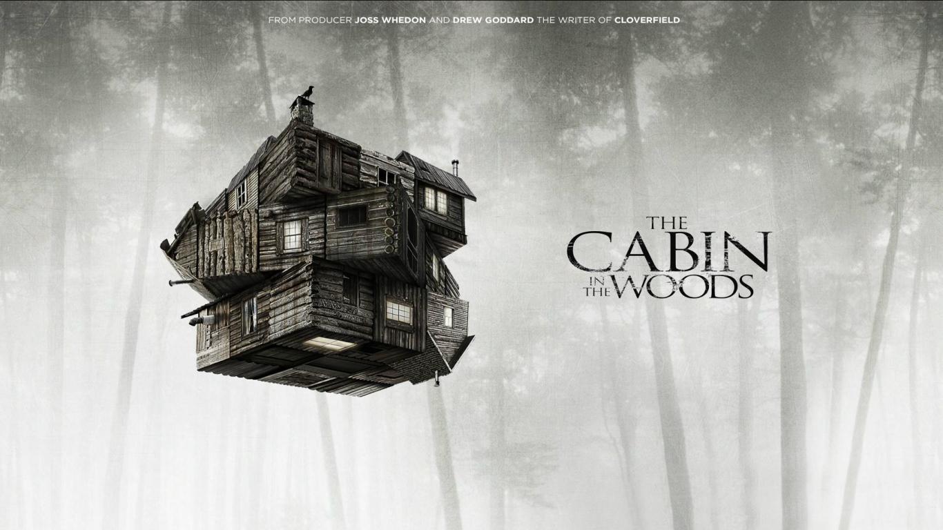
The next font we have found to be popular is Trajan.
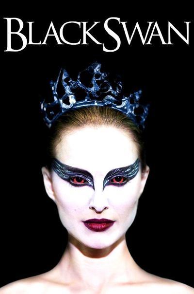
This one is more used in horror or thriller movies. The font gets its name from the Trajan Column which has an inscription on it in this typeface. Black Swan executes this font well, with its pointy edges and capital letters, giving an unsettling feel. Other movies you may know that have used this typeface are The Final Destination, The Cabin In The Woods, and Memoirs of a Geisha.
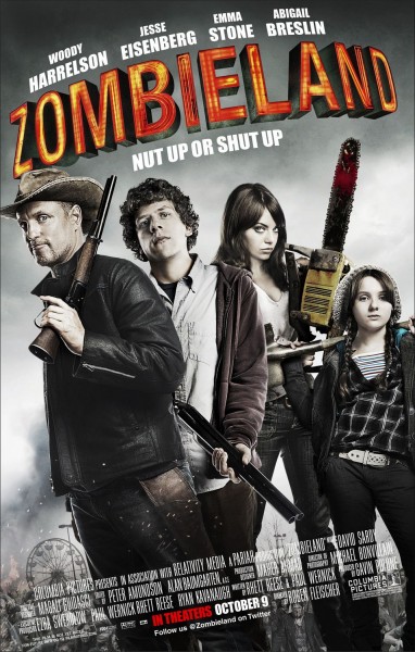
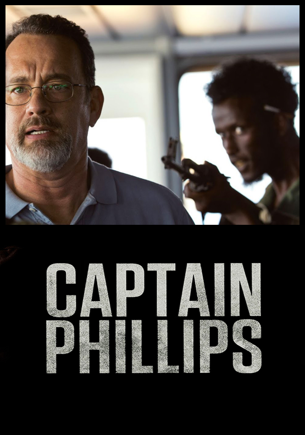
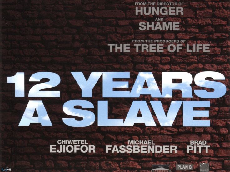
Lastly, one of the most, if not the most, popular typeface we have seen on movie posters is Helvetica.
This seems to be the favourite among the design world. Helvetica, which is latin for Swiss, is a very neutral font. It’s easy to read and has small spaces between lettering, making text flow nicely. As seen in the poster above, the font is clear, strong and enticing. You may have also seen this font on the posters for 12 Years a Slave, Captain Phillips and Zombieland.
There are thousands of fonts out there at our disposal, with more being created all the time, but the ones mentioned above are some of the most used and successful. A font can really make or break a project, so it can take a long time to find the right font for the job.
Here at Solopress, we print a wide range of posters and light boxes. Maybe we can help print the next number one movie poster!


