

Brochure design is a powerful marketing tool that can help you share important information, showcase your products or services, and leave a lasting impression on your customers.
We spoke to our in-house expert, Tim Hann, who has used his 30+ years of experience to bring you some important tips so you can create the best Brochure possible.
Tim has come up with a fantastic line-up of tips, focusing on these key areas:
- Size
- Format
- Imagery
- Copy
- Finishing
- Technical tips
Please note: The number of pages and the quantity can determine which device your brochure is produced on: lithographically or digitally.
Size
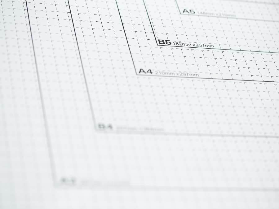
Choose the right size for your Brochure’s needs. If possible, stick to the standard ‘A’ sizes, with A4 and A5 being the most common. ‘A’ sizes maximise your printed size while remaining a cost-effective option. Bear in mind that bespoke sizes are available but can cost more.
Tim’s tip
“Sticking with standard ‘A’ sizes also helps with postage as ‘C’ size envelopes are designed specifically for ‘A’ size documentation.”
Formatting
What format should I have my Brochure in?
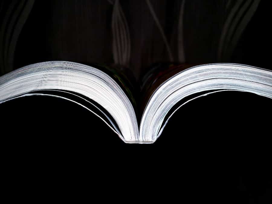
Choosing the right format is crucial for both the appearance and function of your brochure. It’s also crucial to decide on your format early and design accordingly. The most popular Brochure formats are Saddle-Stitch, Perfect Bound and Wiro-Bound.
Tim’s tip
“It’s essential to know which format your Brochures will be produced in before you start designing them.”
Saddle-Stitch is ideal for Brochures with fewer pages
This format is created by folding the pages in half and stapling them along the spine. It’s ideal for smaller brochures with fewer pages (up to 64 pages) and offers a cost-effective solution. Saddle-stitch brochures lie flat when open, making them user-friendly and suitable for mailers or displays. Brochures greater than 64 pages have a tendency to be bulky and resistant to lying flat. They can also tear at the spine during the trimming stage.
Please note: The number of pages in a Saddle-Stitch book must be divisible by four. One sheet or leaf of paper is two printed pages. I.e. 32 sheets or leaf’s is 64 printed pages.
Tim’s tip
“Keep in mind, with a Saddle-Stitch design, folded sections are placed inside one another. This means the centre section is pushed further out from the cover section. Any copy or image close to front edge (opposite to spine) may run the risk of being trimmed. To avoid this never place folios (page numbers) too close to the trim.”
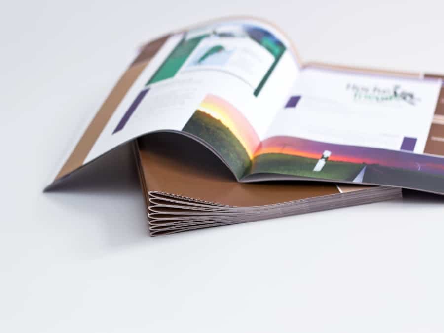
Perfect Bound is ideal for longer Brochures with a premium feel
Perfect Bound Brochures are created by gluing either folded sections, known as signatures, or loose leaf’s which are placed one on top of each other and attached into the cover. They offer a more polished and professional appearance, perfect for larger brochures with a higher page count (above 64).
They’re ideal for Brochures with a spine capacity of 2mm or more and also provide great durability with a luxurious look, suitable for showcasing premium products or a company’s portfolio.
Please note: The number of pages in a Perfect Bound book must be divisible by two.
Tim’s tip
“If you decide to create a Perfect Bound Brochure, you must take the hinge score into consideration. Images and type that run across pages are subject to the hinge score. Avoid images with diagonals, circles and splitting copy through individual words or characters, as this can result in missing images or letters.”
What’s a hinge score?
The hinge score is a crease that runs vertically at a fixed position, between 4-7mm, from the spine on both front and back covers. Its purpose is to stop the Brochure from opening fully and prevent the spine from splitting so pages can’t fall out. With less pressure on its spine the hinge score helps maintain the Brochures condition.
Wiro-Bound Brochures are ideal for manuals and handbooks
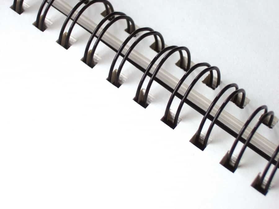
Wiro-Bound: Brochures are created by punching small holes along the spine of a stack of pages and then threading a wire coil through the holes to bind them together. The result is a durable and flexible Brochure that can be easily opened and laid flat for viewing. Great for manuals and handbooks.
Please note: The number of pages in a Wiro-Bound book must be divisible by two. Standard sizes have a ratio of 3:1, three holes per inch, while bigger brochures have a ratio of 2:1. The larger your coil, the greater the number of pages your Brochure can have. This will push the centre pages further away from the cover.
To compensate for this, make sure your cover has plenty of bleed on its front edge. Covers can then be trimmed slightly oversize to prevent the text from protruding beyond the cover. Giving a more professional appearance.
Tim’s tip
“Allow a 10mm margin between your artwork and the spine so your design doesn’t get any holes punched through it.”
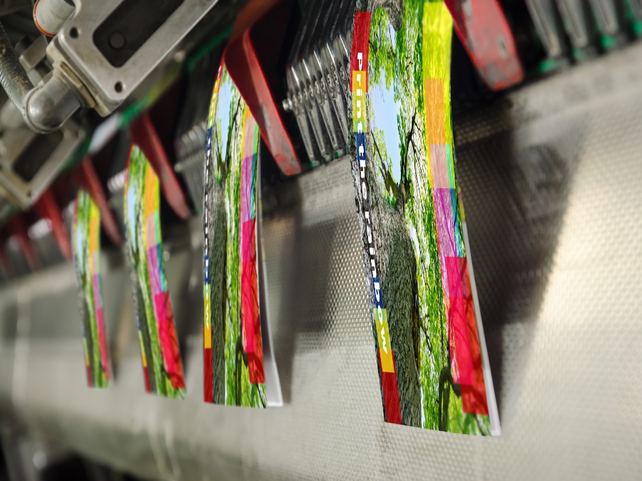
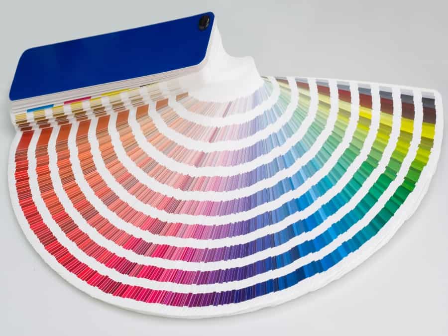
Imagery

What images are best for my Brochure?
High-quality images are essential for capturing and maintaining the attention of your target audience. Visual aids also help you convey your message more effectively.
Creating original content will really set you apart. While using stock images is great, there’s a time and place for them. Using your own, high-quality images that are relevant to your content will help your material to stand out.
Here are some suggestions when selecting your images:
- Use high-resolution images to ensure clear, crisp reproduction on the page.
- Choose relevant images that support your content and message.
- Where appropriate, use a mix of photography, illustrations, and graphics to create visual interest.
- Ensure proper balance between text and images for easy readability.

Saddle-Stitched Brochures are subject to shingling or creep.
What is creep?
Creep is the gradual shifting of images within the folded section of a Saddle-Stitched document. Creep is influenced by the number of pages, folded sections and thickness of the paper. It can result in a misalignment of images or copy that run-over two pages. Creep can have a seriously detrimental effect on your selected images.
Our software compensates for creep, however, you can help to prevent this and speed up the production of your Brochures by keeping your content at least 5mm from the trim edge.
When designing for Perfect Bound or Wiro-Bound, you don’t need to allow for creep.
Tim’s tip
“I’d recommend avoiding images, text or folios close to the edge of the page. I’d also suggest keeping solid blocks of colour or panels away from the trim edge.
“Where possible, avoid having colour close to the edge of your pages as colour inconsistency can become an issue in this instance.”
Copy
What text should I include in my Brochure design?
The copy in your brochure should be precise, engaging, and informative. It’s important that you get the balance between your copy and imagery right, making them work together.
Each word should earn the right to be on your page, if something can be cut, get rid! Readers have varying attention spans and absorb content very differently.
Some will read word for word, while others will skim-read. Make sure the content is engaging for attentive readers but skimmable for those that want to find specific information.
Keep the following tips in mind when crafting your brochure content:
- Use clear, concise language that is easy to understand.
- Focus on the benefits of your products or services, rather than just listing features.
- Organise your content with headings and subheadings for easy navigation.
- Include a clear call-to-action to guide your customers towards a desired next step.
How should my Brochure copy look?
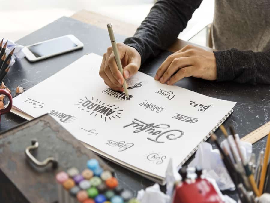
It’s important that you use a font that fits your brand and the message you’re conveying. Your Brochure’s font should match its style and tone or your design may seem disjointed.
If your topic is light-hearted, feel free to use a font that’s fun, quirky and not overly rigid. If the tone of your Brochure is largely serious, it might be better to have a more formal font that matches that mood.
Fonts can be broken down into two main categories: Serif and Sans-Serif. Times New Roman is an example of a Serif font and Arial or Helvetica are examples of Sans-Serif fonts.
Here are the best free fonts you can use in your Brochure design.
Tim’s tip
“Try to avoid copy or type running over two pages. If you do, make sure you’re not splitting words over the middle. With this in mind, I’d also suggest avoiding running tables over two pages on Perfect-Bound Brochures.”
Finishing
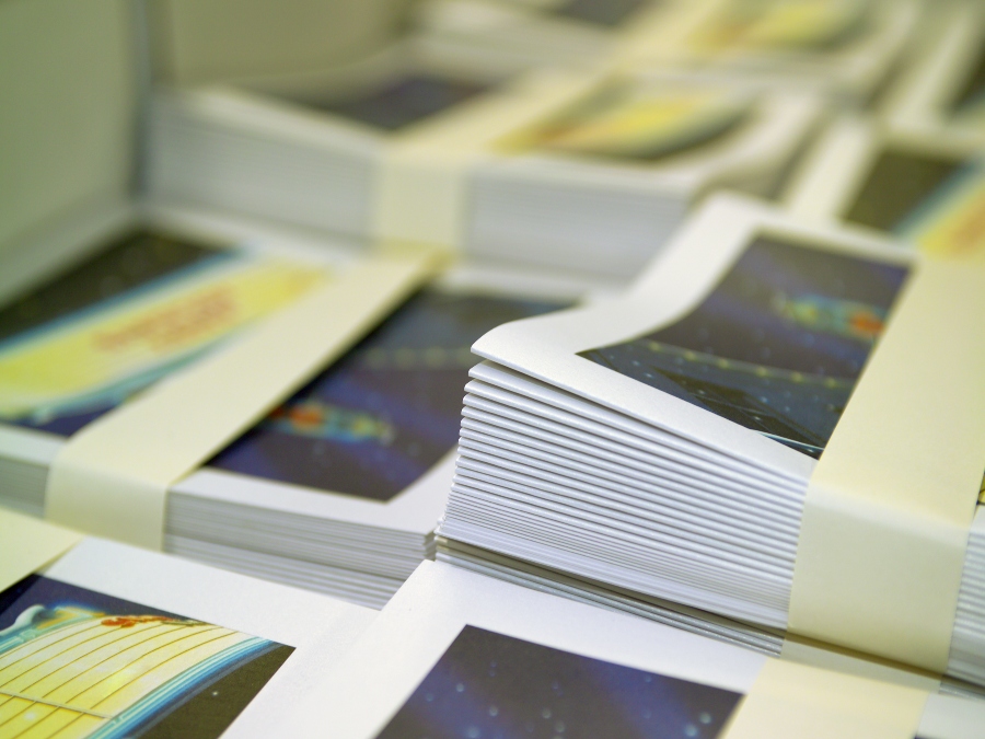
How can I create a Brochure design that shines?
You’ve done the hard work. Your Brochure design is complete and print-ready. Now you need to add the finishing touches.
Visualise how you want your printed Brochure to look and feel in your hands when deciding what finish you want to be applied. Do you want your print to shimmer and shine? Foil or spot UV might be the best for you. Do you want an authentic, natural appearance? Or do you want it to be as environmentally conscious as possible?
Make sure you choose a paper stock that matches your brand image and the purpose of your brochure. Additional treatments and uncoated stocks tend to require a longer lead time.
What’s the difference between coated and uncoated paper stocks?
Papers are divided into two types: coated and uncoated. Coated papers mainly come in a silk, gloss or matt finish. Bond is the only finish in the uncoated range. All paper stocks are referred to by weight, with the weight of one sheet measuring one square metre (gsm).
Images printed on coated paper stocks can enhance your images, making them punchy vibrant and in certain instances jump off the page. This stock can give your Brochure a professional glossy effect. Coated stocks work well with additional enhancements or treatments such as metallic inks, lamination, spot UV and foiling.
Uncoated paper stocks provide a more natural look and feel to them. Due to its composition, when ink dries on uncoated stocks it can give colours and textures a more organic appearance. It’s also an easier surface to write on if a requirement of your Brochure. Uncoated stocks do not lend themselves to the additional treatments and enhancements that coated stocks can.
Please note: The same colour can appear quite different depending if it’s printed on coated or uncoated paper.
Foiled for choice!
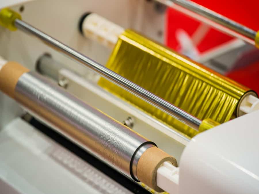
Adding a unique finish creates that wow factor. Foil and spot UV adds texture, highlights text and adds a touch of luxury to your Brochure design. Your customer will be able to see and feel the contrasting surface, providing a focal point that lends your brochure a refined, professional feel.
Foiling and Spot UV finishes are applied to coated stocks only once they are laminated. This is available in three finishes: matt, gloss or velvet. Lamination can produce an extremely tactile product elevating your Brochure to another level. Our huge range of foil colours means you’re definitely foiled for choice!

Tim’s tip
“Inks look different on different stocks. This is down to the way ink dries on your stock. Coated colours look punchy as ink dries by oxidisation.
“Uncoated stocks dry be oxidisation and penetration which means they dry slower so need to be left for 24 hours before they can be despatched. This is to prevent scuffing, bruising or set-off, where ink soaks into the surface and leaves images appearing flat and less punchy compared with coated stocks”.
Technical Tips
How to get make your Brochure design ready for print
To get your design from concept to physical Brochure, there are a few technical points you need to know to get your artwork print-ready. Before sending your brochure to print, make sure to consider these technical aspects:
- Bleed: Include a bleed area around the edges of your design to avoid unwanted white borders or cropping errors. For more guidance on this, read our bleed support guide.
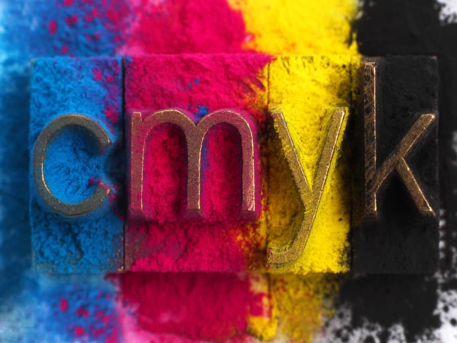
- Colour mode: Use the CMYK colour mode to ensure accurate colour reproduction in print. For further help regarding CMYK, read our colour support guide.
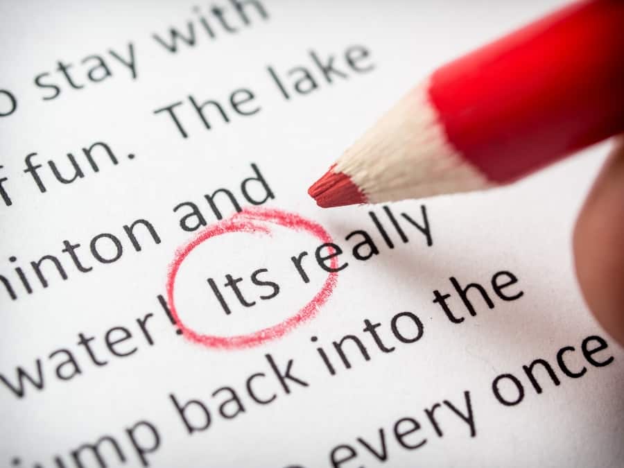
- Proofread: Double-check your content for spelling and grammatical errors, as well as correct image placement and resolution. Read our proofreading blog for expert tips to confidently remove any error from your work.
- File format: Save your brochure design in a high-quality, print-ready file format, such as PDF. If supplying artwork is a struggle, read our support guide for further help.
Tim’s tip
“Get someone to review your work for spelling mistakes. We’re quick to trust spellcheckers and Grammarly, but they can make mistakes, especially American English spellings such as ‘color’.
“Always supply your file with bleed. When you include a bleed in your design, you’ll save time getting your order processed by not having to readjust your artwork, or worse, compromise on it. Where possible supply your files in single pages to avoid printer pairs or supplying your pages as spreads to view.”
Where can I get my Brochure design printed?
Paying attention to your format, imagery, copy, finishing, and technical aspects can help you create a brochure that effectively communicates your message and leaves a lasting impression on your customers.
If you need a helping hand through your design process, we’re always happy to help to bring your vision to life.
