

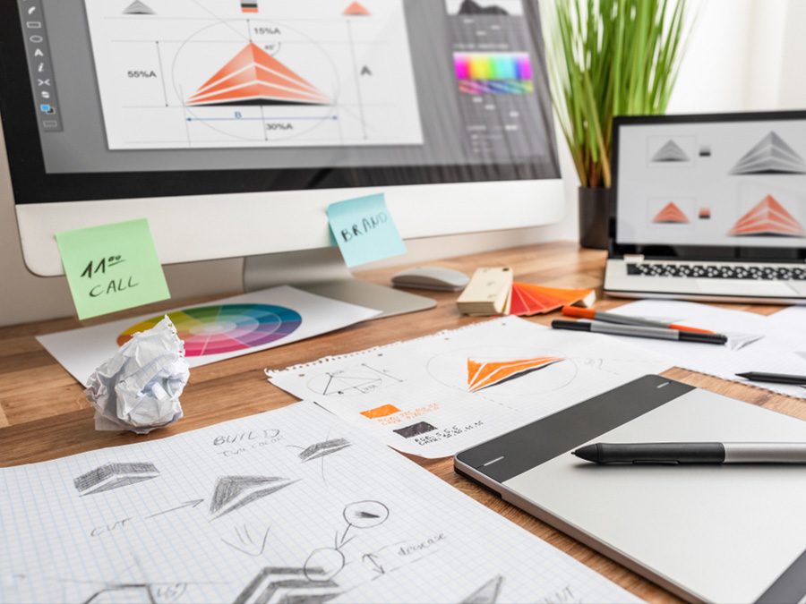
Great print starts before anything goes to production, and it requires both art and science!
The product you choose matters, but so do the foundations behind it. Your logo, colours, images, file type and artwork setup all influence how professional your finished print will look.
You do not need to be a designer or print expert to order professional print. Alongside expert human help, Solopress offers automated artwork checks, online proofing tools, templates and support guides that can help you get started with confidence.
Even so, understanding a few basics can make the process smoother and help you avoid common issues before they happen.
This guide covers the essentials of preparing your brand and artwork for print, from creating a consistent identity to supplying files in the correct size, resolution and format.
Contents:
- Start with your brand
- Consistency builds recognition
- Prepare your artwork properly
- Choose the right size before you begin
- Check your image resolution
- Supply the right file type
- Final artwork checklist
- Get your artwork print ready
Start with your brand
Most businesses already have a logo, colours and a clear idea of how they want to present themselves. Being print ready starts with making sure those elements work consistently wherever customers encounter your business.
Before supplying artwork for print, it’s worth checking that you have the basics in place:
- Your logo
- Your colour palette
- Your typography
- Your tone of voice
- Your visual style
You do not need a lengthy brand guideline document. A clear and consistent approach is often enough.
The important thing is that your printed materials feel connected to the rest of your brand. A Flyer, Business Card, piece of packaging or event display should not feel separate from your website, social media or other marketing activity.

Design insight from Ellise Collins, Senior Designer – Solodesign
Create a simple brand sheet. Include the approved logo variations, your chosen typefaces, ideally one or two, and a focused colour palette all in one document. Keeping these core assets organised in one place makes it easier to maintain a consistent brand across both print and digital touchpoints.
A simple brand sheet gives you, your team or your designer a practical reference point. It helps prevent small inconsistencies from creeping in and makes every new piece of marketing easier to produce.
Consistency builds recognition
Customers rarely encounter a business in just one place.
They might see your website, social media profiles, printed materials, packaging, signage, marketing emails or event displays before they decide to buy. Each interaction contributes to the way they understand and remember your brand.
That does not mean everything has to look identical. A consistent brand is not identical everywhere. It is recognisable everywhere.
That recognition comes from using the same core elements in a considered way:
- The same logo styles
- The same or similar colours
- Consistent typography
- A familiar tone of voice
- A visual style that feels connected
When those elements work together, every piece of marketing feels like part of the same business.
A Flyer might need to work harder than a social post. A Business Card might need to feel more refined than a packaging insert. A Poster might need to be bolder and simpler than a page on your website. But they should all feel like they belong to the same brand.
Ask yourself:
- Would someone recognise your brand without seeing your business name?
- Do your printed materials feel connected to your website and social media?
- Are your colours, fonts and logo being used consistently?
- Does each piece of marketing create the impression you want customers to have?
Greater familiarity leads to greater trust. When customers recognise your business across different channels, they are more likely to remember it, return to it and feel confident choosing it.
Prepare your artwork properly
Once your brand foundations are in place, the next step is making sure your artwork is set up correctly for print.
You do not need to be a designer or print expert to order professional print. Automated artwork checks, online proofing tools, templates and support guides can all help identify common issues before production.
Even so, a few simple checks can make a big difference to the finished result.
Before supplying artwork, make sure you have:
- A vector logo, such as AI, EPS or PDF (for further details, see Understanding Vector Artwork)
- High-resolution images, typically 300dpi (for further details, see Understanding Resolution)
- Colours set up for print using CMYK (for further details, see Understanding Colour)
- Fonts embedded or outlined (for further details, see Understanding Fonts)
- Artwork supplied at the correct size (for further details, see Understanding Document Sizes)
- Include bleed where required (for further details, see What is Bleed?)
These details help prevent common problems such as blurry images, colour shifts, missing fonts and layouts that don’t fit the chosen product.
Start with the file, not the fix.
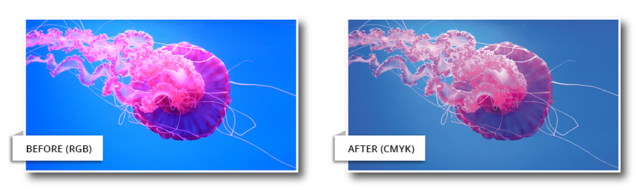
It is much easier to create artwork correctly from the beginning than to repair it later. That means choosing the right product size, colour gamut, product template and file type before you begin.
If you are adapting artwork from a website, social media post or previous campaign, check that it is suitable for print before placing your order. A design that works well on screen may still need adjustment before it can be produced professionally.
The stronger your artwork is at the point of supply, the smoother the print process becomes.
Choose the right size before you begin
Artwork should be created at the correct size from the start.
Resizing a finished design can affect the layout, image quality and readability. Text may become too small, important details can move too close to the edge and images that looked sharp at one size may not work as well at another.
That is why product templates are so useful. They show the correct dimensions for your chosen product, including the bleed and safe areas that help your artwork print and trim correctly.
Bleed extends the artwork beyond the finished edge to prevent unwanted white borders.
Safe areas keep important text, logos and graphics away from the trim line.
Design insight from Ellise Collins, Senior Designer – Solodesign
Start with the template. Using the correct product template from the outset ensures your artwork is set up to the right dimensions, including bleed and safe areas. It also gives you a clear understanding of the available design space. Leave plenty of room around logos, text and key graphics. Generous margins and breathing space often create a more professional-looking design.
Before you begin, check:
- The finished size of the product
- Whether the artwork includes bleed
- Whether key information sits inside the safe area
- Whether the layout still feels clear at the final size
- Whether images are large enough for the format
A Business Card, Flyer, Poster or Roller Banner all give you a different amount of space to work with. Choosing the size first helps you create artwork that suits the product, rather than forcing a finished design to fit later.
Check your image resolution
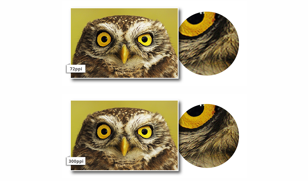
Images that look sharp on screen do not always print sharply.
A phone, laptop or social media feed can make a low-resolution image look acceptable because it is being viewed at a small size. Once that same image is enlarged for print, any lack of detail becomes much easier to see.
Resolution affects how sharp an image appears when printed. As a general rule, 300dpi is recommended for most printed products.
That does not mean every image needs to be treated in exactly the same way. A small image on a Business Card is very different from a large image on a Poster or Roller Banner. The larger the printed format, the more important image quality becomes.
Files that may need extra checking include:
- Images taken from websites
- Images downloaded from social media
- Screenshots
- AI-generated images
- Small images stretched to fit larger formats
- Files exported from online design tools such as Canva
These files are not automatically unsuitable, but they should be checked carefully before being supplied for print.
Look out for:
- Blurry or pixelated images
- Images that look soft when enlarged
- Screenshots used as artwork
- Logos supplied as low-resolution JPEGs or PNGs
- Artwork that has been stretched to fit a different size
If you are unsure whether an image is suitable, Solopress automated artwork checks and support guides can help identify potential issues before production.
The aim is not to make artwork feel complicated. It is simply to make sure the image quality matches the product you want to produce.
Supply the right file type
File type can make a big difference to how smoothly your artwork moves through production.
For most standard printed products, a high-resolution PDF is usually the best format to supply. A PDF helps preserve the layout, images, fonts and print settings, making it a reliable option for products such as Flyers, Leaflets, Brochures, Posters and Business Cards.
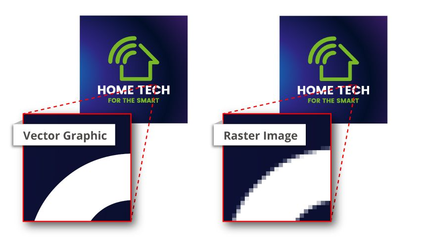
Vector files are especially important for logos and artwork that may need to be scaled. You can learn more about Vectors from our Understanding Vector Artwork Support Guide.
Useful vector formats include:
- AI
- EPS
Unlike a JPEG or PNG, vector artwork can be enlarged without losing sharpness. That makes it ideal for logos, icons, illustrations and designs that may appear across different products and sizes.
Some promotional products have more specific artwork requirements. Items such as certain Pens, Clothing, Seating and Lanyards may need artwork to be supplied as a vector file, often using a limited number of solid colours.
Other products, including some Mugs, Cups, Badges and T-Shirts, may allow full-colour printing methods that can reproduce photographs and more complex artwork.
Check the requirements before you upload.
The right file type depends on the product, the printing method and the artwork itself. Before placing your order, check the file requirements on the product page and make sure your artwork matches what is needed.
Supplying the right format from the start helps avoid delays, artwork issues and unexpected changes to the finished result.
Final artwork checklist
Before you upload your artwork, it is worth taking a moment to check the essentials.
A few simple checks can help prevent delays, avoid production issues and give your print the best chance of turning out exactly as expected.
Make sure:
- Your logo is supplied in the right format
- Images are high enough resolution for the product
- Colours are set up for print using CMYK
- Fonts are embedded or outlined
- Artwork is created at the correct finished size
- Bleed is included where required
- Important text, logos and graphics sit within the safe area
- The file type matches the product requirements
- Any product-specific instructions have been checked
These checks are especially important if your artwork has been adapted from another format, such as a social media graphic, website image, digital advert or previous print campaign.
A few minutes of checking can save a lot of time later.
You do not need to understand every technical detail before ordering print. The aim is simply to supply artwork that gives production teams the clearest possible starting point.
If anything looks uncertain, check the product page, use the available template or ask for support before placing your order. It is always easier to resolve an artwork issue before production begins.
Get your artwork print ready
Preparing artwork for print does not mean mastering every technical detail yourself.
Good print starts with clear foundations: a consistent brand, correctly sized artwork, suitable image resolution and the right file type for the product you are ordering. Once those essentials are in place, the print process becomes smoother and the finished result is more likely to reflect your business in the right way.
If you already have artwork, Solopress templates, support guides, automated artwork checks and online proofing tools can help you prepare it for production.
If you need more hands-on support, Solodesign can help with everything from preparing existing files for print to creating original artwork for print and digital channels.
Whether you are ordering Business Cards, Flyers, Brochures, Posters or branded promotional products, getting the foundations right will help your finished print look sharper, more consistent and more professional.



 English
  French
  Spanish
  German
  Italian
  Dutch
Dutch  Polish
  Romanian
  Bulgarian
  Danish
  Turkish
  Portuguese