
This is Classic Blue – named colour of the year for 2020. But why this particular shade? And why now for 2020? Let’s dive into the deep blue and explore exactly why Classic Blue has already been crowned Pantone colour of the year.
Why is the colour of the year important?
Classic Blue was named colour of the year by the Pantone Color Institute. Most of us have heard of Pantone, but who are they? And what makes their opinion on colour so significant?
In 1963 the company Pantone (based in Grand Rapids, Michigan, USA), introduced a colour referencing scheme called the Pantone Matching System®. It quickly became an international industry standard among designers, printers and manufacturers.
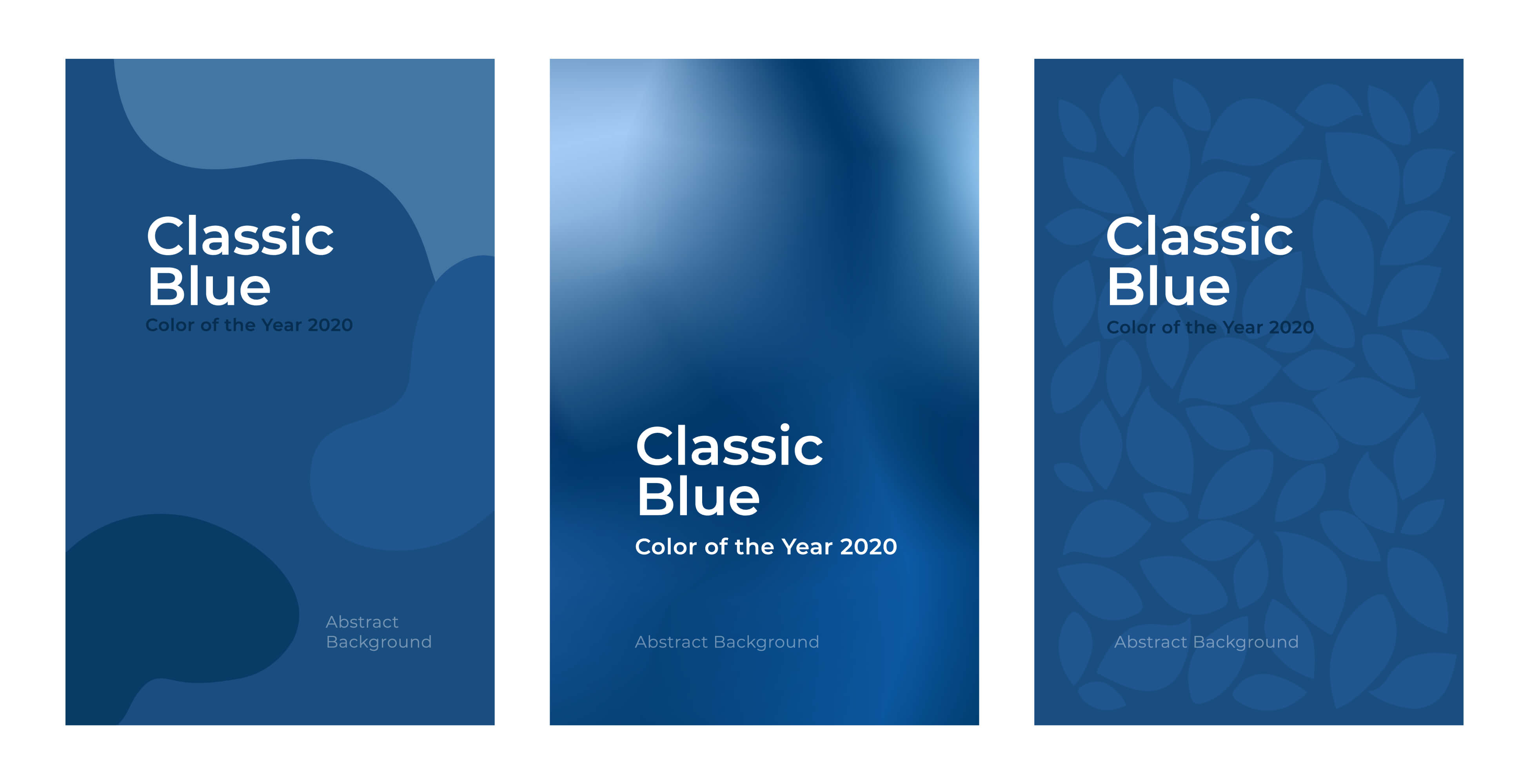
Among other products and services, Pantone curates a growing library of more than 1,300 unique colour references. Since 1999, the Pantone Color Institute has named a colour of the year. The one they’ve selected for 2020 is 19-4052 – or Classic Blue.
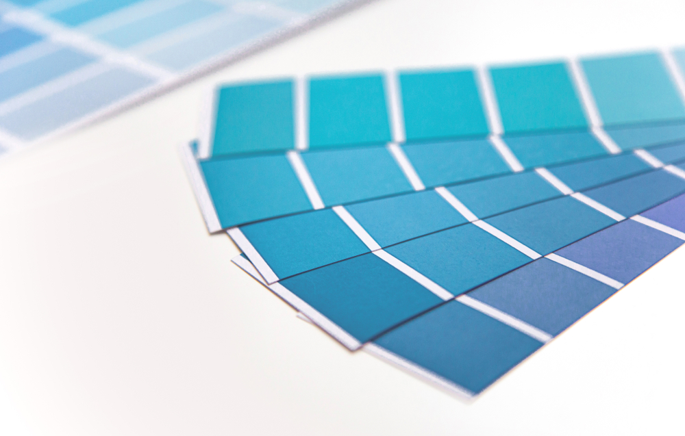
Its simple name belies the depth and range of the Pantone system. Within Pantone’s catalogue, there are probably around 300 to 400 shades that might be described as ‘blue’, depending on your individual interpretations, tastes and photoreceptors.
When Pantone announces its colour of the year, marketing agencies, brand managers, interior designers, fashion houses and paint and dye manufacturers all sit up and listen. In fact, for anyone working with colour, Pantone’s colour of the year is a significant event that has the power to influence design trends over the coming 12 months.
What characteristics does the Classic Blue Pantone have?
Pantone have cited the shade’s “timeless and enduring hue” as the reason for its selection. Quoted in Design Week, Leatrice Eiseman, executive director of Pantone said: “We are living in a time that requires trust and faith. It is this kind of constancy and confidence that is expressed by Pantone 19-4052 Classic Blue, a solid and dependable blue hue we can always rely on.”
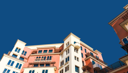
Classic Blue’s universally shared associations helped it secure the top spot. Blue can evoke sadness, loneliness or even vulgarity, but this particular tone’s resemblance to a dusk sky or deep, tranquil water seems to represent positivity and calm. It’s these optimistic, uplifting notions that Pantone feel capture a worldwide appetite for progress, stability and optimism in 2020.
In the areas of trust and reliability Classic Blue truly comes into its own. Forthright but understated, Classic Blue is ideal for company brochures, where it evokes a sense of authenticity and security. It lends a distinctive, established character to the brands it represents, promising quality without grandstanding.
Solopress designer Matt Bruty had this to say about Classic Blue:
“Pantone’s colour of the year certainly evokes calmness and reliability. It lends itself well to being used as a block colour for its easiness on the eye. I think that would work really well with accents of dusky oranges and corals being punctuated through it (think sunset). The blue would also sit very happily alongside gold and creams on a more equal footing.”
What does this mean for designers?
Contemporary designers will be aware of the routes colour trends follow as they filter down to the high street and into the popular consciousness. In recent years, catalysts such as art, music, film and fashion have been joined by bloggers, YouTubers and online influencers.
The Pantone colour of the year is a source that comes with a degree of brand authority and industry insight. The annual decision is based on an array of credible evidence that the Pantone Color Institute observes amid the global cultural climate.
It considers what trends might be bubbling to the surface as well as forecasting what hopes and aspirations might come into play in the year ahead. That might seem overcomplicated when it comes to picking a colour, but Pantone have displayed an uncanny knack for capturing the mood of the times.
Colour of the year’s global impact
In 2018, the Pantone colour of the year was 18-3838 Ultra Violet, citing space exploration and meditation as key influences. In the following 12 months, SpaceX announced it would send the first US astronauts into space since 2011, there was the mindfulness boom and Dior, Yves Saint Laurent, Givenchy and Miu Miu all used violet as part of their collections.
Pantone chose the ecologically-aware 16-1546 Living Coral in 2019 – the year when Greta Thunberg became a household name.
Whether designers agree or disagree with Pantone’s choice, it puts down an industry marker. Just as Pantone’s colour codes serve as a universal reference, their colour of the year is a cultural reference point that’s proved to be a reliable indicator of popular tastes.
For this reason, the Pantone colour of the year is a great choice of screen saver for designers and marketers. It will act as a reminder that exploiting this on-trend hue could bring a contemporary aspect to their work in 2020.
As an extra pro tip for designers, Solopress’ Matt Bruty adds:
“It’s worth pointing out that the Pantone number ‘19-4052’ is from Pantone’s ‘Fashion, Home and Interiors’ range of colours. The equivalent to this in the coated and uncoated books that we’re more familiar with as paper print designers, is the range of blues between 2148 and 2154.”
How can you use Classic Blue in your print marketing
An ideal application for Classic Blue would be as part of a company brochure and associated collateral for a business seeking to portray itself as established, venerable, trustworthy and, well, “Classic!”
Whether you’re building a brand or decorating your home, colours rarely exist on their own. By using Classic Blue as a starting point, it’s possible to build up a variety of colour palettes. If you’re looking for the best colour combinations for brochures, greetings cards or posters, Classic Blue plays nicely with a huge range of shades.
Pantone has created five separate colour palettes that provide harmonious colour schemes, each with an atmosphere of its own. You might choose to adopt one of these palettes in its entirety, or just select one or two accents to build a strong look for your next campaign. Interior design site ApartmentTherapy.com has also explored a range of complementary colours that work just as well for print marketing as they would in your home.
Where to limit use of Classic Blue
There are contexts when it’s inadvisable to dive straight into Classic Blue – if you’re managing a brand with a very specific palette, for example. Trying to shoe-horn this shade into your marketing materials might dilute your identity and look out of place. When this is the case, you can still learn from Pantone’s rationale for 2020 of “calm, confidence, and connection” to seek out a shade that embodies these values and fits better with your brand livery.
Another area where you might want to exercise caution is food marketing. Marketers often see blue as unappetising. Few foods are naturally blue, so our association between that colour and a satisfying gastronomic experience is not so strongly developed. Compared to warmer and more stimulating colours like red, orange, yellow and green, you don’t find as many food brands or restaurant chains relying on a blue Pantone.
While it would be an unconventional choice, Classic Blue is not off limits to foodies. Its resemblance to the sky at twilight means it sits comfortably in the natural world. That familiarity makes it a bold but certainly usable choice for a potential food, nature or environment-based brand.
Into the blue
If Classic Blue has inspired you to revamp your marketing materials and adopt the best colour combinations for brochures in 2020, shop with Solopress. Explore the huge range of promotional print on offer, or give us a call on 01702 460047.


Great Post! Thank you so much for sharing this very helpful and informative blog