Kraft Paper Colour Guide
This guide will help you understand why some colours work better than others when printing onto kraft paper, and how to prepare your coloured artwork to get the best results.
What is kraft paper?
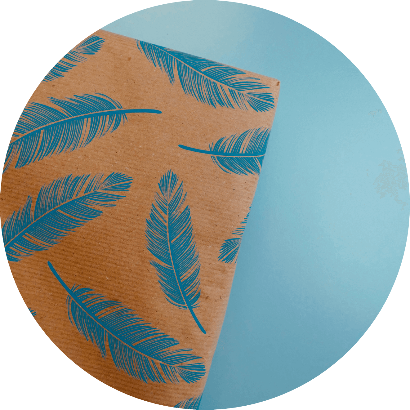
Made from 100% recycled pulp, our kraft paper has a tactile, organic feel and an earthy brown tone. It makes for a versatile material that brings a distinctive quality to a wide range of products such as Greeting Cards, Flyers and Leaflets, Postcards, Invitations, Business Cards, Swing Tags and much more.
While colours appear differently when printed onto brown kraft paper, they can be used to great effect, either by dialling back the range of colours for a subtle, natural finish, or ramping it up with strong, bold colours to ensure they stand out.
What colours print well on kraft paper?
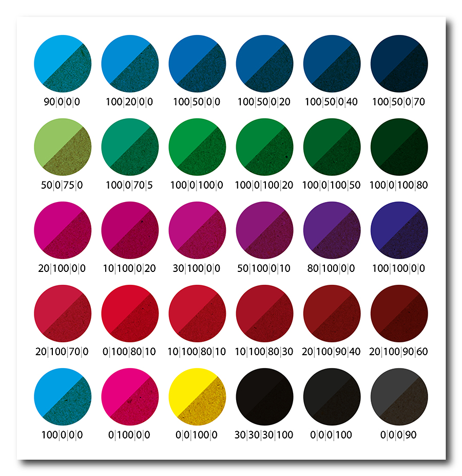
The CMYK colour printing process uses the underlying whiteness of the paper to help make up its full gamut of colours. For a full explanation of how this works, check out our Colour Guide. However, because kraft paper is naturally brown, the resulting colours will be different than if white paper had been used.
As you’d expect, lighter colours that rely heavily on the whiteness of the page to achieve their brightness will be more radically affected by switching to kraft. You should also be aware that any white areas in your design will show as blank, brown areas of the kraft paper on your finished product.
Darker colours will be reproduced more faithfully as these aren’t so strongly affected by the colour of the kraft paper. Other than black though, all colours will appear to a certain extent darker and softer than if they were printed onto white paper.
Here are some examples of how colours may vary when printed onto kraft:
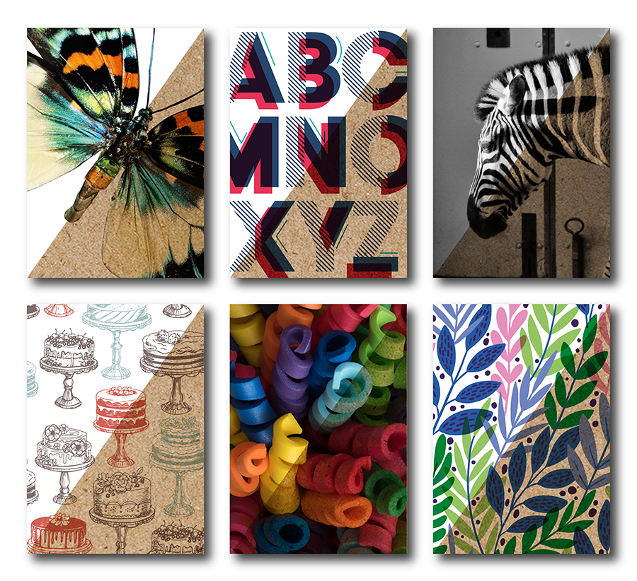
Design examples
Here are some direct comparisons of how the same designs would appear on white paper compared to how they would appear on kraft:
Need Help?
Following these guidelines ensures that there will be no delays with your printing. If you have any problem, please don't hesitate to call our team on 01702 460047 who will be more than willing to help.