

Election Leaflets are a big part of any political campaign — we should know, we’ve printed one or two in our time.
But what makes some campaigns more effective than others? We were intrigued to hear people’s opinions on the issue, so we carried out a survey of 878 voters to discover what they really think when they receive an election leaflet. Here are our findings…
Political headlines
The first set of questions our survey asked was to do with the headline. What kind of message do people prefer to see on the front of an election leaflet?
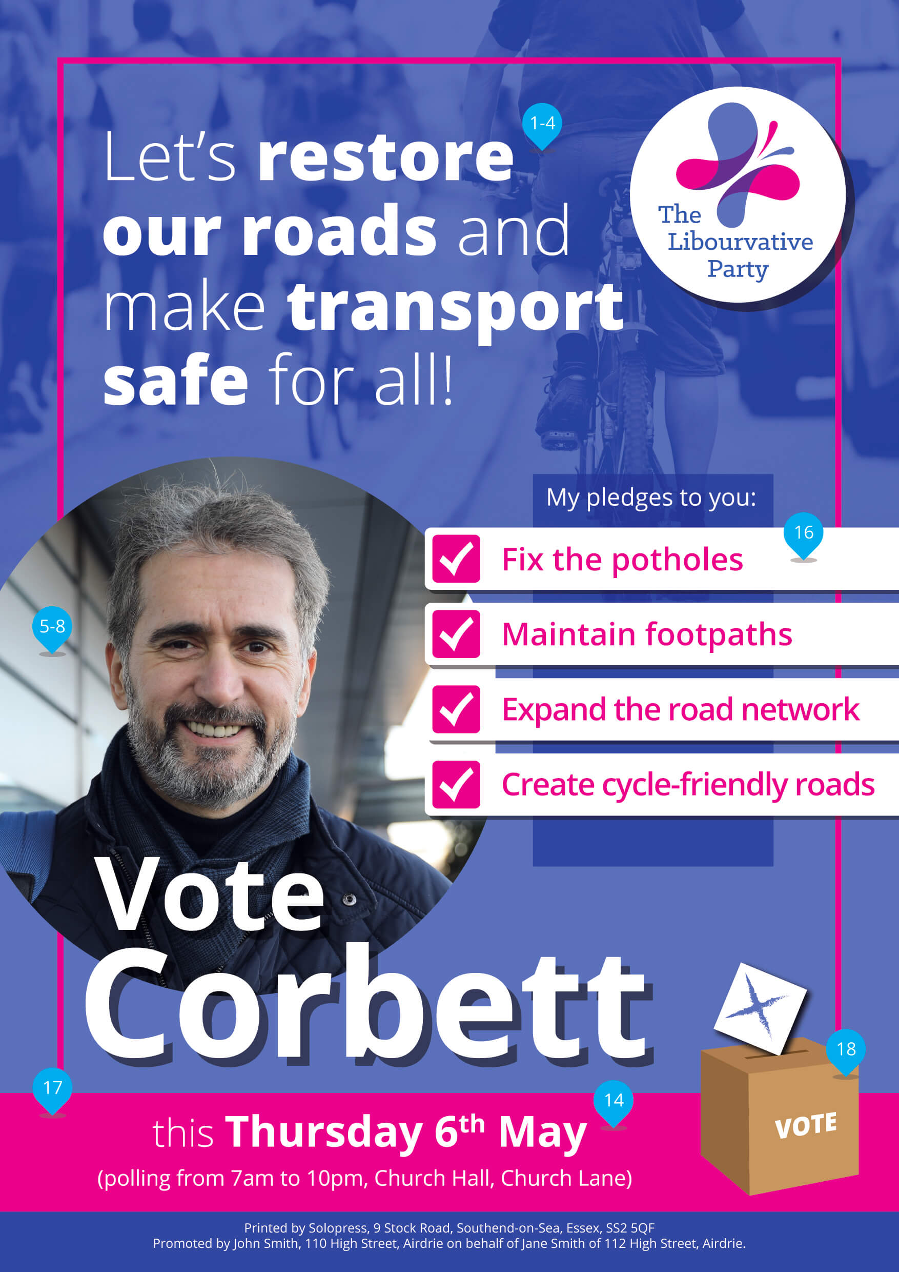
1. Which type of headline would you prefer to see on the front of an election leaflet? A party slogan, a specific policy or a quote from the candidate?
We discovered that our respondents in the majority prefer to see a headline that’s sharply focused on a specific policy area rather than a more general statement of intent. 56% of respondents said they would prefer to see a specific headline. 25% preferred a party slogan and only 19% wanted to see a quote from the candidate. This is at odds with the prevailing trend we see for more generalised headlines, such as ‘Strong and stable leadership in the national interest’ (Conservative, 2017). Maybe the big parties should shift towards more specific headlines?

2. What should the headline message on the front of an election leaflet focus on? One main issue, or several issues?
If you do choose to lead with a policy-driven headline, should it focus tightly on one issue, or take in a broader range of policies? 56 % of respondents said that they prefer to see a headline that focuses on one main issue whereas the remaining 44% would prefer to see a more general message focusing, so the single-policy headline wins by a narrow margin.
3. What would you prefer to learn from the headline? What the candidate stands for, or against?
Headlines can highlight a positive stance on behalf of the candidate, or they can concentrate on something that they oppose. When we asked people which they prefer, an overwhelming 88% favoured a headline that spelt out what the candidate stands for, with only 12% preferring one that focuses on what the candidate stands against.

4. What should the headline tell you? Why you should vote for the candidate, or why you shouldn’t vote for the opposition?
Similarly, the headline can be an opportunity for self-promotion, or an opportunity to disparage the opposition. According to our survey though, the vast majority of people would sooner see you make your case for leadership than witness you sling mud at your opponents, with 96% preferring a positive message.

Photo opportunities
A photo of the candidate is a mainstay feature of campaign leaflets. There are decisions to be made though about where the photo is taken, who appears in it, how it’s cropped and even what facial expression to adopt.
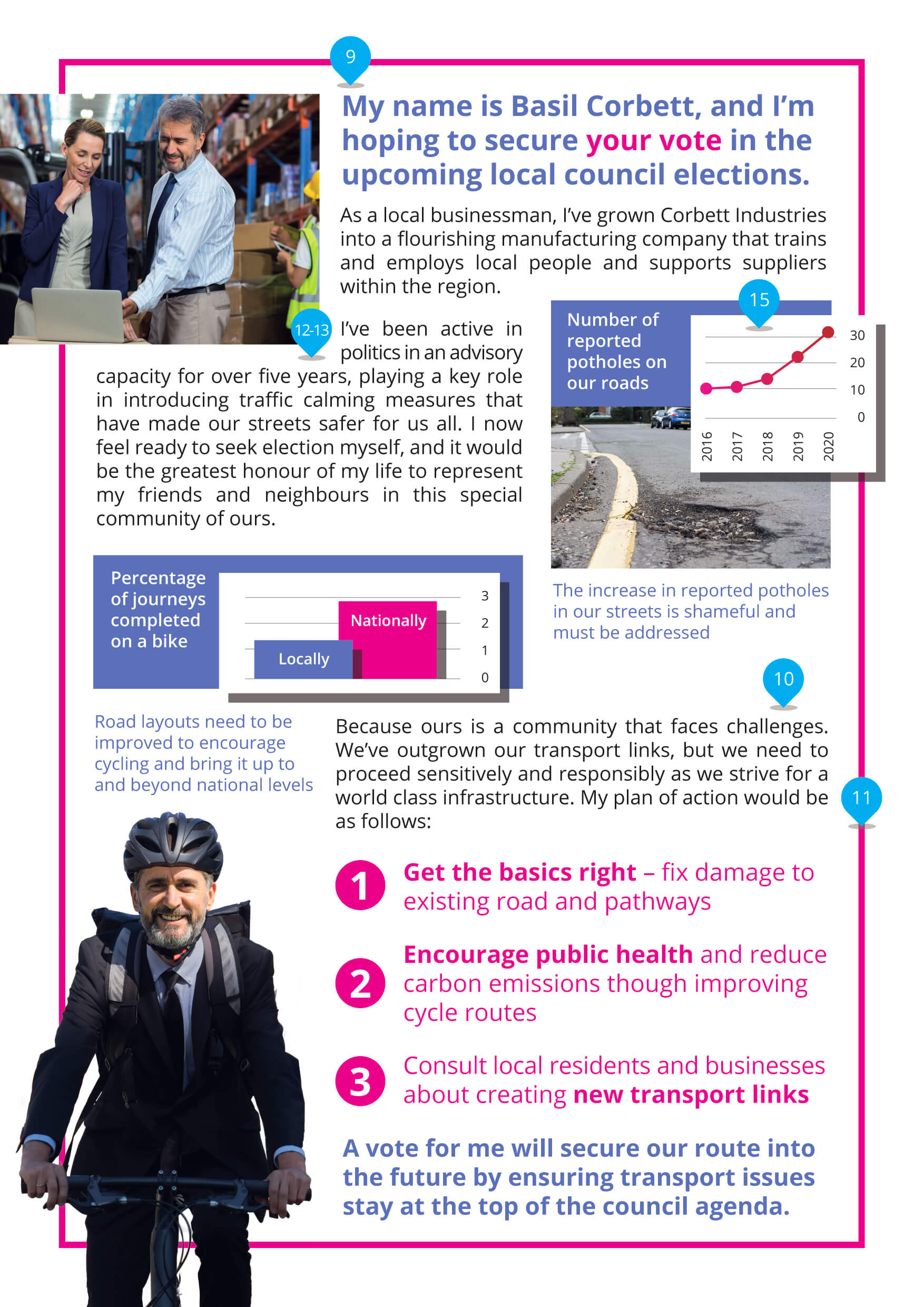
5. Which type of photograph would you prefer to see on the front? A photo of the candidate, or one depicting an issue in the constituency/ward?
Respondents were split almost half and half when asked about where the candidate should actually appear at all, with 52% preferring a photo of the candidate and 48% preferring to see a photo depicting an issue in the constituency or ward. So maybe, when it comes to the front cover at least, featuring a snap of candidate isn’t the no-brainer we thought it was!

6. What kind of photograph of the candidate would you prefer to see? Head and shoulders or full body?
Exactly how much of the candidate do people really want to see? 74% of those we asked preferred to see a photo cropped around the head and shoulders, with only 26% preferring a full-body photo.
7. How would you prefer to see the candidate pictured? In their constituency, with their party leader or professionally in a studio?
We also asked whether respondents would prefer to see the candidate pictured in their community, alongside their party leader, or snapped in a studio by a professional. An overwhelming 82% of respondents preferred to see their candidate in the constituency or ward that they hoped to represent. 11% preferred a picture alongside the party leader and only 7% would prefer to see a professional studio photo.
 8. How should the candidate’s facial expression appear? Happy & cheerful? Or serious & business-like?

When we asked if voters would prefer to see their candidate in a happy and cheerful mood or with a serious and business-like facial expression, 68 % preferred a smile with only 32% preferring a stern expression, so it pays to cheer up.
Rhetorical questions
9. How do you prefer an election leaflet to be written? By the candidate in the 1st person, or about the candidate in the 3rd person?
The survey went on to inquire about the written style of an election leaflet. We asked whether people preferred a leaflet written in the first person (eg. “I’m the woman for the job”) or whether they prefer it in the third person (eg. “She’s the woman for his job”). A huge majority of 90% preferred to read a leaflet written in the first-person voice.

10. Which tone of voice do you prefer in an election leaflet? Passionate and empathetic? Or direct and factual?
In terms of the mood of the language used within the leaflet, we asked whether people preferred a passionate and empathetic tone of voice, or a very direct and factual one. It was a close-run thing, with just 54% preferring direct and factual language over passionate and empathetic. This even split may suggest that a compromise between the two approaches could be the most effective approach.
The bigger picture
11. Which would you prefer to learn more about? The party’s shared objectives, or the candidate’s personal priorities?
Our next question centred around whether people prefer to learn more about the party’s objectives overall, or whether they prefer to hear the candidate’s personal views and priorities. While 52% mildly preferred to hear about the candidate’s personal priorities, it was a pretty even split with 48% willing to hear more about the party’s manifesto.

12. Are you interested in reading about the candidate’s personal life and interests?
Candidates often supply a bit of personal information about their interests, hobbies and family life, maybe to paint a broader picture of the type of personality they are. However, only 44% of people we asked expected to hear this kind of info, with 56% stating that they were specifically not interested in hearing about the candidate’s personal life!
13. Are you interested in reading about the candidate’s professional/political past record?
We asked if people were interested in hearing about the candidates past record in politics or in their professional career, and this time a huge 80% of respondents declared an interest. These two questions demonstrate that if you’re going to include information about the candidate as an individual, it may be better to weight it towards the professional, rather than personal, details.
Facts and figures
14. Do you expect the leaflet to give information on the date, time and location of polling?
We asked whether readers expected the leaflet to provide information on the time, date and location of polling for the election itself, and a significant 85% said they would indeed expect this information to be printed. Clearly, it’s a good idea to make sure this info is included in your leaflet.
15. How do you prefer statistics to be presented? As written statements? Or graphs and diagrams?
An election leaflet will often present statistics and information to the reader, so we asked whether people preferred written statements or graphs and diagrams to illustrate the facts and figures. It seems most people, 77% in fact, find information easier to digest in the form of graphs and diagrams, with only 23% preferring a written statement. It’s certainly worth considering a graphic representation whenever you’re looking to present statistical information.

16. How do you prefer pieces of information to be presented? In paragraphs or bullet points?
In terms of the specific points candidates wish to make through their written content, we often see these presented either as paragraphs of text or separated into bullet points. We asked our respondents which they preferred, and two thirds (67%) favoured bullets. So, if you want to make your point plainly and simply, readers prefer it when your written content is separated out into distinct snippets.
Good optics
17. Which style of graphics on election leaflets do you find the most appealing? Slanted or non-slanted?
When we looked at campaign materials from recent elections, we’ve noticed a design trend for slanted graphics and text holding devices, almost reminiscent of mid-century Soviet propaganda! We were keen to see if our survey respondents preferred this approach to more traditional horizontal text banners. Despite current trends, 64% preferred the non-slanted versions, so it could be that an edgy graphic design approach can actually harm how your campaign is perceived.

18. Does including an election graphic such as a ballot box or rosette help communicate the purpose of the leaflet?
Staying with traditional design devices, we were also curious as to whether traditional motifs such as the rosette and the ballot box still have a place in signposting the purpose of an election leaflet. When we asked people whether they prefer to see a ballot box or rosette as part of the design, 64% said yes. The lesson here seems to be that you shouldn’t let the quest for originality, or the urge to avoid cliché, drag you away from certain design tropes that readers expect and welcome when it comes to campaign material.
19. Does a well-designed election leaflet make you more likely to read the content?
But is design important when it comes to putting your political message across? We asked whether a well-designed election leaflet made people more likely to actually read the content itself, and 95% agreed that it did. It seems that it’s well worth investing some serious time and effort into getting your leaflet design right if you want your message to be heard.

Creating the perfect Election Leaflet
The people have spoken
We hope you find these insights as fascinating as we did, and that they come in handy when creating your Election Leaflet.
Flyers and Leaflets are just part of a candidate’s campaign kit. our Election Printing page brings together our full range of invaluable printed campaign material with free next day delivery.
